Black Beans Branding by Deborah Avila |
Home > Winners > #148476 |
 |
|
||||
| DESIGN DETAILS | |||||
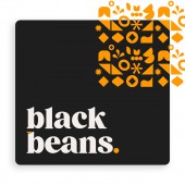
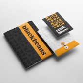
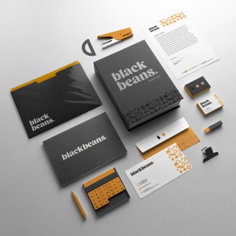
| DESIGN NAME: Black Beans PRIMARY FUNCTION: Branding INSPIRATION: Beans are the essential, basic nutrition to all Brazilian families. It is a superfood that is strong and indispensable. There is why the logo needed to be as bold as its meaning. Modern and elegant premium brands, such as Uber and Mastercard, served as great inspirations for their simplicity and minimalism. The research took one full day, and the next day was spent creating the brand itself. UNIQUE PROPERTIES / PROJECT DESCRIPTION: Black Beans is a new agency born from merging the best two marketing companies in Sao Paulo, Brazil. The name Black Beans came from the idea of putting more water when cooking, which means cooking great ideas together and making them last longer. The challenge was to create a logo and identity that portrays premium, bold and robust capabilities within the digital market. The result was an elegant, strong, and versatile logo and identity. OPERATION / FLOW / INTERACTION: This brand design is for Black Beans marketing agency only use. There was a blend between two strong agencies in Sao Paulo, Brazil, and from this union, Black Beans was born. The brand’s design matches its new creative direction, portraying an elegant, modern, and sophisticated brand identity. It is already in use by the agency, with its goal of finding clients that match the new brand’s modern style. PROJECT DURATION AND LOCATION: The naming task took two months. After the company's directors, teams, and I chose the name, the deadline to create a logo and visual identity was very tight. In two days, the logo was created and approved by the whole company. FITS BEST INTO CATEGORY: Graphics, Illustration and Visual Communication Design |
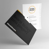
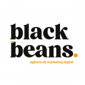
PRODUCTION / REALIZATION TECHNOLOGY: Adobe Illustrator software was used for the creation of the logo. There, the typography was chosen and drawn accordingly to the brand's meaning. The colors were selected, and the patterns were illustrated. In the final, Adobe Photoshop software was used to create mockups for the images with the brand and also a presentation for the client's approval. SPECIFICATIONS / TECHNICAL PROPERTIES: The chosen main typography was Briston Typeface. It is a corpulent font, and its design was changed to match the brand’s meaning, like an additional element illustrated on top of the b on beans, the connection between the e and a, forming a union between the two companies merging, and the dot at the final, matching a simple and minimalist bean. TAGS: Brand identity, Modern Design, Logo creation, Logo identity RESEARCH ABSTRACT: The research for the logo creation was mostly using the online platforms Dribbble and Behance. There, I searched for inspirations in design that would match the new brand’s meaning. I only had two days to create this new brand, which characterizes it as a very fast paced, although very analytical, and thorough process. The results were the best possible, and the logo was approved by all and put to use immediately. CHALLENGE: Initially, the challenge was to direct the new name into something related to flame, hence the two previous logos have flames in them. Eventually, the strongest idea was that of using beans and their powerful, strong meaning as nutrition for every Brazilian family. The next challenge was to create a logo and identity matching a premium and modern visual in only two days. ADDED DATE: 2023-02-15 18:17:15 TEAM MEMBERS (1) : Art Director and Graphic Designer: Deborah Avila IMAGE CREDITS: Logo proprietor: Black Beans Digital Marketing Mockups used in all images: Creative Market Video Credits: Black Beans Digital Marketing |
||||
| Visit the following page to learn more: http://www.blackbeans.com.br | |||||
| AWARD DETAILS | |
 |
Black Beans Branding by Deborah Avila is Winner in Graphics, Illustration and Visual Communication Design Category, 2022 - 2023.· Read the interview with designer Deborah Avila for design Black Beans here.· Press Members: Login or Register to request an exclusive interview with Deborah Avila. · Click here to register inorder to view the profile and other works by Deborah Avila. |
| SOCIAL |
| + Add to Likes / Favorites | Send to My Email | Comment | Testimonials | View Press-Release | Press Kit | Translations |
Did you like Deborah Avila's Graphic Design?
You will most likely enjoy other award winning graphic design as well.
Click here to view more Award Winning Graphic Design.


