| THE AWARD |
| CATEGORIES |
| REGISTRATION |
| SUBMIT YOUR WORK |
| ENTRY INSTRUCTIONS |
| TERMS & CONDITIONS |
| PUBLICATIONS |
| DATES & FEES |
| METHODOLOGY |
| CONTACT |
| WINNERS |
| PRESS ROOM |
| GET INVOLVED |
| DESIGN PRIZE |
| DESIGN STORE |
| THE AWARD | JURY | CATEGORIES | REGISTRATION | PRESS | WINNERS | PUBLICATIONS | ENTRY INSTRUCTIONS |
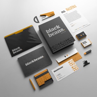
Black Beans Branding by Deborah Avila |
Home > Winners > Design #148476 >Interview |
 |
|
FS: What is the main principle, idea and inspiration behind your design?
DA: Beans are the essential, basic nutrition to all Brazilian families. It is a superfood that is strong and indispensable. There is why the logo needed to be as bold as its meaning. Modern and elegant premium brands, such as Uber and Mastercard, served as great inspirations for their simplicity and minimalism.
FS: What has been your main focus in designing this work? Especially what did you want to achieve?
DA: I wanted to achieve an elegant, clean, and modern style for this brand work, using the concepts of beans, union, and strength.
FS: What are your future plans for this award winning design?
DA: My plans are to earn more incredible clients like this one and win more awards.
FS: How long did it take you to design this particular concept?
DA: The research took one full day, and the next day was spent creating the brand. Meaning, two days.
FS: Why did you design this particular concept? Was this design commissioned or did you decide to pursuit an inspiration?
DA: This brand design is for Black Beans marketing agency only use. There was a blend between two strong agencies in Sao Paulo, Brazil, and from this union, Black Beans was born.
FS: Is your design being produced or used by another company, or do you plan to sell or lease the production rights or do you intent to produce your work yourself?
DA: This design is currently being used by Black Beans, the company that invited me to create the brand project.
FS: What made you design this particular type of work?
DA: I have more than 15 years of experience as a Graphic Designer. I am used to creating brand designs for many companies, especially those working in a fast-paced time. Black Beans called me because they trusted my work.
FS: Where there any other designs and/or designers that helped the influence the design of your work?
DA: Yes. Companies such as Uber and Mastercard served as inspirations for this design. Their clean and elegant style is what I was aiming for for this brand project.
FS: Who is the target customer for his design?
DA: Marketing companies and clients who need the incredible marketing work Black Beans offers.
FS: What sets this design apart from other similar or resembling concepts?
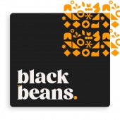
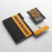
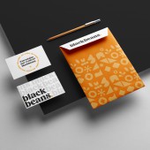
DA: This brand design is very concise and bold. The art is harmonic and deep. Every single aspect of it has a meaning, even the patterns were carefully designed to be part of the beans concept.
FS: How did you come up with the name for this design? What does it mean?
DA: I helped the board of directors choose "Black Beans" as a name for the brand. Initially, the challenge was to direct the new name into something related to flame, hence the two previous logos have flames in them. Eventually, the strongest idea was that of using beans and their powerful, strong meaning as nutrition for every Brazilian family.
FS: Which design tools did you use when you were working on this project?
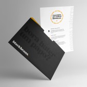
DA: I used Adobe Illustrator to create all the drawings, from the logo itself to the patterns. I used Adobe Photoshop to create mockups and presentations for the client.
FS: What is the most unique aspect of your design?
DA: The elegant typography, with serifs. Not all companies use this bold idea for the font in this market.
FS: Who did you collaborate with for this design? Did you work with people with technical / specialized skills?
DA: No, I created the logo and all the brand identity by myself.
FS: What is the role of technology in this particular design?
DA: The easiness to design a logo using only one app: Adobe Illustrator, and bringing to it all the aesthetic I wanted to give to the brand.
FS: Is your design influenced by data or analytical research in any way? What kind of research did you conduct for making this design?
DA: My research was all related to the competitors and the newest design trends. I could see that most of the competitors stay with sans-serif fonts and are always using elements for their brand identity that don't make sense.
FS: What are some of the challenges you faced during the design/realization of your concept?
DA: The due date was extremely tight. I had only two days to create the entire brand identity and present it to the board of directors.
FS: How did you decide to submit your design to an international design competition?
DA: A friend found out about this competition and called my attention to it. She encouraged me to submit my newest piece of art, and so I did.
FS: What did you learn or how did you improve yourself during the designing of this work?
DA: I improved my fast timing in finding solutions on a tight due date. I also can say I improved my ability to create brand works.
FS: Any other things you would like to cover that have not been covered in these questions?
DA: Black Beans earned two other awards for this brand: A Silver Wolf for Naming and a Bronze Wolf for Brand Identity. This is one of the best Brazilian awards in Sao Paulo's region.
FS: Thank you for providing us with this opportunity to interview you.
A' Design Award and Competitions grants rights to press members and bloggers to use parts of this interview. This interview is provided as it is; DesignPRWire and A' Design Award and Competitions cannot be held responsible for the answers given by participating designers.
| SOCIAL |
| + Add to Likes / Favorites | Send to My Email | Comment | View Press-Release | Translations |

