Airport Bremen Wayfinding System by Thomas Geissert |
Home > Winners > #93704 |
 |
|
||||
| DESIGN DETAILS | |||||
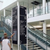
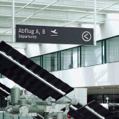
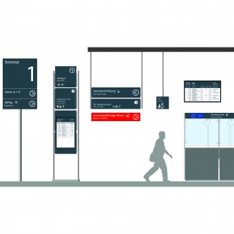
| DESIGN NAME: Airport Bremen PRIMARY FUNCTION: Wayfinding System INSPIRATION: The aim in designing the new wayfinding system was to create a calm atmosphere and a balanced general view without creating visual disturbances. The choice of typography and icons as well as the lighting and coloring make orientation easier for international guests. The most important means besides using the new font, Fago OT from Ole Schäfer is the introduction of high contrast colors. Our focus was on functional and psychological aspects such as good visibility, readability and barrier free information. The decisive factor for the effectiveness of the new guidance and orientation system is the complete information chain. UNIQUE PROPERTIES / PROJECT DESCRIPTION: The goal was to create a system with its own identity and originality that goes beyond. Characterized by its modern, contemporary appearance with the modern classic typography. The calm appearance should promote safety, confidence and deceleration among passengers. A contrasting modern design and a clear information hierarchy characterize this new system. The orientation system works easy and makes a positive contribution to the service quality of the airport. OPERATION / FLOW / INTERACTION: the wayfinding system works simply, safely, quickly and intuitively. It not only guides and accompanies the passengers, but also makes the space tangible and thus creates identification and identity. PROJECT DURATION AND LOCATION: starting in 2012 finished in 2018 FITS BEST INTO CATEGORY: Graphics, Illustration and Visual Communication Design |
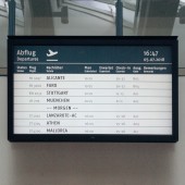
PRODUCTION / REALIZATION TECHNOLOGY: New aluminium cases with contemporary, optimized LED illumination are used for the signage system. Bremen City Airport has introduced new flight information display screens (FIDS) throughout its terminal complex. The screen-designs are created by teamgeissert and displayed on NEC MultiSync V651 models. SPECIFICATIONS / TECHNICAL PROPERTIES: Various dimensions according to the neccessities on-site TAGS: modern, contemporary, reluctant, minimal, plain, timeless RESEARCH ABSTRACT: The new font is the Fago OT. The font is used in different font sizes. This builts a hierarchy that captures and structures the information facilitated. The primary information is flight-related information, the secondary information concern the service facilities in the airport. CHALLENGE: The arrow became an independent, striking element suitable for the pictograms newly designed. ADDED DATE: 2019-10-15 12:36:46 TEAM MEMBERS (2) : Thomas Geissert and Anne Wichmann IMAGE CREDITS: teamgeissert |
||||
| Visit the following page to learn more: http://www.teamgeissert.de | |||||
| AWARD DETAILS | |
 |
Airport Bremen Wayfinding System by Thomas Geissert is Winner in Graphics, Illustration and Visual Communication Design Category, 2019 - 2020.· Read the interview with designer Thomas Geissert for design Airport Bremen here.· Press Members: Login or Register to request an exclusive interview with Thomas Geissert. · Click here to register inorder to view the profile and other works by Thomas Geissert. |
| SOCIAL |
| + Add to Likes / Favorites | Send to My Email | Comment | Testimonials | View Press-Release | Press Kit | Translations |
Did you like Thomas Geissert's Graphic Design?
You will most likely enjoy other award winning graphic design as well.
Click here to view more Award Winning Graphic Design.


