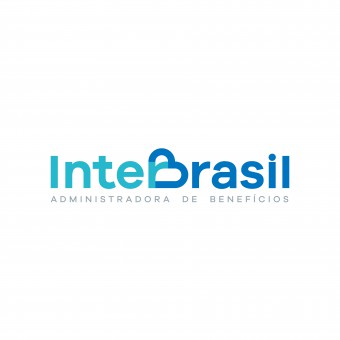
InterBrasil Logotype Redesign Brand Identity Redesign by Mateus Matos Montenegro |
Home > Winners > #86886 |
 |
|
||||
| DESIGN DETAILS | |||||
| DESIGN NAME: InterBrasil Logotype Redesign PRIMARY FUNCTION: Brand Identity Redesign INSPIRATION: Brand redesign was inspired by the sense of modernization and integration that was changing in the company culture. The design of the heart could no longer be external to the brand and needed to be integrated. Inspiring a union, a partnership both internally with employees, but also with customers. An integrated union between benefits, commitment and quality of service. UNIQUE PROPERTIES / PROJECT DESCRIPTION: InterBrasil updated to a new internal systems and communication with consumers, so there was a need to update the brand. After the first and second redesign a couple years back, InterBrasil decided to redesign its brand to talk and interact better with its target audience and employees. The logo was rethought and redesign all the way to its basic principles. The heart was integrated in the B letter of BRASIL and the health cross in the T of INTER. The two words got unified in the middle. OPERATION / FLOW / INTERACTION: The main concept of the brand is centered in the simple feeling of union, presenting to customers and employees a friendly environment, and a first class product. The colors reinforce this environment with clarity, providing a feeling of relaxation. The design was carefully planned so that all the elements that represent Interbrasil were inside the design, but in a simple and elegant way. PROJECT DURATION AND LOCATION: Started in july 2018 and ended in January 2019 in Fortaleza, Brazil. FITS BEST INTO CATEGORY: Graphics, Illustration and Visual Communication Design |
PRODUCTION / REALIZATION TECHNOLOGY: The logo was developed using computer graphics and extensive editing of the typography to accomplish the integration of the two words INTER and BRAZIL, highlighting the heart in the form of B of Brasil, the heath cross in the letter T and the union of the two words in the center. The CMYK standard for primary and secondary colors was used. SPECIFICATIONS / TECHNICAL PROPERTIES: Many elements were created from the logo graphics to support the new digital midias and printed demands as an icon and a symbol that was used for the development of textures. Several pieces of stationery were also developed, such as Business Card, Letterhead, Badge, Envelope and External Signage. TAGS: Logotype, Branding, Redesign, Corporate Identity, Logo Design, Brasil, Interbrasil, Health RESEARCH ABSTRACT: A simple survey was developed using a quantitative and qualitative mix with its employees and collaborators to determine company values, communication and tastes. From this research was developed the moodboard and the line of communication that the company would follow. CHALLENGE: The major creative challenge in brand design came in the changes and adaptations of typography so that the design had all the elements in a harmonious, elegant and continuous way. ADDED DATE: 2019-05-15 18:44:48 TEAM MEMBERS (1) : Mateus Matos Montenegro IMAGE CREDITS: Mateus Matos Montenegro, 2019. |
||||
| Visit the following page to learn more: http://bit.ly/2Q4wVDi | |||||
| AWARD DETAILS | |
 |
Interbrasil Logotype Redesign Brand Identity Redesign by Mateus Matos Montenegro is Winner in Graphics, Illustration and Visual Communication Design Category, 2019 - 2020.· Read the interview with designer Mateus Matos Montenegro for design InterBrasil Logotype Redesign here.· Press Members: Login or Register to request an exclusive interview with Mateus Matos Montenegro. · Click here to register inorder to view the profile and other works by Mateus Matos Montenegro. |
| SOCIAL |
| + Add to Likes / Favorites | Send to My Email | Comment | Testimonials | View Press-Release | Press Kit | Translations |
Did you like Mateus Matos Montenegro's Graphic Design?
You will most likely enjoy other award winning graphic design as well.
Click here to view more Award Winning Graphic Design.


