Wild! Album Artwork by Mario Alejandro Stephens |
Home > Winners > #76529 |
 |
|
||||
| DESIGN DETAILS | |||||
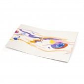
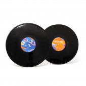
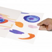
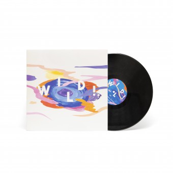
| DESIGN NAME: Wild! PRIMARY FUNCTION: Album Artwork INSPIRATION: The artworks were inspired by contemporary abstract paintings, which were brought into mind after analysis of the album, and the realization of the contemporary nature of its music. Additionally, this inspired the idea to disassemble the letters for the album title and the alignment of the tracklist on the back cover. Colors were inspired by moods, with dark hues suggest melancholy, and bright hues representing anticipation and admiration. UNIQUE PROPERTIES / PROJECT DESCRIPTION: This university project was for aspired digital image making students to visually conceptualize innovative artworks for a 12-inch special edition release, based on a genre of music of interest. Additionally, a promotional item, to be delivered along with the vinyl package, was to be established. Erasure's 1988 album was selected, due to the designer being an avid electronic music listener, and whose goal, in designing the special edition, was to engage music shoppers and listeners more towards the album's messages. Additionally, the designer has established a set of organic shape stickers, available on one single sheet, which can be accessed from one of the vinyl sleeves. The special edition artworks are designed to allure music shoppers and listeners of Wild! to its adventurous atmosphere. OPERATION / FLOW / INTERACTION: The main goal of conceptualizing such a vibrant and colorful art movement for this special edition is to appeal to a larger number of music shoppers, and eventual listeners to Wild!. Such a style amplifies the album's drama and adventurous narrative. This stimulates fascination into shoppers, who catch sight of the special edition in stores, to discover more about Wild!. Furthermore, the goal is also to attract the interest of those who are neither avid electronic or synth-pop music listeners, nor are listeners, or are otherwise familiar with the band. PROJECT DURATION AND LOCATION: The project started in March 2016 and finished in June 2016. |
PRODUCTION / REALIZATION TECHNOLOGY: The artworks were constructed in Adobe Photoshop. Firstly, acrylic paints were applied to cartridge paper and then scanned to capture their wavy textures. Secondly, the organic shapes were all inspired by seamless wood patterns, which were digitally traced and formed from photographs of wooden floorboarding. Thirdly, the digital constructions involved transforming these forms into layers, primarily to allow different close-ups of the paint texture scans to be placed inside and further edited, all while still pertaining to the organic form. Additionally, this stage involved color applications and experiments. Finally, the typefaces for the album title, band name and tracklist were all applied, along with experiments involving disassembling the title letters on the front cover, and the tracklist on the back cover. SPECIFICATIONS / TECHNICAL PROPERTIES: 305 mm x 6mm x 305 mm TAGS: Digital Art, Photoshop, Painting, Visual Art, Album Artwork RESEARCH ABSTRACT: The brief prompted a deep investigation into the selected genre, in order to become familiar with as much as possible for visual inspiration. Such aspects included the genre's pioneering, its instruments and the reasons why musical artists continue composing music in its style to this day. For Erasure, it was clear that their music, including their 1988 album, was written purposefully during the late 20th-century to embrace synth-pop, a subgenre of electronic music. At the time, such a genre encouraged popular music to take on its avant-garde style due to its incredible musical compositions. Realizing these aspects inspired contemporary art visualizations for this special edition brief. Synth-pop was clearly a groundbreaking, imaginative genre. The brief had also encouraged students to utilize an array of materials and methods to achieve their visualizations. Therefore, this influenced the choice to incorporate digital processes with traditional hands-on methods as part of the design process. CHALLENGE: Each composition, while being abstract, still required careful consideration in terms of shape arrangements and color, so as to avoid too much chaos. For the front artwork, in particular, this proved challenging. Furthermore, during the presentation and evaluation stage, it appeared reviewers understood the decisions for the art style, however, suggestions could not be offered in regards to whether this composition looked complete or not. The designer was reminded that such an artwork could only reach a stage of completion if they truly believed, for themselves, it conveyed the messages clearly, in which it already was doing. This eased pressure faced during completion of the rest of the artworks for the other package components. ADDED DATE: 2019-02-14 10:13:47 TEAM MEMBERS (1) : IMAGE CREDITS: Image #1, Image #2, Image #3, Image #4, Image #5: Photographer Mario Alejandro Stephens (Communication Designer), Wild!, 2016. |
||||
| Visit the following page to learn more: https://www.i-am-jandro.com/ | |||||
| AWARD DETAILS | |
 |
Wild! Album Artwork by Mario Alejandro Stephens is Winner in Graphics, Illustration and Visual Communication Design Category, 2018 - 2019.· Read the interview with designer Mario Alejandro Stephens for design Wild! here.· Press Members: Login or Register to request an exclusive interview with Mario Alejandro Stephens. · Click here to register inorder to view the profile and other works by Mario Alejandro Stephens. |
| SOCIAL |
| + Add to Likes / Favorites | Send to My Email | Comment | Testimonials | View Press-Release | Press Kit |
Did you like Mario Alejandro Stephens' Graphic Design?
You will most likely enjoy other award winning graphic design as well.
Click here to view more Award Winning Graphic Design.


