The Edible Ampersand Personal Project by Ashley Anastasia Howell |
Home > Winners > #68953 |
 |
|
||||
| DESIGN DETAILS | |||||
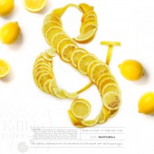
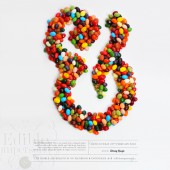
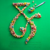
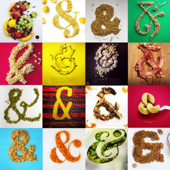
| DESIGN NAME: The Edible Ampersand PRIMARY FUNCTION: Personal Project INSPIRATION: A personal side project inspired by a little Sunday afternoon idea. My husband and I brought over fruit salad to my in-laws. At the same time the Manulife Centre at Bay and Bloor in Toronto was in the midst of doing renovations, and marketed it by asking creatives to post ampersands out of random objects and photograph them. And my first fruit ampersand was created. This inspired me to produce a weekly project called the Edible Ampersand which developed into a weekly creative project. UNIQUE PROPERTIES / PROJECT DESCRIPTION: This project was produced on the basis to learn more about food photography in combination with expanding knowledge of typography particularly ampersands. All while posting online and expanding a social network through common interest. OPERATION / FLOW / INTERACTION: This project is a weekly creative project that helps me understand the photography of food. Once I determine an ampersand I will manually arrange the food to look like the ampersand and photograph it accordingly. PROJECT DURATION AND LOCATION: Established in January of two thousand and eighteen and a weekly occurrence, still in production and ongoing. Taking place in the Avid Creative home studio. FITS BEST INTO CATEGORY: Graphics, Illustration and Visual Communication Design |
PRODUCTION / REALIZATION TECHNOLOGY: Various materials are used including food and edible contents as the subject. A Cannon Rebel T2i are used to take photos along side various photo lights and equipment. Programs including Illustrator, Photoshop and Premiere Pro are used to edit the photographs and film. SPECIFICATIONS / TECHNICAL PROPERTIES: The images were shot in a studio and once completed they were edited in Illustrator, Photoshop or PremierPro. The images and videos are set up mainly for the Edible Ampersand Instagram feed. TAGS: Ampersand, Side Project, Food, Typography, Personal, Design, Photography, Layout RESEARCH ABSTRACT: The research is mainly based around food texture, colour and lighting along with researching various ampersands which needs a background knowledge of typography. The main objective is to find the most suitable ampersand for the food that will be represented typographically. CHALLENGE: The hardest part is trying to not be so picky about each piece that is produced. As a side project and as a project that is about learning and understanding the limitations and time constraints that are crucial to the project. The project is also teaching me to limit my time while producing quality work within a limited time frame. ADDED DATE: 2018-06-21 05:04:41 TEAM MEMBERS (1) : Ashley Howell IMAGE CREDITS: All images are shot and edited by Ashley Howell. |
||||
| Visit the following page to learn more: https://goo.gl/wXXZ4y | |||||
| AWARD DETAILS | |
 |
The Edible Ampersand Personal Project by Ashley Anastasia Howell is Winner in Graphics, Illustration and Visual Communication Design Category, 2018 - 2019.· Read the interview with designer Ashley Anastasia Howell for design The Edible Ampersand here.· Press Members: Login or Register to request an exclusive interview with Ashley Anastasia Howell. · Click here to register inorder to view the profile and other works by Ashley Anastasia Howell. |
| SOCIAL |
| + Add to Likes / Favorites | Send to My Email | Comment | Testimonials | View Press-Release | Press Kit |
Did you like Ashley Anastasia Howell's Graphic Design?
You will most likely enjoy other award winning graphic design as well.
Click here to view more Award Winning Graphic Design.


