Learning Education Rebranding Integrated Corporate Identity by United Design Practice |
Home > Winners > #67020 |
 |
|
||||
| DESIGN DETAILS | |||||
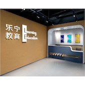
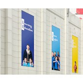
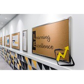
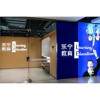
| DESIGN NAME: Learning Education Rebranding PRIMARY FUNCTION: Integrated Corporate Identity INSPIRATION: How do we integrate a brand logo (a fixed component) with marketing communications (a variable component) seamlessly? So that the brand DNA is encoded directly into the branding, facade, signage, graphics, video and even methodology wise. So that it is not a placeholder at one corner, but front and center in touchpoints visually. That is the starting point of this project. And where better to demonstrate the power of language in design than a project for a children's English education client. UNIQUE PROPERTIES / PROJECT DESCRIPTION: A comprehensive integrated rebranding project that involved graphic branding rework, generating new brand assets like brand video, key image photography, and extending the branding across spatial design, facade treatment, signage and wayfinding. In response to a greater need for quality English education, the client decided to embark on a holistic rebranding project to reposition the company for the future. OPERATION / FLOW / INTERACTION: Spatially, we created a mosaic pattern with sound proofing panels to resonate with core branding and to provide a lively environment for children at their viewing height. Simplicity in graphic elements allow for LE to be front and center, different word combination understood quickly. Different color backgrounds identify respective subject groups and target audience. Bringing across honesty in expressions and interaction between teacher and student is key, hence we used used inhouse teachers and students, instead of professional models. PROJECT DURATION AND LOCATION: Project lasted from Feburary 2017 til November 2017 in Shanghai China. |
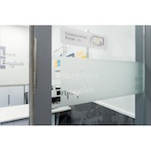
PRODUCTION / REALIZATION TECHNOLOGY: As this is school teaching English, we wanted to demonstrate the joys and potential of English as a language. We incorporated this possibility into the logo itself, with L E combining into different words that express their core proposition, methodology, brand values, and into wayfinding itself. From brand statements like Learn English, Love English, call to action like Lets Enjoy, Lets Empower, to value propositions like Learning is Effective, Learning Excellence, and even incorporated into signages with Lets Enter, Lets Exit. SPECIFICATIONS / TECHNICAL PROPERTIES: We designed 3 new schools and revamped facades of 20 old ones. TAGS: integrated design, holistic design, multi-disciplinary design, children education, RESEARCH ABSTRACT: Extensive stakeholder interviews, market study, visual audits and consumer journey study were done to generate insights and identity design opportunities. This was essential to minimize risk when pursuing break through ideas. For eg in photographic subjects we used an international racial mix, rather than just caucasians (current perception of native English speakers) to celebrate diversity. Also deep research was done into their sales process, allowing us to craft the service design behind spatial layout and experiential journey. CHALLENGE: Because of the way the logo is enlarged to be a primary communications and visual device, it was a challenge to make the design work across all touchpoints. From the facade, outdoor advertising of all dimensions and aspect ratio, to multi-media application and interior decoration. ADDED DATE: 2018-03-07 12:16:38 TEAM MEMBERS (1) : IMAGE CREDITS: Shawn Koh, Feng Studios |
||||
| Visit the following page to learn more: http://suo.im/4kTrH5 | |||||
| AWARD DETAILS | |
 |
Learning Education Rebranding Integrated Corporate Identity by United Design Practice is Winner in Graphics, Illustration and Visual Communication Design Category, 2017 - 2018.· Read the interview with designer United Design Practice for design Learning Education Rebranding here.· Press Members: Login or Register to request an exclusive interview with United Design Practice. · Click here to register inorder to view the profile and other works by United Design Practice. |
| SOCIAL |
| + Add to Likes / Favorites | Send to My Email | Comment | Testimonials | View Press-Release | Press Kit |
Did you like United Design Practice's Graphic Design?
You will most likely enjoy other award winning graphic design as well.
Click here to view more Award Winning Graphic Design.


