Humour Business Exhibition Design by Pink Blue Black & Orange |
Home > Winners > #61539 |
 |
|
||||
| DESIGN DETAILS | |||||
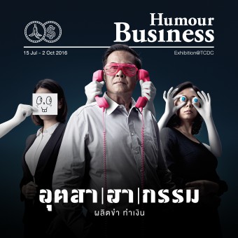
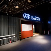
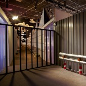
| DESIGN NAME: Humour Business PRIMARY FUNCTION: Exhibition Design INSPIRATION: The idea behind 'Humour Business' exhibition is to exhibit the power of humour that moves people through time, especially in crisis. It also can create many business opportunities. For communication material such as poster, we chose to portrait key message of this exhibition 'Humour is not nonsense', by mocking and playing around with the world most successful businessmen faces which appeared in leading business magazine covers. UNIQUE PROPERTIES / PROJECT DESCRIPTION: Our attempt for this exhibition was to break all expectation and play around with an unforeseen. For logo and key visual, we created a serious business tone of voice and then gave it a twist with humour. The exhibition design drew an inspiration from big industrial corporate factory, using graphic elements and realistic simulation and spiced up with physical effects include sound, wind and vibration. We also put various secret facilities between rooms to surprise an audience. OPERATION / FLOW / INTERACTION: This interactive exhibit is designed to draw audience engagement with many form of information. To enter the exhibition, the audience needs to push the elevator button to the basement. We tried to create the unexpected experience as they walk through i.e. laser walk way, indoor/outdoor atmosphere. They can create their own poster and share with other audiences or on social media. PROJECT DURATION AND LOCATION: The project started in February 2016 and ran through the exhibition period from July 15 - October 2, 2016. FITS BEST INTO CATEGORY: Interior Space and Exhibition Design |
PRODUCTION / REALIZATION TECHNOLOGY: We designed the beyond expectation experience to the audience since the entrance hall. As they enter, the elevator simulation with environmental effects such as visual, sound, wind and motion effect created more immersive experience as if they were taken deep down to the basement. We also installed the laser room to indulge their spy fantasy. Viewers had to try not to be caught by censor or the siren would go on. We used many cross-platform technology from analog to software and display in digital. Viewers can also personalise their own photo poster in the photo booth and add some humour to it with funny graphic. SPECIFICATIONS / TECHNICAL PROPERTIES: 550 sq. m. TAGS: Graphic Design, Identity, Breakthrough, Event Design, Experience Design, Exhibition, Humour, New Media, Conceptual, Bangkok, Thailand RESEARCH ABSTRACT: Due to its comprehensible content and unexpected user experience, the exhibition had been the talk of the town as well as created a significant impact on audiences ranged from kids to adults, including those who are not the main audience of TCDC. CHALLENGE: Humour has always been a difficult subject to communicate as people usually expect to encounter fun visual or experience. All communication will fail if we cannot meet their expectation. We instead chose to deviate their attention by creating a serious and solemn business manner to the project and allow humour works in time and place that the audience are least expected. ADDED DATE: 2017-09-29 16:05:57 TEAM MEMBERS (8) : Design Director : Siam Attariya, Exhibition Design : Paputh Nimchuar, , Nipitpol Phurichboonsub, Graphic Designer : Teerapat Lowsuwannawong, Construction : Parallel P X T.Progress, Interactive (Elevator) : Duck Unit, Interactive (Photo Booth) : Craftsmanship and Photographer (Key Visual) : Nok Pipattungkul IMAGE CREDITS: Image #1 : Nok Pipattungkul Image #2-5 : Phongthep J. Khanmanee |
||||
| Visit the following page to learn more: http://pinkblueblack.com/show/?id=7789&a |
|||||
| AWARD DETAILS | |
 |
Humour Business Exhibition Design by Pink Blue Black & Orange is Winner in Graphics, Illustration and Visual Communication Design Category, 2017 - 2018.· Read the interview with designer Pink Blue Black & Orange for design Humour Business here.· Press Members: Login or Register to request an exclusive interview with Pink Blue Black & Orange. · Click here to register inorder to view the profile and other works by Pink Blue Black & Orange. |
| SOCIAL |
| + Add to Likes / Favorites | Send to My Email | Comment | Testimonials | View Press-Release | Press Kit |
Did you like Pink Blue Black & Orange's Graphic Design?
You will most likely enjoy other award winning graphic design as well.
Click here to view more Award Winning Graphic Design.


