Ian Bennett Architecture Branding by Joel Derksen |
Home > Winners > #61110 |
 |
|
||||
| DESIGN DETAILS | |||||
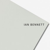
| DESIGN NAME: Ian Bennett Architecture PRIMARY FUNCTION: Branding INSPIRATION: Ian began the project with limited language to describe his unique approach. He said, "I believe in purity and simple forms." As part of research for the project, I presented Ian with anonymised biographies of his competitors - all indistinguishable and leaning on the same tautological language. Using interviews with architecture professors, I had them write descriptions of Ian's work. From there, we worked on capturing his themes: masculinity, interior/exterior, confidence and boldness. UNIQUE PROPERTIES / PROJECT DESCRIPTION: Ian's work is the dynamic engagement of interior and exterior spaces with bold, unapologetic, masculine forms. The identity plays with negative space and forms around it, including the air around the paper itself. A customised verison of Classic Grotesque with its angled edges and refined forms compliments the immaculate detailing of Ian's work. OPERATION / FLOW / INTERACTION: Ian's collateral system functions by breaking the expected parameters of a paper branding system, through the engagement of the negative space around the paper to break into multiple dimensions. Set on an angle, the paper itself engages the negative space; set at 90 degrees, the typography pitches at an angle, engaging within the confines of the paper. PROJECT DURATION AND LOCATION: The project started in April 2017 and finished August 2017. Client was remote in Australia; designer in Amsterdam FITS BEST INTO CATEGORY: Graphics, Illustration and Visual Communication Design |
PRODUCTION / REALIZATION TECHNOLOGY: Printing - white foil stamps, GF Smith Colourplan papers. SPECIFICATIONS / TECHNICAL PROPERTIES: Various: A4, C6, DL, standard business card size (85mm x 55mm). TAGS: architecture, branding, typography, australia, RESEARCH ABSTRACT: Research methods involved competitor analysis of Ian Bennett's local architectural scene, as well as a global search to discover unique biographies and expressions as best-in-class examples of how architects can talk about their work. From there, architecture professors and aficionados were asked to write and talk about what they saw in Ian's work - what excited them. This lead to a wealth of phrases, inspiration and references to play back to Ian and give him a broader linguistic toolkit to talk about his practice and philosophy in architecture. This is especially critical when many architects use the same language - which is filled with embedded knowledge - but does not clarify a practice, approach or philosophy to a potential client. Ian was incredibly enthusiastic, and through further discussions and selection of language, we were able to frame the key themes of the practice and unlock the true conceptual potential of the brand. CHALLENGE: The hardest part was working with Ian in the capacity that it is easy for any creative consultant to slide back into language that is native to their field - empty terms such as "pure", "simple", "authentic" ADDED DATE: 2017-09-25 22:50:27 TEAM MEMBERS (1) : Joel Derksen IMAGE CREDITS: Architectural photography - Katherine Lu. All other - Joel Derksen |
||||
| Visit the following page to learn more: http://www.joelderksen.com/work/ian-benn |
|||||
| AWARD DETAILS | |
 |
Ian Bennett Architecture Branding by Joel Derksen is Winner in Graphics, Illustration and Visual Communication Design Category, 2017 - 2018.· Read the interview with designer Joel Derksen for design Ian Bennett Architecture here.· Press Members: Login or Register to request an exclusive interview with Joel Derksen. · Click here to register inorder to view the profile and other works by Joel Derksen. |
| SOCIAL |
| + Add to Likes / Favorites | Send to My Email | Comment | Testimonials | View Press-Release | Press Kit |
Did you like Joel Derksen's Graphic Design?
You will most likely enjoy other award winning graphic design as well.
Click here to view more Award Winning Graphic Design.


