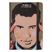
JT Foxx Branding Logo Design by Lawrens Tan |
Home > Winners > #59696 |
| CLIENT/STUDIO/BRAND DETAILS | |
 |
NAME: JT FOXX Organisation PROFILE: JT Foxx is widely known when introduced on stage or in the media as the world's #1 wealth coach. His various coaching organizations have widely been hailed as the world's top organization. What makes this organization is two folds. One is the culture that has been built based on a "Powered by Your Success" philosophy that means the more successful our clients are the more successful we become as an organization. Our second is our #FamilyFirst mantra. We treat all our clients as if they were our family and as cliche as it may sound, it's what has really differentiated ourselves from the rest of the competition. Every client is assigned to a personal relationship manager who is a liaison between you and the coach and constantly is in contact with the client. They are like accountability partners and also track your progress and report back to the director of coaching, the CEO and even sometimes Mr. Foxx personally. We take our coaching very seriously. We coach in the areas of business, start ups, real estate, internet marketing, passive income and mindset. Most of our coaches are people who have been coached personally with Mr. JT Foxx or have taken our 3 day intensive coaching certification process. We don't teach from a manual or a script every coach is individually matched based on experience, needs and desired outcome. |
| AWARD DETAILS | |
 |
Jt Foxx Branding Logo Design by Lawrens Tan is Winner in Graphics, Illustration and Visual Communication Design Category, 2017 - 2018.· Read the interview with designer Lawrens Tan for design JT Foxx Branding here.· Press Members: Login or Register to request an exclusive interview with Lawrens Tan. · Click here to register inorder to view the profile and other works by Lawrens Tan. |
| SOCIAL |
| + Add to Likes / Favorites | Send to My Email | Comment | Testimonials | View Press-Release | Press Kit |
Did you like Lawrens Tan's Graphic Design?
You will most likely enjoy other award winning graphic design as well.
Click here to view more Award Winning Graphic Design.


