Motorix Typeface by Monica Maccaux |
Home > Winners > #59656 |
 |
|
||||
| DESIGN DETAILS | |||||
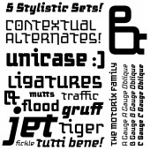
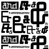
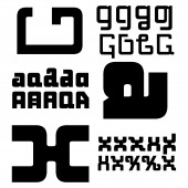
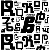
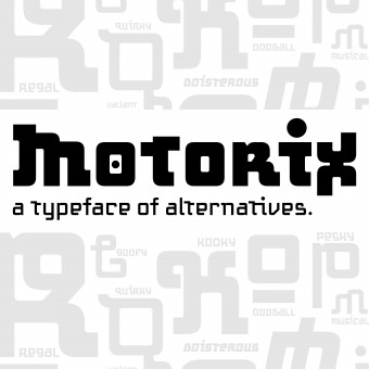
| DESIGN NAME: Motorix PRIMARY FUNCTION: Typeface INSPIRATION: I was inspired by how I could manipulate the counter spaces of a letterform. This typeface grew out of a graduate school type workshop, and evolved over time to include thousands of letterform variants. UNIQUE PROPERTIES / PROJECT DESCRIPTION: This typeface began in a type workshop in graduate school, and under the mentorship of Sibylle Hagmann as a mentor, it became a full family of weights. It was originally called 'Weird', in its beta-form. The typeface later evolved and found a home at PsyOps Type Foundry in San Francisco, CA. With the guidance and advice from Rod Cavazos at PsyOps, we collaborated and created what is now called 'Motorix', which is a typeface with many alternatives. OPERATION / FLOW / INTERACTION: Stylistic sets can be accessed through the Open Type Feature, using Microsoft and any Adobe Product. Ligatures can be accessed in the same way, via the Open Type Palette. PROJECT DURATION AND LOCATION: This project started in graduate school in 2011, and was published with PsyOps Type Foundry (San Francisco, CA) in 2014. FITS BEST INTO CATEGORY: Graphics, Illustration and Visual Communication Design |
PRODUCTION / REALIZATION TECHNOLOGY: Fontlab Studio was used to create this typeface, along with scripting to create the stylistic sets to get endless variations of letterforms. SPECIFICATIONS / TECHNICAL PROPERTIES: Typeface family. 3 weights with corresponding obliques: A Gauge, A Gauge Oblique, B Gauge, B Gauge Oblique, C Gauge, C Gauge Oblique. TAGS: Typeface, Typography, Lettering, Graphic Design, Digital Typography, Type RESEARCH ABSTRACT: My research required me to look at existing sans serif typefaces, and to understand how they worked optically, visually, printed, and on-screen. My research objective was to take current sans serif type (and modern English language), and see how I could manipulate it to look differently, but keeping the principal components of how letterforms are recognized. The effect of the research in real-life design is that it is a niche typeface that fits into tech, space, modern and alternative type categories. CHALLENGE: The hardest part of this project was finding a home for it (a type foundry). Another challenge is marketing it, and trying to get more advertising so that it can reach more markets. ADDED DATE: 2017-08-27 00:23:29 TEAM MEMBERS (1) : Rod Cavazos PsyOps Type Foundry, Production, technical and Creative Support. Sibylle Hagmann, Kontour Type, mentor and teacher in preliminary phases. IMAGE CREDITS: All image credits: Monica Maccaux/Type Designer |
||||
| Visit the following page to learn more: http://bit.ly/2vBc3Yz | |||||
| AWARD DETAILS | |
 |
Motorix Typeface by Monica MacCaux is Winner in Graphics, Illustration and Visual Communication Design Category, 2017 - 2018.· Read the interview with designer Monica Maccaux for design Motorix here.· Press Members: Login or Register to request an exclusive interview with Monica Maccaux. · Click here to register inorder to view the profile and other works by Monica Maccaux. |
| SOCIAL |
| + Add to Likes / Favorites | Send to My Email | Comment | Testimonials | View Press-Release | Press Kit | Translations |
Did you like Monica MacCaux's Graphic Design?
You will most likely enjoy other award winning graphic design as well.
Click here to view more Award Winning Graphic Design.


