SCPG Shopping Plaza Shopping Center by Ping Xu - PH Alpha Design Limited |
Home > Winners > #55458 |
 |
|
||||
| DESIGN DETAILS | |||||
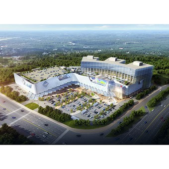
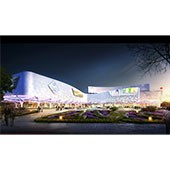
| DESIGN NAME: SCPG Shopping Plaza PRIMARY FUNCTION: Shopping Center INSPIRATION: Creating an architecture responsive to latest branding of client and to have an innovated expressive façade and iconic shopping for Shenzhen city. Through the new design of façade, entrance plaza, interiors and space, the design has largely enhanced the quality of the SCPG Plaza. UNIQUE PROPERTIES / PROJECT DESCRIPTION: The objective for this project is to upgrade an existing shopping center that consists of a shopping center and one of the largest SAM’s store in China. The aim is to connect the 2 separate buildings to create a unified identity with an extensive canopy. By utilizing the SCPG latest logo design, the abstract typology-shaped pattern is created. The pattern is applied to the design of façade and at the same time become the key element for the interior design. Such design reveals the unique characteristics of SCPG in the commercial development sector. Moreover, the shape of the canopy symbolizes moving waves where the highest point allows the entrance to be highlighted and become more welcoming. OPERATION / FLOW / INTERACTION: The building sets back far from the main road and thus an eye catching façade helps the building to stand out. Flow of pedestrian is carefully studied and directed from the main street. The newly designed canopy provides a shelter for the entire pedestrian flow and also leads them to the entrance of the plaza. Walking under the canopy, together with lighting effects on it as well as the façade, creates a fascinating experience for shoppers. PROJECT DURATION AND LOCATION: Location:69 Nonglin Rd., Shenzhen, China Interior to be completed by first quarter of 2018 Exterior to be completed by first quarter of 2019 FITS BEST INTO CATEGORY: Architecture, Building and Structure Design |
PRODUCTION / REALIZATION TECHNOLOGY: Using parametric design to create module openings in different sizes while controlled within 5 modules. Each module is a triangulated aluminum panels with shortest dimension not larger than 1.3m to ensure construction feasibility, where the longest side is 3.8m. The whole module will be done in 3 pieces, embracing a shape with fritted glass which is also part of the client’s logo. Canopy is done using ETFE membrane, whose structure is composed by 2m triangles, supported by columns spaced every 16m. The columns of the canopy sit on the existing structure of the basement that allows better support, easier construction and structural transfer. SPECIFICATIONS / TECHNICAL PROPERTIES: 16000 sq.m of façade modification area, 7000sq.m of newly added ETFE canopy. 40000 sq.m of shopping center and 25000 sq.m of SAM’s club. TAGS: Commercial, shopping center, innovative, retail, Shenzhen, façade, canopy RESEARCH ABSTRACT: The project is currently a renowned building in Shenzhen, therefore the new design has to appear to be new, interesting and functional enough to be successful. The team analysed the site from different view angles, pedestrian flow, shopper’s behaviour and usage of existing shops and restaurant. It is essential to understand the above because the new design has to not only enhance the aesthetic of the building, but also the experience provided to all people. Thus, from the exterior on how to increase attraction from the street to how to create a warm and welcoming yet elegant interior become our motives during the whole design process. The design has even redesigned the sunken plaza opening to improve the access of shoppers to the basement retail, as well as to be more corresponding to the canopy design so that it can be covered to provide semi open and sheltered space for outdoor dining or performance area. CHALLENGE: The project is an extensive renovation that heavily depends on existing structure and condition. During the design, the team has carefully gone through all existing structures and drawings to ensure the feasibility of scheme. The strategy was to utilize existing structures including columns and structural beam or truss as much as possible. To reduce the construction cost, the design allows the new facade to be installed on top of the existing façade without having to tear it down. Thus, existing condition is critical, any small mistakes would affect the entire façade design. Moreover, under limited budget considering such a large scale makeover, the design has excelled in innovative aspect while achieving the budget set from the client (e.g. ETFE span, steel proportion on support and etc have to be thoroughly studied and calculated) ADDED DATE: 2017-02-27 10:10:18 TEAM MEMBERS (4) : Design Director: Dr. Ping Xu, Project Director: Mr. Clive Chow, Architectural Designer: Ms. Lijia Ma and Architectural Designer: Ms. Britt Wang IMAGE CREDITS: PH Alpha Design Limited PATENTS/COPYRIGHTS: PH Alpha Design Limited |
||||
| Visit the following page to learn more: http://www.ph-alpha.com/index.php/works- |
|||||
| AWARD DETAILS | |
 |
Scpg Shopping Plaza Shopping Center by Ping Xu-Ph Alpha Design Limited is Winner in Architecture, Building and Structure Design Category, 2016 - 2017.· Press Members: Login or Register to request an exclusive interview with Ping Xu - PH Alpha Design Limited. · Click here to register inorder to view the profile and other works by Ping Xu - PH Alpha Design Limited. |
| SOCIAL |
| + Add to Likes / Favorites | Send to My Email | Comment | Testimonials | View Press-Release | Press Kit |


