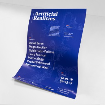
Artificial Realities Exhibition identity by Alex Howell |
Home > Winners > #54361 |
 |
|
||||
| DESIGN DETAILS | |||||
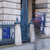
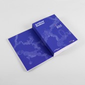
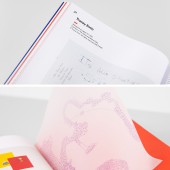
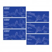
| DESIGN NAME: Artificial Realities PRIMARY FUNCTION: Exhibition identity INSPIRATION: The main graphic element drew inspiration form the Somerset House building itself as well as combining this with graphic elements to try and convey a sense of the artificial (reality). UNIQUE PROPERTIES / PROJECT DESCRIPTION: Artificial Realities marked the 25th year since the inauguration of the East Wing Biennial in 1991. Based in Somerset House, London the Courtauld Institute of Art required the AR exhibition branding to take inspiration form the vast array of artists as well as the setting of Somerset House itself. The design team required all materials designing, exhibition catalogue, posters, handout, VIP invitation, digital banners OPERATION / FLOW / INTERACTION: Exhibition attendees used many of the materials designed to gather information on the artists, the layout of the exhibition and its history. The posters were implemented throughout the Central London area to promote the exhibition and the artists exhibiting. The catalogue contained all works and short art bios so users could gather a greater sense of the work and artist themselves. The overall identity aimed at conveying a meeting of the new and the old, the real and the artifice through the merging of (real) architectural elements (i.e stone facades, archways, window bays and brickwork) from Somerset House itself with graphic shapes and patterns to create a new illustrated space or realm. PROJECT DURATION AND LOCATION: Started: September 2015 Completed: Jan 2016 FITS BEST INTO CATEGORY: Graphics, Illustration and Visual Communication Design |
PRODUCTION / REALIZATION TECHNOLOGY: Ensuring that all materials worked coherently with one another was a major aspect to the project. Paper stocks and confirming Pantone references was super important. When designing the main graphic element much research was undertaken into the building itself (Somerset House) with a number of visits and discussions with staff to gain as much in site as possible. The graphic and typography used were refined over a number of critiques of the work with the client to ensure that they were happy with the final identity. Feedback was given and implemented throughout. SPECIFICATIONS / TECHNICAL PROPERTIES: Poster: A3 & A4 Catalogue: A5 Invite: DL slip Handout/map: A3 folds to A6 TAGS: Exhibition identity, graphic design, illustration, poster, Somerset House London RESEARCH ABSTRACT: The task was to create an identity for the exhibition that was strong and recognisable yet allowed the artists work to be the main focus. The main aim was to use the Somerset House building as inspiration. In this way the facade, interiors and other elements of the building needed to be considered in the development of the identity. The title 'Artificial Realities' lent it self to the idea of creating an other world through graphic representation of both the real world (Somerset House in this case) and another artificial or man-made one. The colour way (royal/deep blue & orange) used symbolises a welcoming yet lavish and a little flamboyant to convey theme and style of exhibition and artists exhibiting. A number of meetings took place with the design team at the Courthauld Institute (the client) to discuss concepts and the look/feel of the exhibition. This was invaluable research and a lot of developments where made through these meetings along with extensive personal R&D. CHALLENGE: Initially the brief stipulated that the imagery of the Somerset House was required to be used for the identity and sourcing quality imagery on a budget was near enough impossible. As a result a creative compromise was reached and the illustrative aspect of the project (the graphic that runs throughout the identity) was created to replicate in some form the facade, interiors and other aspects of the building. This was then combined with an intricate grid to create a new (or in this case artificial) structure, thus creating a ideal middle ground for which the client was happy and the title of the exhibition was visually represented. Acting as a volunteer Designer and Art Director on this project made it a great experience but also challenging, utilising my skills as designer to further other creatives work was fulfilling. As well as the usual tight deadlines and across a number of printable materials (80pp catalogue, posters, invites, handouts) and digital requirements (press release, e-shot, social media banners) and making this consistent across the identity also proved practically challenging. ADDED DATE: 2017-02-22 08:37:00 TEAM MEMBERS (1) : Alex Howell IMAGE CREDITS: Design and Creative Direction: Alex Howell Images: Alex Howell Video: digiQualia |
||||
| Visit the following page to learn more: http://bit.ly/2oOLK1a | |||||
| AWARD DETAILS | |
 |
Artificial Realities Exhibition Identity by Alex Howell is Winner in Graphics, Illustration and Visual Communication Design Category, 2016 - 2017.· Read the interview with designer Alex Howell for design Artificial Realities here.· Press Members: Login or Register to request an exclusive interview with Alex Howell. · Click here to register inorder to view the profile and other works by Alex Howell. |
| SOCIAL |
| + Add to Likes / Favorites | Send to My Email | Comment | Testimonials | View Press-Release | Press Kit |
Did you like Alex Howell's Graphic Design?
You will most likely enjoy other award winning graphic design as well.
Click here to view more Award Winning Graphic Design.


