Polka Corporate Identity by Yuta Takahashi |
Home > Winners > #46353 |
 |
|
||||
| DESIGN DETAILS | |||||
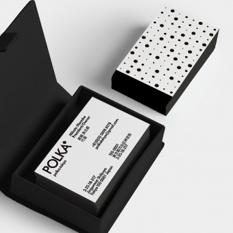
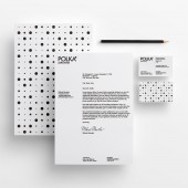
| DESIGN NAME: Polka PRIMARY FUNCTION: Corporate Identity INSPIRATION: Polka goes overseas and buys bland-new products form all over the world, then sells and introduces a wide variety of lifestyle products via internet to customers mainly in Japan. When we created Polka's brand image, We expressed the passion, pioneering spirit, and many of interests as Polka's identity. UNIQUE PROPERTIES / PROJECT DESCRIPTION: By used of polka dot that is the origin of the name of Polka, we produced the logotype that is full of modernity and joy. Then, by extracting the dots, we designed the original pattern of random arrangement of large and small four dots. It expresses the interests, pioneering spirit, passions, funs, the claims of individuality of Polka. OPERATION / FLOW / INTERACTION: Polka represents the image of the refined, urban modern woman who also has a fun, cute side. It also refers to this company's customers and suggests a certain lifestyle to them. Finally, modern women's unending curiosity is expressed by using a dot pattern. PROJECT DURATION AND LOCATION: 2 months FITS BEST INTO CATEGORY: Graphics, Illustration and Visual Communication Design |
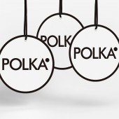
PRODUCTION / REALIZATION TECHNOLOGY: For card printing we utilized Vent Nouveau V snow white 235kg, a high grade printing paper which combines two characteristics that are usually mutually exclusive: realization of printing with a cloth-like feel while having a stylish touch. This paper was perfectly suited for expressing Polka's integration of a refined, urban element together with a fun, cute feeling. SPECIFICATIONS / TECHNICAL PROPERTIES: Business card: 55mm x 91mm Letterhead: 297mm x 210mm Tag: 100mm x 100mm TAGS: branding, minimal, simple, dots RESEARCH ABSTRACT: In addition to relevant business conditions, we have also begun a wide-ranging and random investigation of user images and impressions, or feelings, of various businesses. We have clarified positions of existing companies and brands from marketplace experience, and have researched what kind of visual language is considered necessary for Polka based on these foundations. CHALLENGE: We are always thinking from the perspective of the user, and putting effort into thinking about how people should react to Polka. While simultaneously modern and sophisticated, it is also brimming with fun and cuteness, taking up the challenge to bring together two seemingly contradictory impressions. ADDED DATE: 2016-02-25 02:58:54 TEAM MEMBERS (1) : Yuta Takahashi IMAGE CREDITS: Yuta Takahashi |
||||
| Visit the following page to learn more: http://www.yutatakahashi.jp/ | |||||
| AWARD DETAILS | |
 |
Polka Corporate Identity by Yuta Takahashi is Winner in Graphics, Illustration and Visual Communication Design Category, 2015 - 2016.· Read the interview with designer Yuta Takahashi for design Polka here.· Press Members: Login or Register to request an exclusive interview with Yuta Takahashi. · Click here to register inorder to view the profile and other works by Yuta Takahashi. |
| SOCIAL |
| + Add to Likes / Favorites | Send to My Email | Comment | Testimonials | View Press-Release | Press Kit |
Did you like Yuta Takahashi's Graphic Design?
You will most likely enjoy other award winning graphic design as well.
Click here to view more Award Winning Graphic Design.


