Georgian Wines Series of Georgian wines by Valerii Sumilov |
Home > Winners > #33201 |
 |
|
||||
| DESIGN DETAILS | |||||
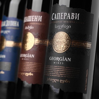
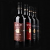
| DESIGN NAME: Georgian Wines PRIMARY FUNCTION: Series of Georgian wines INSPIRATION: Working on a design for a product with a very strong national character is a challenging and special task. Especially when talking about Georgian wines, which are intended for sale in Russian Federation. Georgia is a very old country, which is well known for its traditions, winemaking and works of art. Georgia is always associated with style, temperament and status. My primary goal was to create a design that would not only correspond to the Russian consumer’s idea about the appearance of Georgian wines. I’m writing this because Russians have a strongly formed image of Georgian wines. These wines can be seen instantly on the shelf because of their original design and appearance. They have a character of their own. And that is why I wanted to create a design that would not only satisfy the Russian consumer’s expectations, but make the Georgian winemakers proud of their product too. Georgians are very temperamental and prideful, and they are often offended by the way most Georgian wines are decorated. Quite often it’s done without the necessary status, without any respect to their ancient culture. This was the reason why I was so inspired to work with an ethnic wine that has such a pronounced national character. UNIQUE PROPERTIES / PROJECT DESCRIPTION: While working on the design, I’ve tried to avoid the stereotypes, which are commonly used when decorating Georgian wines. I wanted to find a recognizable, attractive and individual image for this product line. I’ll start with the main and central element of the label – the ethnic Georgian image implemented in the ancient Georgian stamping style. This element is the main aspect of this label, an eye-stopper, which instantly draws the customer’s attention. OPERATION / FLOW / INTERACTION: This wine was design for sale in Russian Federation through retail stores and supermarket chains. The consumer will mainly come into contact with the product via store shelves. PROJECT DURATION AND LOCATION: The project started in November 2013 and was concluded 2013. The product appeared on Russian market shelves in January 2014. FITS BEST INTO CATEGORY: Packaging Design |
PRODUCTION / REALIZATION TECHNOLOGY: The project was designed and implemented on self-adhesive artistic paper Antique Intensive White from Raflatac. The paper has a very distinct texture to it, which works very well with the main message of the label. Besides, we’ve also applied the unique technique of printing upon hot lettering, which creates the impression of ancient gold stamping. SPECIFICATIONS / TECHNICAL PROPERTIES: The height of the label is 140 mm, width – 105 mm. It’s also worth noting the product’s cap. It was additionally personalized through the use of ornament, which can also be seen on the label. TAGS: wine, wine label, georgian wines RESEARCH ABSTRACT: This project was quite ambitious and voluminous. A new product had to be introduced to the market, which shares fierce competition. That’s why the main task was to make the new product stand out from the rest of competitors, attract the consumer’s attention and create a stable and memorable image for the next purchase. This all required a unique communication route to be found with the product’s target audience. The entire process can be divided into stages: A) Brief. It’s imperative to study the brief and the client’s task in detail. We have a special form for that. If I think that the presented information is insufficient or it’s not detailed enough, I address my questions to the person who’s designated responsible from the client’s part. Thus, we start by briefing the client in order to understand the precise marketing tasks and carry on in the right direction. Technical parameters and limitations. It’s important to know the bottle manufacturer in advance and get a list of requirements not only in terms of technical sketches but also the design. Assessing the competition. . It’s crucial to understand who’s field you’re going to play and with whom. Sales markets, product shelves. It’s important to study the existing competition in order to avoid copying or duplicating any existing products. Empathy. We have to think like a consumer. To have the buyer’s portrait in full focus, to understand him, to know what he lives for. What he’s expecting from the product. The second phase is the development itself. It also involves several stages. B) Sketches. We develop a large number of sketches drawn by hand on paper. In different styles and directions. We’re searching for a form that would be taken as the basis for further refinement. Refinement. The chosen sketch is transferred into a drawing and further detailed refinement is carried out. Fonts, colors, element location are all corrected. Approval. The artistic council comprised of different company subdivision heads chose one concept out of the three presented. This concept is taken to further stages: addition of the technical information, backside label makeup, layout of all the products in the range. Preparing files for printing. It is a separate and very important technical aspect in every project. Depending on the correct file preparation before printing the quality of the label, its appearance can be quite different. And since we’re talking about hundreds of thousands and even millions of printed labels, it becomes clear why this stage is so important for finalizing the project. After this laborious process we move on to the final phase – work in the printing house. This phase is as important and all the previous ones. C) Author supervision of the test print and run print. There aren’t any small things in this process. When working in the facility it’s crucial to take all the aspects and technical parameters into consideration, all of which can seriously affect the product’s quality. Full understanding and deep knowledge of the printing processes serves as a guarantee for a successful project realization and execution of a successful printing run. CHALLENGE: The Georgian wine market in Russia is very saturated with different products. Quite often the consumer gets lost when choosing a particular wine. This project was challenging not only because there was a need in an effective communication route with the consumer, but also because there was a very fine balance between the ethnic design elements and the information aspect, which would be understandable to the Russian consumer. ADDED DATE: 2014-02-26 04:50:21 TEAM MEMBERS (1) : Vallerii Sumilov, Irina Strashnic IMAGE CREDITS: Image #No1: Kirill Zmurciuk, Georgian Wines, 2014. Image #No2: Kirill Zmurciuk, Georgian Wines, 2014. Image #No3: Kirill Zmurciuk, Georgian Wines, 2014. Image #No4: Kirill Zmurciuk, Georgian Wines, 2014. Image #No5: Kirill Zmurciuk, Georgian Wines, 2014. |
||||
| Visit the following page to learn more: https://www.shumilovedesign.eu | |||||
| AWARD DETAILS | |
 |
Georgian Wines Series of Georgian Wines by Valerii Sumilov is Winner in Packaging Design Category, 2013 - 2014.· Read the interview with designer Valerii Sumilov for design Georgian Wines here.· Press Members: Login or Register to request an exclusive interview with Valerii Sumilov. · Click here to register inorder to view the profile and other works by Valerii Sumilov. |
| SOCIAL |
| + Add to Likes / Favorites | Send to My Email | Comment | Testimonials | View Press-Release | Press Kit | Translations |
Did you like Valerii Sumilov's Packaging Design?
You will most likely enjoy other award winning packaging design as well.
Click here to view more Award Winning Packaging Design.


