Our House Media store by Allen International |
Home > Winners > #27530 |
 |
|
||||
| DESIGN DETAILS | |||||
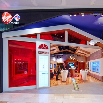
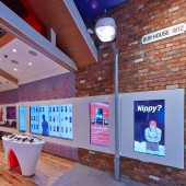
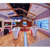
| DESIGN NAME: Our House PRIMARY FUNCTION: Media store INSPIRATION: The store is based around the idea of a ‘Media Street’. The concept was about creating a thread to hang a more readable story on for the customers. It looks like part of a street, so it’s a half-constructed house, and when you walk in you see things like the fibre-optics. UNIQUE PROPERTIES / PROJECT DESCRIPTION: New integrated retail experience Reinvents the shopping experience though innovative design, leading edge digital technology and a touch of Virgin magic to create a retail environment like none other. Provides an unrivalled ‘wow’ factor, perfect in which to showcase Virgin Media’s next-generation services & provide a fun & immersive sensory experience at every touch point through: Kinetic gesture controlled screens and interactive panels interactive mobile wall noticeable absence of traditional tills OPERATION / FLOW / INTERACTION: The space is loosely divided into zones to make the offer as simple to enjoy and shop as possible. On entering the store customers are greeted by Richard Branson, Mo Farah, Usain Bolt or even a T-Rex in a full high definition digital door.Media products are presented on the leftwhile mobile products and services are placed on the right towards the rear of the store. The 'shed ' provides refreshments and a dwell space where customers can relax. The garden space is designed for customers to sit with staff and discuss products and services. PROJECT DURATION AND LOCATION: Project took 3 months and was completed in December 2012 Westfield London, UK FITS BEST INTO CATEGORY: Interior Space and Exhibition Design |
PRODUCTION / REALIZATION TECHNOLOGY: - SPECIFICATIONS / TECHNICAL PROPERTIES: store dimensions 105sqm TAGS: Virgin, media, allen international, design, interior, technology RESEARCH ABSTRACT: - CHALLENGE: - ADDED DATE: 2013-02-05 09:10:58 TEAM MEMBERS (6) : Richard Benson, Tarquin Willis, Roy Lowe, Adrian Hawkins, Dean Neill and Mark Upchurch IMAGE CREDITS: Allen International, 2012. |
||||
| Visit the following page to learn more: http://www.allen-international.com | |||||
| AWARD DETAILS | |
 |
Our House Media Store by Allen International is Winner in Interior Space and Exhibition Design Category, 2012 - 2013.· Read the interview with designer Allen International for design Our House here.· Press Members: Login or Register to request an exclusive interview with Allen International. · Click here to register inorder to view the profile and other works by Allen International. |
| SOCIAL |
| + Add to Likes / Favorites | Send to My Email | Comment | Testimonials | View Press-Release | Press Kit | Translations |
Did you like Allen International's Interior Design?
You will most likely enjoy other award winning interior design as well.
Click here to view more Award Winning Interior Design.


