Bon Vivant Information Magazine by Kiyoka Yamazuki |
Home > Winners > #170205 |
 |
|
||||
| DESIGN DETAILS | |||||
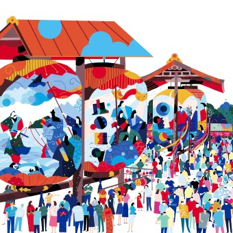
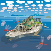
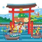
| DESIGN NAME: Bon Vivant PRIMARY FUNCTION: Information Magazine INSPIRATION: This project was created as an information tool that can be placed in the storefronts of Shinkin banks nationwide and can be freely taken home. It is also an information magazine based on the concept of "shinkumi," UNIQUE PROPERTIES / PROJECT DESCRIPTION: This magazine is available at credit unions across Japan and is available for customers to pick up at their convenience. She created it with warm, hand-drawn illustrations and eye-catching colors to make it easy for customers to pick up and take home. OPERATION / FLOW / INTERACTION: Installed at Shinkin Bank branches/ Distributed free of charge/Information and gifts This information magazine introduces people, industries, local products, and tourist spots working hard in each region of Japan, helping to steadily connect people and cities. PROJECT DURATION AND LOCATION: She was commissioned to do this project by a planning and production company (BOON Corporation + Shinkumi Sogo Service Corporation). She produced six books per year for each month over five years (30 books) from January 2011 to April 2018. The project was supervised by the National Federation of Shinkin Banks. FITS BEST INTO CATEGORY: Graphics, Illustration and Visual Communication Design |
PRODUCTION / REALIZATION TECHNOLOGY: My works are mainly hand-drawn illustrations using brushes, acrylic paints, illustration boards, compasses, rulers, ruling pens, etc., and some are retouched in Photoshop. SPECIFICATIONS / TECHNICAL PROPERTIES: Used for the cover illustration of the magazine. Magazine size: 21cm x 15cm, 1mm thick (B5 size), about 15 pages Published bimonthly, this year's theme is "World Heritage Sites and Festivals." The illustrations are mostly hand-drawn, but sometimes Photoshop is used. TAGS: #142430 Graphic, Illustration and Visual Communication Design Category Silver Award / Kumano Kodo RESEARCH ABSTRACT: This magazine is a pamphlet distributed free of charge by Shinkin banks nationwide. How do customers get it? We think it is important for customers to get to know the local people and towns. She created eye-catching illustrations that convey the warmth and nostalgia of the town. As a result, people visit the area (by buying local products, etc.) and learn about its good points. I think this has connected people and towns. CHALLENGE: She didn't know how the magazine actually got from store shelves to customers' hands. However, the magazine did receive feedback from readers. One such comment, "Looking at the illustration on the cover, I felt nostalgia and a sense of the season, and it reminded me of home," made her happy.She didn't quantify the actual effect, so she doesn't know, but it seems that this activity was effective. ADDED DATE: 2025-02-27 00:27:34 TEAM MEMBERS (1) : IMAGE CREDITS: Main image is Image #1 Illustrator Kiyoka Yamazuki 2015 Optional image #1 Illustrator Kiyoka Yamazuki 2015 Optional image #2 Illustrator Kiyoka Yamazuki 2014 Optional image #3 Illustrator Kiyoka Yamazuki 2014 Optional image #4 Illustrator Kiyoka Yamazuki 2015 PATENTS/COPYRIGHTS: Copyright Kiyoka Yamazuki 2014 |
||||
| Visit the following page to learn more: https://www.yamazuki.me | |||||
| AWARD DETAILS | |
 |
Bon Vivant Information Magazine by Kiyoka Yamazuki is Winner in Graphics, Illustration and Visual Communication Design Category, 2024 - 2025.· Read the interview with designer Kiyoka Yamazuki for design Bon Vivant here.· Press Members: Login or Register to request an exclusive interview with Kiyoka Yamazuki. · Click here to register inorder to view the profile and other works by Kiyoka Yamazuki. |
| SOCIAL |
| + Add to Likes / Favorites | Send to My Email | Comment | Testimonials | View Press-Release | Press Kit |
Did you like Kiyoka Yamazuki's Graphic Design?
You will most likely enjoy other award winning graphic design as well.
Click here to view more Award Winning Graphic Design.


