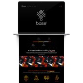
Base Visual Identity by Lance Francisco |
Home > Winners > #169785 |
 |
|
||||
| DESIGN DETAILS | |||||
| DESIGN NAME: Base PRIMARY FUNCTION: Visual Identity INSPIRATION: The design draws inspiration from the intricate craft of Chinese knotting, an ancient folk art deeply rooted in Buddhism and Taoism, symbolizing unity and good fortune. This motif reflects the interconnectedness of tradition and modernity, aligning with Base' mission to preserve cultural heritage while adapting to contemporary design sensibilities. By reinterpreting traditional patterns with a modern aesthetic, the identity system bridges generations, ensuring cultural relevance. UNIQUE PROPERTIES / PROJECT DESCRIPTION: Base’ visual identity modernizes Chinese religious goods while staying true to cultural heritage. The logo subtly incorporates the letter "b" within a woven structure inspired by Chinese knotting, symbolizing continuity and legacy. Repetitive patterns reflect the cyclical nature of belief, where beginnings and endings are intertwined. A refined color palette of black, red, and gold balances elegance with tradition, creating a distinctive, meaningful, and contemporary brand presence. OPERATION / FLOW / INTERACTION: The identity system is designed for seamless integration across touchpoints, creating a cohesive brand experience. The woven pattern and color palette ensure immediate recognition, while the scalable logo adapts to various formats without losing clarity. The packaging enhances the ritual experience by balancing tradition with modern aesthetics, making religious goods more visually appealing and accessible for a new generation. PROJECT DURATION AND LOCATION: The project began in August 2024 and was developed in Shanghai, China for Singapore. FITS BEST INTO CATEGORY: Graphics, Illustration and Visual Communication Design |
PRODUCTION / REALIZATION TECHNOLOGY: The visual identity was developed using a combination of digital design and traditional cultural research. The logo and patterns were created using vector-based design software, ensuring precision and scalability. A modern woven-style graphic system was developed to mirror the cyclical nature of Chinese traditions. The color palette was carefully calibrated for both digital and print applications, maintaining consistency across packaging, website, and brand materials. SPECIFICATIONS / TECHNICAL PROPERTIES: The visual identity system includes a scalable logo, brand typography, custom woven-style patterns, and a defined color palette. Applications span digital and physical formats, including packaging, website design, business applications, and environmental branding. Typography is optimized for both print and screen, ensuring legibility. The packaging specifications adhere to material guidelines, balancing durability with environmental responsibility. TAGS: Chinese religious goods, modern tradition, visual identity, cultural branding, packaging design, woven patterns, heritage meets modern, brand identity, Base Genesis, Singapore design RESEARCH ABSTRACT: The research combined cultural studies, consumer insights, and material exploration. The objective was to modernize Chinese religious goods while respecting tradition. Methods included analyzing historical artifacts, conducting interviews with religious practitioners, and studying contemporary design trends. Insights revealed a gap in the market for a refined, modern approach. The resulting identity system bridges heritage and contemporary aesthetics, making traditional products relevant to today’s audience. CHALLENGE: The main challenge was balancing cultural authenticity with modern aesthetics. Traditional religious goods often feature intricate, ornate designs, while contemporary branding leans toward minimalism. Finding a middle ground required deep research into historical motifs and modern design principles. Another challenge was ensuring the design resonated across generations, from older practitioners to younger consumers seeking a refined, meaningful connection to their heritage. ADDED DATE: 2025-02-25 10:00:34 TEAM MEMBERS (1) : IMAGE CREDITS: Lance Francisco, 2024. |
||||
| Visit the following page to learn more: https://www.basegen.sg/ | |||||
| AWARD DETAILS | |
 |
Base Visual Identity by Lance Francisco is Winner in Graphics, Illustration and Visual Communication Design Category, 2024 - 2025.· Read the interview with designer Lance Francisco for design Base here.· Press Members: Login or Register to request an exclusive interview with Lance Francisco. · Click here to register inorder to view the profile and other works by Lance Francisco. |
| SOCIAL |
| + Add to Likes / Favorites | Send to My Email | Comment | Testimonials | View Press-Release | Press Kit |
Did you like Lance Francisco's Graphic Design?
You will most likely enjoy other award winning graphic design as well.
Click here to view more Award Winning Graphic Design.


