DESIGN NAME:
Funaging
PRIMARY FUNCTION:
Elderly Educational Service
INSPIRATION:
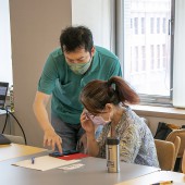
FunAging is an educational brand in Taiwan offering smartphone app courses of various topics to accompany and empower the elderly, enabling them to maintain a social life and enjoy learning new things.
FunAging disseminates the new course information with the elderly via LINE, a widely used social app in Taiwan, also among the elderly. But many newbies have difficulties in using it, especially in registering courses via LINE, as it does not optimize its overall design for the elderly.
How might we better redesign the overall service, especially for the course registration experience, for the elderly?
UNIQUE PROPERTIES / PROJECT DESCRIPTION:
Difficulties in registering the class for the elderly, such as unaware of key information during the process, unable to find specific function, or uncertainty for whether they have successfully registered the class, and so forth.
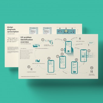
In this project, we use senior-centered service design thinking to review the overall class registration process to identify key UX problems. A set of systematic design diagnosis clarifies the design issues, with insightful design deliverables, to make the service more fluent and effective.
OPERATION / FLOW / INTERACTION:
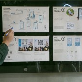
We identify 12 UX issues in the customer journey mapping. With corresponding elderly-first design prescriptions, a new service workflow is implemented, with user interface and design artifacts remodeled. In the end, the percentage of elderly calling for help during the registration process has been decreased from 20% to 0 in a short period.
PROJECT DURATION AND LOCATION:
The project started in June 2022 and finished in Dec 2022 in Taipei.
FITS BEST INTO CATEGORY:
Meta, Strategic and Service Design
|
PRODUCTION / REALIZATION TECHNOLOGY:
We employ the following focus as our design approaches:
(1) Customer journey mapping;
(2) Sorting out the main axes of the customer journey;
(3) Consolidation of key touchpoints on the main axis;
(4) Interface design (UI/UX) on key touchpoints;
(5) Experience iterations.
Through implementation, we evaluate the direction of revision through the actual use by the elderly users, and the "experience iteration" goes back and forth many times, approaching the final and perfect design outcome.
SPECIFICATIONS / TECHNICAL PROPERTIES:
1. Optimized service workflow, UI elements and graphic assets;
2. MENU architecture, and Event Cards templates for LINE App.
3. Improved service logic and guidelines.
TAGS:
service design, elderly, senior-centered, accessible design, older adults, senior users, inclusive design, universal design, aging, senior citizens
RESEARCH ABSTRACT:
This project attempts to improve FunAging's online registration experience for the elderly. We used a more macro service design perspective to tackle interface operation problems under technical constraints. Through elderly-centered service design thinking, the percentage of elderly calling for help during the registration process has been decreased from 20% to 0 in a short period.
CHALLENGE:
Since LINE has covered 95% of Taiwanese population’s social media use, deeply tied to the elderly’s daily social lives, it’s not practical to introduce new platforms to pull them out of what they have already accustomed to. However, LINE app doesn't provide open source code for flexible customization, thus we had to invent new techniques under LINE's technical constraints to align with elderly's cognitive capabilities.
For instance, some elderly can't remember which classes they have had registered. Hence, we design a pictorial card with class information to be saved on their smart phone as their reminder. Or, as it's not possible to adjust character spacing and line spacing, we use rephrasing and blank lines to enhance readability for the paragraphs. These details are not obvious, but play a big role.
ADDED DATE:
2022-09-30 17:56:38
TEAM MEMBERS (1) :
IMAGE CREDITS:
Ting-Han Chen, 2022.
|


