Before the Midnight Hour Furniture Illustrations by Martin Reznik |
Home > Winners > #133798 |
 |
|
||||
| DESIGN DETAILS | |||||
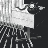
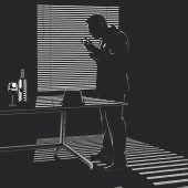
| DESIGN NAME: Before the Midnight Hour PRIMARY FUNCTION: Furniture Illustrations INSPIRATION: Main inspiration for this project were comics and classic French noir cinema. The concept for the first illustration came from a reference photo I received from the client, which was a shot of a chair from behind and at a very low angle. It was very unusual and sparked loads of questions in my head. Being a fan of detective stories I decided to follow this approach in the layout of the image. The first image was crucial in setting the tone for the whole series. UNIQUE PROPERTIES / PROJECT DESCRIPTION: Series of illustrations commissioned by furniture designer Marc Krusin for the promotional use on his website and across social media channels and featuring his most prominent furniture designs for Knoll and Desalto. The project brakes the conventions of furniture illustration by bringing a narrative to the scenes, use of exaggerated perspective and a film noir aesthetic. The lack of human presence and scattered objects add an element of mystery. The protagonist is revealed in a surprise ending. OPERATION / FLOW / INTERACTION: The project was initially published on Instagram. The illustrations were posted in regular time intervals. Main interaction with the story comes with the 4th and last illustration, where the viewer is encouraged to reveal the protagonist (the smoker) by using the scroll option on the Instagram post. The unusual approach to furniture illustration in these series ensures the greater impact on the viewers arousing their curiosity about the products and the brand itself. PROJECT DURATION AND LOCATION: The series was posted on Instagram and LinkedIn starting February 2021 and these posts are still active. The hero banners on client's website run for about 8 months, nearly till the end of 2021. FITS BEST INTO CATEGORY: Graphics, Illustration and Visual Communication Design |
PRODUCTION / REALIZATION TECHNOLOGY: Each illustration was drawn in pen and ink on paper and once approved by the client it was redrawn digitally. I used Adobe Illustrator to construct the furniture and interiors accurately and then Photoshop to apply textures, light and draw other elements using Wacom Cintiq tablet. The images were rendered using black only to recreate film noir aesthetic. SPECIFICATIONS / TECHNICAL PROPERTIES: The illustrations are mainly used in a digital format online, but they were also designed with art print production in mind. Each square illustration is drawn on 500 x 500mm digital canvas. The images were later combined into a large poster (500 x 700mm) and reproduced as a limited edition screen print. TAGS: illustration, furniture, noir, interior design, comics, digital art, black and white, drawing, architecture, graphic RESEARCH ABSTRACT: Since I have never illustrated furniture before I made few initial sketches based on an online research of the industry trends, but these came out quite dull and rigid. I was not happy with them at all. I decided to go a different way and focus on style and narrative instead. From then on the research involved my favourite films and comic books, noir genre in particular. I decided to recreate its moody atmosphere in my series. The style also justifies unconventional framing of the furniture. CHALLENGE: The client was against any human figures in the scenes, but I could not help but wonder about the smoker missing from the first image. I felt his appearance was important to the story. His silhouette is revealed in an extended version of the 4th illustration, but only as a scroll option on an Instagram post. The client thought this elegant solution added an element of surprise and closure to the story. Each image needed different cropping options to accommodate various socials and screen formats. ADDED DATE: 2021-12-18 13:27:44 TEAM MEMBERS (1) : IMAGE CREDITS: All illustrations: Martin Reznik, 2021 |
||||
| Visit the following page to learn more: http://www.martinreznik.com | |||||
| AWARD DETAILS | |
 |
Before The Midnight Hour Furniture Illustrations by Martin Reznik is Winner in Graphics, Illustration and Visual Communication Design Category, 2021 - 2022.· Read the interview with designer Martin Reznik for design Before the Midnight Hour here.· Press Members: Login or Register to request an exclusive interview with Martin Reznik. · Click here to register inorder to view the profile and other works by Martin Reznik. |
| SOCIAL |
| + Add to Likes / Favorites | Send to My Email | Comment | Testimonials | View Press-Release | Press Kit | Translations |
Did you like Martin Reznik's Graphic Design?
You will most likely enjoy other award winning graphic design as well.
Click here to view more Award Winning Graphic Design.


