The Early Chapter Brand Identity by Allan Toh |
Home > Winners > #128237 |
 |
|
||||
| DESIGN DETAILS | |||||
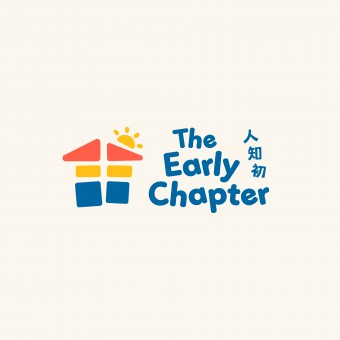
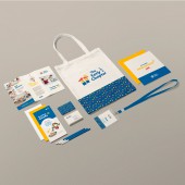
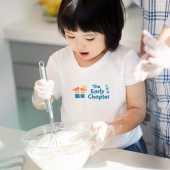
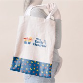
| DESIGN NAME: The Early Chapter PRIMARY FUNCTION: Brand Identity INSPIRATION: Inspired by the idea of a "close-knit and fun community for children", I wanted to create a logo that looks like a colourful hut that feels uplifting, fun and safe. The colours are carefully selected- red for attention, yellow for fun and blue for safety. They also happen to be the primary colours which children can easily identify with. UNIQUE PROPERTIES / PROJECT DESCRIPTION: The Early Chapter is an early childhood activities clubhouse for children to develop an interest in Mandarin through immersive play. The logo consists of simple shapes in primary colors- red, yellow, and blue, stacked to look like a hut or small house. This represents the community that the brand tries to create. The negative space between the shapes forms the Chinese written character for Mandarin, which represents the clubhouse's emphasis on the Chinese language (Mandarin). The half-sun symbolizes the uplifting environment The Early Chapter wishes to create for the rising young stars of tomorrow. OPERATION / FLOW / INTERACTION: Due to the use of three primary colour hues, it is ideal the logo appears on a White or Floral White (beige-looking) background. Floral white provides a warm support for the three colours so the logo stands out well. PROJECT DURATION AND LOCATION: The project started in late April 2021 in Singapore, and finished in late June 2021. The clubhouse is has completed renovations and is open to the public since November 2021. The logo and brand materials are used in stores and for marketing purposes. FITS BEST INTO CATEGORY: Graphics, Illustration and Visual Communication Design |
PRODUCTION / REALIZATION TECHNOLOGY: I started out by understanding from the client's perspective what they wanted, and went on to use mind maps to break down the meanings and associations for the words, "Early", and 'Clubhouse" SPECIFICATIONS / TECHNICAL PROPERTIES: The minimum height of the logo for web is 45px. The minimum height for print is 10mm. TAGS: The Early Chapter, Early Childhood Clubhouse, Children, Mandarin, Chinese, Activities, Fun, Playful. RESEARCH ABSTRACT: Desk research, market study and brand positioning analysis were conducted to understand the context, target market and competition. Stakeholder interviews, target market study and competitive analysis were carried out. The research indicated that children in the target age group(1.5-6 years) engage in constructive play, and decipher primary colours such as red, yellow and blue better. The findings gave a clear design direction and contributed to an outcome that is more relevant and appropriate. CHALLENGE: The challenge was to create a suitable colour palette as I was working with the 3 primary colours. I also have to be mindful in creating a brand identity that feels trustworthy yet uplifting and fun. I have to find a balance point such that the outcome does not appear boring while attempting to be trustworthy, and also not being too childish and unreliable while trying to be fun and uplifting. I hope I managed to strike a good balance here. ADDED DATE: 2021-06-30 18:23:25 TEAM MEMBERS (1) : IMAGE CREDITS: Allan Toh, 2021. PATENTS/COPYRIGHTS: Copyrights belong to Allan Toh Design Studio, 2021. |
||||
| Visit the following page to learn more: https://www.allantoh.com/portfolio_page/ |
|||||
| AWARD DETAILS | |
 |
The Early Chapter Brand Identity by Allan Toh is Winner in Graphics, Illustration and Visual Communication Design Category, 2021 - 2022.· Read the interview with designer Allan Toh for design The Early Chapter here.· Press Members: Login or Register to request an exclusive interview with Allan Toh. · Click here to register inorder to view the profile and other works by Allan Toh. |
| SOCIAL |
| + Add to Likes / Favorites | Send to My Email | Comment | Testimonials | View Press-Release | Press Kit |
Did you like Allan Toh's Graphic Design?
You will most likely enjoy other award winning graphic design as well.
Click here to view more Award Winning Graphic Design.


