Cala di Seta Wine Labels by Giovanni Murgia |
Home > Winners > #127081 |
 |
|
||||
| DESIGN DETAILS | |||||
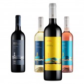
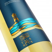
| DESIGN NAME: Cala di Seta PRIMARY FUNCTION: Wine Labels INSPIRATION: Sea, sand and wind are the elements that dominate this territory. An island in the island populated centuries ago by sea people who settled in this corner of Sardinia. A people that has drawn its fortune from the sea and that has made its treasures grow on the sand: the sapling vineyards of Carignano grapes. From these elements is born the inspiration for this labels taking on one of the symbols of these places: the Mangiabarche lighthouse. UNIQUE PROPERTIES / PROJECT DESCRIPTION: The appeal is that of young, colorful and easy to interpret wines, aimed at a disengaged target but looking for quality products. The labels therefore have a colorful, minimal, refined and refined appearance in which the design of the lighthouse stands out, made with simple graphics and embellished with colored metal foils and the three-dimensional effect of the Braille relief, which thus simulates the ripple of the waves. OPERATION / FLOW / INTERACTION: The project aims to transfer a sense of freshness, dynamism and happiness to the viewer. The colors, the textures, the names and the texture of the paper are designed to create a captivating, immediate object aimed at a young and quality-seeking audience. PROJECT DURATION AND LOCATION: The project started in February 2021 in Sassari anche finished in April 2021. FITS BEST INTO CATEGORY: Packaging Design |
PRODUCTION / REALIZATION TECHNOLOGY: The printing of the labels took into account the design and tried to make the effect of brilliance like that of the sun on the sea using a pearl paper, colored according to the type of wine. The graphic element that characterizes the labels was created using foils of different shades in order to create a three-dimensional game that could recall the movement of the sea. SPECIFICATIONS / TECHNICAL PROPERTIES: Label size: 80 x 136mm Paper type: FASSON Frozen Quartz Pearl Hot foil with three color variations - Embossed braille TAGS: wine, carignano, label, sardinia, italy, minimalism RESEARCH ABSTRACT: The research for this project started from the history of this territory which despite being in Sardinia (Italy) is a Ligurian enclave. The names of the wines derive from the Tabarkino dialect that is spoken in these parts. The graphic element combines three identity concepts: the lighthouse that represents the history of this people who came from the sea; the waves that surround these lands; the sand on which the vines of Carignano grow ungrafted. CHALLENGE: Rejuvenate the image of the winery, founded in 1932, and at the same time be products suitable for a HORECA market. Bringing the almost centennial history of this winery into these new products by dressing it in a new and more contemporary dress, suitable for the new way of understanding wine consumption. The difficulty was to create a clean and minimal design but at the same time concrete and identitary, which did not lose the link with the cellar's roots. ADDED DATE: 2021-06-19 12:31:08 TEAM MEMBERS (4) : Art direction: Giovanni Murgia, Illustration: Giovanni Murgia, Copywriting: Giovanni Murgia and Photography: Diego Attene IMAGE CREDITS: Image 1: Diego Attene Image 2: Diego Attene Image 3: Diego Attene Image 4: Diego Attene Image 5: Diego Attene |
||||
| Visit the following page to learn more: https://bit.ly/3sjwA4m | |||||
| AWARD DETAILS | |
 |
Cala Di Seta Wine Labels by Giovanni Murgia is Winner in Packaging Design Category, 2021 - 2022.· Read the interview with designer Giovanni Murgia for design Cala di Seta here.· Press Members: Login or Register to request an exclusive interview with Giovanni Murgia. · Click here to register inorder to view the profile and other works by Giovanni Murgia. |
| SOCIAL |
| + Add to Likes / Favorites | Send to My Email | Comment | Testimonials | View Press-Release | Press Kit | Translations |
Did you like Giovanni Murgia's Packaging Design?
You will most likely enjoy other award winning packaging design as well.
Click here to view more Award Winning Packaging Design.


