
|
|
| DESIGN DETAILS |
DESIGN NAME:
Branding Accademia of Perugia
PRIMARY FUNCTION:
Brand System and Campaign
INSPIRATION:
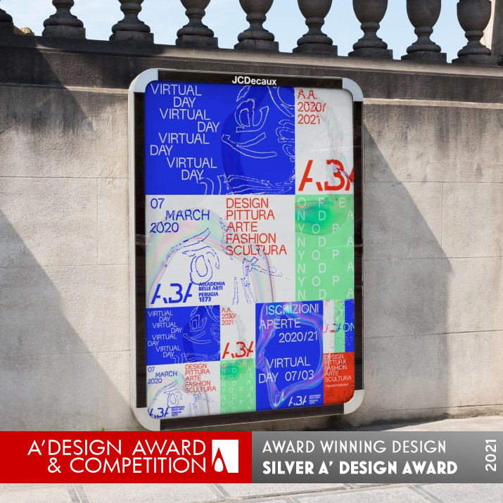
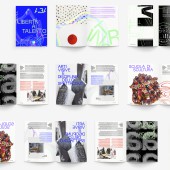
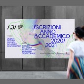
A robust visual communication was achieved through the design of a classical-inspired logo and a bespoke typeface together with the development of dynamic use of images throughout print and digital. The developed communication system uses motion graphics to create a wide palette of still images. These images are complemented by the colors and shapes morphing together to characterize and distinguish the different courses, workshops, and activities.
UNIQUE PROPERTIES / PROJECT DESCRIPTION:
The Accademia of Perugia, needed a new visual identity to reflect the institution’s desire to move quickly into the future. S&P worked with ABA’ s staff and students to involve different departments and aspects of the Academy. Our challenge was to create a unified kinetic brand identity and architecture that also gave individuality to the single courses. We created an energetic, robust, and positive identity system that works across the different arts avoiding the typical clichés and conventions
OPERATION / FLOW / INTERACTION:
The Interaction with the campaign was across both traditional outdoor and online social campaigns.
PROJECT DURATION AND LOCATION:
June-October, Perugia Italy
FITS BEST INTO CATEGORY:
Graphics, Illustration and Visual Communication Design
|
PRODUCTION / REALIZATION TECHNOLOGY:
The material was both digital and print
SPECIFICATIONS / TECHNICAL PROPERTIES:
Online and outdoor campaign
TAGS:
Type, Campaign, Art school
RESEARCH ABSTRACT:
We wanted to create a fluid motion concept for the campaign and ur research entailed studying and replicating in 3d animation the flow and colors of soap bubbles and how they affect layers.
CHALLENGE:
The main challenge was to create a non-3d effect in the rendering and have the effect movement in the outdoor experience.
ADDED DATE:
2020-07-20 12:29:22
TEAM MEMBERS (2) :
Creative direction: Paul Robb and Animation and Type: Tommaso Calderini
IMAGE CREDITS:
Paul Robb
|
|
| COMMENTS |
| Giulia Esposito |
Comment #12338 on December 27, 2022, 8:10 am |
|
As a design enthusiast, I could not be more impressed with the Brand System and Campaign created for the Accademia of Perugia. The work demonstrates a perfect balance of creativity and functionality, with a beautiful visual identity that is sure to leave a lasting impression. The attention to detail is remarkable, and the implementation of the branding strategies is simply masterful. It's clear that the designer has a deep understanding of the role of visual communication in branding, and they have created an incredibly powerful and cohesive visual identity. This work is an absolute testament to the designer's creativity and professional skill. Kudos to Paul Robb for this outstanding work.
|
| Paul Williams |
Comment #57122 on January 3, 2023, 8:42 pm |
|
The Branding Accademia of Perugia by Paul Robb is a stunning example of excellent design. The work is a perfect blend of classical-inspired visuals with dynamic images and motion graphics to create an energetic and robust brand identity that works across different art forms. The research put into the project to create a non-3d effect in the rendering and have the effect movement in the outdoor experience is remarkable and the end result is truly remarkable. The brand identity and architecture gives individuality to the single courses while maintaining a unified look and feel. It is no surprise that this impressive work has been awarded the A' Design Award in Graphics, Illustration and Visual Communication Design.
|
| Paul Phillips |
Comment #66812 on January 4, 2023, 1:10 am |
|
I'm incredibly impressed by the Brand System and Campaign created by A' Design Award winner for their work titled "Branding Accademia of Perugia". Not only did they manage to create an energetic and robust identity system, but they also managed to give individuality to the single courses while still keeping the brand unified. This kind of thoughtful design is something that's truly special and it's clear to see why they won the award. Congratulations to the team behind the Branding Accademia of Perugia for their remarkable achievement!
|
| Elena Petrenko |
Comment #70260 on January 4, 2023, 2:49 am |
|
This award-winning work is a stunning example of kinetic branding that successfully unifies the different arts while giving individuality to the single courses.
|
| Adam Harris |
Comment #76883 on January 4, 2023, 6:00 am |
|
This work by the A' Design Award winner is truly remarkable! The Brand System and Campaign for the Accademia of Perugia is an excellent example of good design, as it creates a unified and energetic visual identity that works across the different arts with a classical-inspired logo and a bespoke typeface. It also uses motion graphics to create a wide palette of still images that are complemented with colors and shapes morphing together to characterize and distinguish the different courses, workshops, and activities. The main challenge of creating a non-3D effect in the rendering and having the effect movement in the outdoor experience has been met successfully. This work is a testament to the designer's creativity, skill and hard work.
|
| Chloe Turner |
Comment #84825 on January 4, 2023, 11:23 am |
|
This is truly an inspiring piece of work! The classical-inspired logo and the bespoke typeface are beautiful works of art, and the dynamic use of images in print and digital is incredibly impressive. The motion graphics used to create the wide palette of still images is also remarkable and creates a unique and captivating visual experience. The colors and shapes used to characterize and distinguish the different courses, workshops, and activities are well thought out and contribute to the overall aesthetic. The branding system is outstanding and it is no surprise that it has been awarded the A' Design Award.
|
| Mark Allen |
Comment #86685 on January 4, 2023, 12:57 pm |
|
This award-winning work is truly remarkable. It showcases an inspired visual identity system that works across the different arts, creating an energetic and positive aesthetic. Through the use of motion graphics, the campaign was able to create a wide palette of still images that are complemented by the colors and shapes morphing together. The main challenge of creating a non-3d effect in the rendering and having the effect movement in the outdoor experience was masterfully accomplished. Congratulations to the designer for this amazing achievement.
|
| Elisabeth Clark |
Comment #87932 on January 4, 2023, 2:09 pm |
|
I am in awe of Paul Robb's unique and inspiring design for Branding Accademia of Perugia! Their ability to create a unified visual identity that celebrates individuality and avoids typical clichés is incredibly impressive. The classical-inspired logo and bespoke typeface are masterfully combined with dynamic images and motion graphics to create a vibrant and energetic brand. Furthermore, their research into the flow and colors of soap bubbles to create a fluid motion concept for their campaign is truly inspiring. Paul Robb's work is a shining example of good design, and their success in winning the A' Design Award is a testament to their creativity and hard work.
|
|
|


