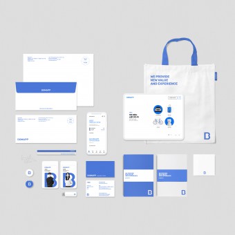
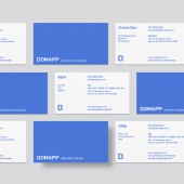
Bomapp Brand Identity Design by Taiyoon Lee |
Home > Winners > #99409 |
| CLIENT/STUDIO/BRAND DETAILS | |
 |
NAME: Bomapp PROFILE: To solve information asymmetry of insurance industry, Bomapp developed a system where users can check their insurance contract information all at once. In addition, we enhanced consumer convenience by implementing the one-stop claim service in our app. In addition to our existing insurance contract information check and insurance claim service, now we offer a system where users can purchase car insurance, travel insurance, pet insurance, and other lifestyle insurances without any help of agents. From purchase to claim, consumers can enjoy one-stop service with Bomapp. We are disrupting distribution structure of insurance market to provide more convenient and affordable insurance to consumers. Also, Bomapp provides health analytics, insurance diagnostics, and other services that can provide information to help our users’ insurance purchase. As a new distribution channel, Bomapp is leading digital innovation in insurance market. Now, insurance has become easy and convenient with Bomapp. |
| AWARD DETAILS | |
 |
Bomapp Brand Identity Design by Taiyoon Lee is Winner in Graphics, Illustration and Visual Communication Design Category, 2019 - 2020.· Read the interview with designer Taiyoon Lee for design Bomapp here.· Press Members: Login or Register to request an exclusive interview with Taiyoon Lee. · Click here to register inorder to view the profile and other works by Taiyoon Lee. |
| SOCIAL |
| + Add to Likes / Favorites | Send to My Email | Comment | Testimonials | View Press-Release | Press Kit |
Did you like Taiyoon Lee's Graphic Design?
You will most likely enjoy other award winning graphic design as well.
Click here to view more Award Winning Graphic Design.


