Miltos Branding by Yuta Takahashi |
Home > Winners > #99373 |
 |
|
||||
| DESIGN DETAILS | |||||
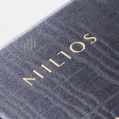
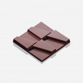
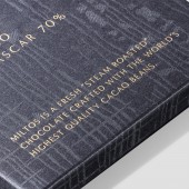
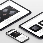
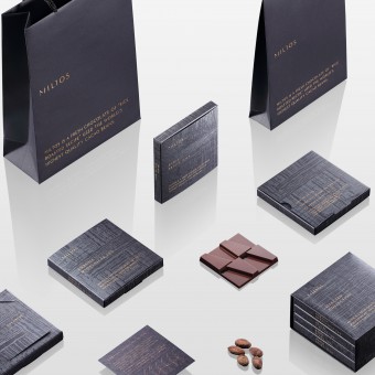
| DESIGN NAME: Miltos PRIMARY FUNCTION: Branding INSPIRATION: There was a need for a brand experience which not only encourages users to consume, but also one where people can learn about food, think about sustainability and think about the maker of the ingredients. Therefore, they did away with the image of "sweet chocolate" that children eat and focused on the brand experience that adults can deepen their thoughts about food while enjoying quiet moments. UNIQUE PROPERTIES / PROJECT DESCRIPTION: Miltos proposes a Tree to Bar chocolate which goes one step further from Bean to Bar. They are inspired by the brand philosophy that maximizes the aroma of cacao and forms the identity of a "perfume-like chocolate." The package expresses the aroma of cacao by the texture of silk fabric. Like a sculpture, chocolate has a step where they can enjoy a gorgeous aroma and rich melty texture. The book shaped case make you feel the brand story. The online store provides they with the Miltos world view. OPERATION / FLOW / INTERACTION: The package opens like the cover of a book. As you open the case, the flavor chart card is attached. The chocolate tastes are explained in detail as is done with wine and whiskey. The assortment box was designed based on the image of a bookcase. By making the package shaped like a book, the design projects the brand story. They have built a unified world view from package to the online store. PROJECT DURATION AND LOCATION: This project started development in Ehime, Japan in August 2018 and was completed in January 2020. The product announcement was made in January 2020. FITS BEST INTO CATEGORY: Graphics, Illustration and Visual Communication Design |
PRODUCTION / REALIZATION TECHNOLOGY: The package uses dark blue fine paper selected to express the flavor of dark chocolate. Glitter processing that shines in various colors on the surface of the paper. Furthermore, varnish processing which expressed silk pattern. Gold foil stamping. After die cutting, bonding processing. SPECIFICATIONS / TECHNICAL PROPERTIES: Chocolate: Width 2.75 x Depth 0.275 x Height 2.75inch Chocolate package: Width 4 x Depth 0.5 x Height 4inch Assort box: Width 4.2 x Depth 2.3 x Height 4.2inch Shopping bag (M): Width 7 x Depth 3 x Height 9.5inch Shopping bag (S): Width 6 x Depth 1.5 x Height 8.5inch TAGS: Branding, Packaging, Identity, Logo, Chocolate, Food, Sweets, Japan RESEARCH ABSTRACT: They investigated chocolates saturating the market and researched the user experience. Also, a variety of market research was done and they studied the connection between the industry (fashion, fragrance, arts, architecture and sculpture) which seems to have no relationships with chocolate at first glance. As a result, rather than just designing packages, they thought that they can provide a new user experience which is differentiated from others by structuring a brand to create better culture. CHALLENGE: Although it is chocolate, it needed a brand which allows people to think about the brand philosophy and its background. They needed to construct a brand experience that was differentiated from others for chocolates which are sold some thousands every year. They enabled them by broadening the chocolate concept and integrating the inspirations acquired from various industries into one offering. ADDED DATE: 2020-02-18 07:17:04 TEAM MEMBERS (4) : Art Director: Yuta Takahashi, Designer: Yuta Takahashi, Photographer: Yuta Takahashi and Programmer: Takashi Sasahara IMAGE CREDITS: Image 1: Photographer Yuta Takahashi, 2020 Optional Image 1: Photographer Yuta Takahashi, 2020 Optional Image 2: Photographer Yuta Takahashi, 2020 Optional Image 3: Photographer Yuta Takahashi, 2020 Optional Image 4: Photographer Yuta Takahashi, 2020 PATENTS/COPYRIGHTS: Copyrights belong to Yuta Takahashi, 2020 |
||||
| Visit the following page to learn more: http://miltos.jp | |||||
| AWARD DETAILS | |
 |
Miltos Branding by Yuta Takahashi is Winner in Graphics, Illustration and Visual Communication Design Category, 2019 - 2020.· Read the interview with designer Yuta Takahashi for design Miltos here.· Press Members: Login or Register to request an exclusive interview with Yuta Takahashi. · Click here to register inorder to view the profile and other works by Yuta Takahashi. |
| SOCIAL |
| + Add to Likes / Favorites | Send to My Email | Comment | Testimonials | View Press-Release | Press Kit |
Did you like Yuta Takahashi's Graphic Design?
You will most likely enjoy other award winning graphic design as well.
Click here to view more Award Winning Graphic Design.


