Delate Mobile Application by Roberto M. Paura and Sofie Di Bartolomeo |
Home > Winners > #98350 |
 |
|
||||
| DESIGN DETAILS | |||||
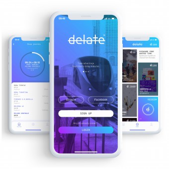
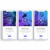
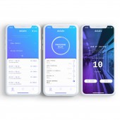
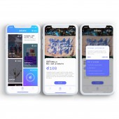
| DESIGN NAME: Delate PRIMARY FUNCTION: Mobile Application INSPIRATION: Delate was created for all those commuters who constantly suffer from train delays. Normally the commuter is given a refund after a certain amount of train delay or based on the ticket price that needs to have a minimum value. Our goal was to give to the commuter the refund of the single minute caused by the train and the chance to turn the discomfort into aimed discounts on product and services. UNIQUE PROPERTIES / PROJECT DESCRIPTION: Delate is a system that commuters can use to collect the lost time caused by the trains. Through the app, the users can keep track of the state of the journey and in case of delay they earn points to be spent on deals present in the marketplace of the app. It is the ultimate tools to refund users with discounted products and services offers by third part brands and to turn an inconvenient into an advantage. OPERATION / FLOW / INTERACTION: Our navigation structure was developed following an extensive amount of tests. We had prototyped out a considerable number of variations of the UI, and put countless iterations in front of the app's users to gauge a better understanding of how they interact with it. Through the monitoring of the train journey, we gained strategic insights about how the system was consuming the phone's battery; when then the users collected points we tested how clear was the process to redeem deals on the marketplace, which brought us to design the use of the app as intuitive as possible, with a reduced consumption of energy. PROJECT DURATION AND LOCATION: Delate was launched in November 2019. |
PRODUCTION / REALIZATION TECHNOLOGY: The UX and UI for Delate were designed in Adobe Illustrator, organized on Axure and then handed off to the development team. Available on mobile, Delate was built using Html, CSS and Javascript. Relevant libraries that have been used include Polymer, Vue.js and Redux. In addition, Dalate uses the open-source database of Viaggiatreno to track the movements of the trains in real-time. SPECIFICATIONS / TECHNICAL PROPERTIES: iOS, Android. TAGS: Mobile, iPhone, Commuters, Train, Geolocalization, UI, UX. RESEARCH ABSTRACT: We have calculated that Italian railway commuters lose an average of 3500 minutes per year due to train delays. Therefore we have designed a system that rewards the commuter for each minute of delay caused by a train, to give value to the lost time. Through deep analysis and collaborative process between UX, graphic design, development and accessibility we have conducted user researches followed by prototype testings to assess the accuracy of our design, hierarchy of contents and interaction in order to create and easy and complete experience. CHALLENGE: We wanted to design an app that could be adapted to each country that has a problem with train delays. For this reason, it was very important to keep the user interface and UX as minimal and intuitive as possible. Another aspect that was really important for the app was the structure of the marketplace, that needed to have a great variety of companies both physical and digital in order to cover different audience taste and to be always updated and appealing for the users. ADDED DATE: 2020-02-10 11:57:43 TEAM MEMBERS (2) : Sofie Di Bartolomeo, UX, Roberto Maurizio Paura, UI, Andrea Provenzale, Backend Developer, Marco Giannone, Business advisor, Marco Maisto, Marketing advisor, Roberto Serritella, Frontend Developer. and IMAGE CREDITS: Roberto Maurizio Paura |
||||
| Visit the following page to learn more: http://delate.app/ | |||||
| AWARD DETAILS | |
 |
Delate Mobile Application by Roberto M. Paura and Sofie Di Bartolomeo is Winner in Mobile Technologies, Applications and Software Design Category, 2019 - 2020.· Read the interview with designer Roberto M. Paura and Sofie Di Bartolomeo for design Delate here.· Press Members: Login or Register to request an exclusive interview with Roberto M. Paura and Sofie Di Bartolomeo. · Click here to register inorder to view the profile and other works by Roberto M. Paura and Sofie Di Bartolomeo. |
| SOCIAL |
| + Add to Likes / Favorites | Send to My Email | Comment | Testimonials | View Press-Release | Press Kit | Translations |
Did you like Roberto M. Paura and Sofie Di Bartolomeo's Mobile Design?
You will most likely enjoy other award winning mobile design as well.
Click here to view more Award Winning Mobile Design.


