ODTU Sanat 20 Visual Identity Design by Kenarkose Creative |
Home > Winners > #97941 |
 |
|
||||
| DESIGN DETAILS | |||||
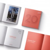
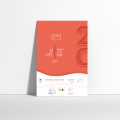
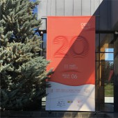
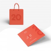
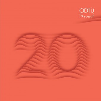
| DESIGN NAME: ODTU Sanat 20 PRIMARY FUNCTION: Visual Identity Design INSPIRATION: Odtu Sanat is an annually held art festival by one of the most successful state universities of Turkey, Middle East Technical University. The festival is centered around an exhibition under the established theme of the year and is supported by various events that last about a month. For the 20th year of the festival, the request from the institution was to build a visual language to highlight the consequent 20 years of the festival. UNIQUE PROPERTIES / PROJECT DESCRIPTION: As per the request from the institution, the 20th year of the festival was emphasized by approaching it like a covered art piece to be unveiled. Shadows of the same colored layers that form the numbers 2, and 0 created a 3D illusion. This illusion gives the feeling of relief and the numbers look like they melted into the background. The vivid color choice creates a subtle contrast with the tranquility of the wavy 20. The visual identity was adopted to many printed and digital media in various sizes. OPERATION / FLOW / INTERACTION: Metu campus is the biggest green area in Ankara thanks to its large forest that accompanies its own natural habitat. The whole campus was once a vast arid land and is the outcome of the Metu Afforestation Project. The biggest challenge was to be easily recognized in this green campus. In order to immediately grab the attention of the audience, a distinctive vibrant coral color was selected that stands out among the shades of green. PROJECT DURATION AND LOCATION: The project started in October 2018 in Ankara and finished in March 2019. FITS BEST INTO CATEGORY: Graphics, Illustration and Visual Communication Design |
PRODUCTION / REALIZATION TECHNOLOGY: As in each year of the festival, the visual identity was supposed to be mostly projected through printed materials. The design idea for the 20th year required the sense of depth and this depth was achieved by the careful use of shadows in between the same colored layers to give the sense of a relief surface. SPECIFICATIONS / TECHNICAL PROPERTIES: The smallest printed material was the event program brochure with the dimensions of an A6 sized paper. The biggest printed materials were the banners hanged outside the Metu Culture and Convention Center with the dimensions of 5m x 8m. TAGS: Visual Identity, Visual Communication, Graphic Design, Branding RESEARCH ABSTRACT: This was the fourth consecutive year of the team designing the visual identity system for Odtu Sanat. Also, being graduated from Odtu the whole design team is quite familiar with the university values and its identity. Therefore, the research phase for this project was done both consciously during the design process but it was also supported subconsciously by the knowledge came from the familiarity with the institution. CHALLENGE: Odtu Sanat administrative committee is a crowded team consisting of members with various design and fine arts backgrounds. The creative challenge was to come up with a design idea that could bring together the challenging opinions of the committee into a single system. In addition, visibility, legibility, noticeability were the most important challenges since there were many printed and digital materials to be designed and produced. ADDED DATE: 2020-02-05 11:43:48 TEAM MEMBERS (4) : Merve Okcu, Gizem Akdag, Haktan Aksu and Pelin Bilgin IMAGE CREDITS: All visual materials were designed and produced by Kenarkose Creative. |
||||
| Visit the following page to learn more: http://bit.ly/2vUXK73 | |||||
| AWARD DETAILS | |
 |
Odtu Sanat 20 Visual Identity Design by Kenarkose Creative is Winner in Graphics, Illustration and Visual Communication Design Category, 2019 - 2020.· Read the interview with designer Kenarkose Creative for design ODTU Sanat 20 here.· Press Members: Login or Register to request an exclusive interview with Kenarkose Creative. · Click here to register inorder to view the profile and other works by Kenarkose Creative. |
| SOCIAL |
| + Add to Likes / Favorites | Send to My Email | Comment | Testimonials | View Press-Release | Press Kit | Translations |
Did you like Kenarkose Creative's Graphic Design?
You will most likely enjoy other award winning graphic design as well.
Click here to view more Award Winning Graphic Design.


