DOT Desktop Calendar by Caxton Chung |
Home > Winners > #97361 |
 |
|
||||
| DESIGN DETAILS | |||||
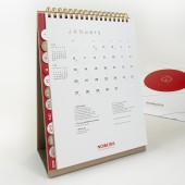
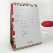
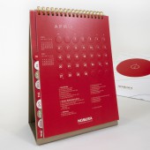
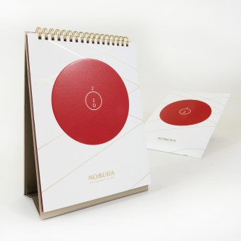
| DESIGN NAME: DOT PRIMARY FUNCTION: Desktop Calendar INSPIRATION: 2020 marks a significant year for Japan as Tokyo being the host city of the 2020 Summer Olympic Game. As a Japan originated company, Nomura would like to design its 2020 corporate calendar with a strong yet subtle association of its nation. The national flag of Japan is selected as the. The feature of the flag, which is the iconic red circle, inspired the theme of the calendar – “DOT”. UNIQUE PROPERTIES / PROJECT DESCRIPTION: The theme - “Dot” is executed through out the calendar in any possible yet practical way. First, the title 2020 is arranged in a graphical way transforming the “0” into two circles/dots. Second, embossed dots are applied on content pages forming the grid of page. Third, the monthly tabs are die cut into semi circle shapes. Fourth, numbers of dot are used to indicate the month on the tab. In terms of visual variety, four different background colours are applied throughout the pages. OPERATION / FLOW / INTERACTION: “DOT” calendar contains information including dates of 2020, national holidays of countries where the firm’s offices located, and the address of the firm’s global offices. In order to indicate the national public holiday, three different icons are created to represent that for three different regions: A dot represents that is a public holiday in Asia-Pacific; a circled represents for Europe, Middle East and Africa region; and a slash represents for Americas. PROJECT DURATION AND LOCATION: The project started in September 2019 in Hong Kong, and was finished in December in Hong Kong. 5000 copies are produced and they are available for purchase in Asia-Pacific regions in January 2020. FITS BEST INTO CATEGORY: Graphics, Illustration and Visual Communication Design |
PRODUCTION / REALIZATION TECHNOLOGY: Polytrade Graffitti Diamond is selected as the main material for this calendar. The character of this paper is optimum color reproduction. As the layout of this calendar design includes large area printing, this paper is an ideal choice. 290gsm of Polytrade Graffitti Diamond is used for the cover, while 170gsm of that is used for the content pages. The diamond texture of the paper enhanced the sophisticated feel of the item. While it is uncoated paper with brightening surface, uses will find no trouble writing on the pages. To finish the design with a complete classy feel, a light bronzed binding ring is used to match with the foil stamping on the cover. SPECIFICATIONS / TECHNICAL PROPERTIES: Size: 167mm (w) x 220mm (h) Materials: - Cover: 290gsm Polytrade Diamond Graffiti Paper - Inside pages: 1700gsm Polytrade Diamond Graffiti Paper - Bronze wire binding rings TAGS: Calendar, Corporate Gift, Embossing, Minimalism, Grid, Layout, Branding, Printing RESEARCH ABSTRACT: On the tab, numbers of dots are used to indicate the month of the page. With a group of dots, it is possible for some people may associate this visual with dices or dominoes. In order to scale down the association with dices and dominoes, the arrangement of the dots are arranged in a different way than that of dice or domino as much as possible. CHALLENGE: A lot of attentions was paid on the printing technology to ensure this design meets the expectation and requirement. First, the embossed circles plays an important role of the design by forming the grid of the page. It has to be obvious enough to form the grid visually, but it would damage the paper if the embossing is too strong. Therefore, the degree of the embossing has to be well balanced. Second, the tab is in semi circle shape, the die-cut technology has to be refined in order to achieve a smooth round edge. ADDED DATE: 2020-01-26 13:49:12 TEAM MEMBERS (1) : IMAGE CREDITS: Caxton Chung, 2019. |
||||
| Visit the following page to learn more: http://nomura.giftu.com.hk/ | |||||
| AWARD DETAILS | |
 |
Dot Desktop Calendar by Caxton Chung is Winner in Graphics, Illustration and Visual Communication Design Category, 2019 - 2020.· Read the interview with designer Caxton Chung for design DOT here.· Press Members: Login or Register to request an exclusive interview with Caxton Chung. · Click here to register inorder to view the profile and other works by Caxton Chung. |
| SOCIAL |
| + Add to Likes / Favorites | Send to My Email | Comment | Testimonials | View Press-Release | Press Kit |
Did you like Caxton Chung's Graphic Design?
You will most likely enjoy other award winning graphic design as well.
Click here to view more Award Winning Graphic Design.


