Hou Juice Drink Packaging by Leng Chen |
Home > Winners > #95369 |
 |
|
||||
| DESIGN DETAILS | |||||
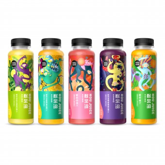
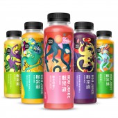
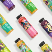
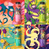
| DESIGN NAME: Hou Juice PRIMARY FUNCTION: Drink Packaging INSPIRATION: We believe that visual recognition and art direction can give consumers a more reliable sense of brand trust, and create a juice brand with a sense of trust and recognition in China.Monkey.the iconic symbol of it's parent brand Pagoda fruit, customizes the theme story according to the characteristics of each fruit juice, and presents the natural to one pattern creative style through the form of illustration, which better interprets the concept of nature and freshness of fruit juice brand. UNIQUE PROPERTIES / PROJECT DESCRIPTION: Pagoda is China's largest fruit production.trade, retail as one of the fruit industry chain enterprises.Its recently- lauched brand HOU Juice focuses on providing fresh juice. so HOU juice endorses Pagoda in naming strategy, which is not only related to the symbol of Pagoda monkey.but also similar to the pronunciation of good Juice in cantonese.This product strives to convey the core value of Pagoda, both in manufacturing technology and packaging. OPERATION / FLOW / INTERACTION: Nowadays, the beverage market is constantly developing, and safe and healthy fruit juice beverage is the first choice of consumers.Good fruit Juice comes from good fruit. HOU Juice inherits the concept of healthy,natural and high quality of its parent brand Pagoda from brand naming and overall visual expression,and creates a unique brand image.The creative style of returning to nature and vitality with rich illustrations makes it deeply rooted in people's heart. PROJECT DURATION AND LOCATION: The project started on March 20,2018 and completed on May 28,2018.The design was completed in Shenzhen. FITS BEST INTO CATEGORY: Packaging Design |
PRODUCTION / REALIZATION TECHNOLOGY: The plastic bottle is made of pearlescent film with frosting and spot color printing technology. SPECIFICATIONS / TECHNICAL PROPERTIES: Diameter 45mm x Height 165mm TAGS: juice, packaging, branding, drink, beverages, RESEARCH ABSTRACT: The urban middle class with health needs is our core audience.They pay more attention to the quality of life and the feeling of packaging.therefore this product not only focues on the design of it's own craft but also focuses on the design of its own craft, but also focuses on the inheritance of culture.The monkey.is not only the super symbol of the Pagoda brand but also one of the Chinese zodiac signs which has been regarded as a symbol of auspiciousness and vitality since ancient times.so we decided to use this element to show originality and enhance the brand's cultural identity. CHALLENGE: The biggest obstacle to the launch of fruit juice is consumer Questioning the source of fruit.Our team undertakes the mission of art direction.With Pagoda as quality guarantee, we believe that through innovative visual creativity and brand strategy, from nice packaging to tastes good, we can meet consumers' demand for high-quality fruit juice and give consumers a more reliable sense of brand trust. ADDED DATE: 2019-12-12 03:17:44 TEAM MEMBERS (3) : Design Director:Chen Leng, Designer:Li Yin and Illustrator:Anna rudak IMAGE CREDITS: Image #1: designer Leng Chen, Variations, 2019. Image #2: designer Yin Li, Variations, 2019. Image #3: designer Yin Li, Variations, 2019. Image #4: designer Leng Chen, Variations, 2019. Image #5: designer Leng Chen, Variations, 2019. |
||||
| Visit the following page to learn more: http://www.37-21design.com/ | |||||
| AWARD DETAILS | |
 |
Hou Juice Drink Packaging by Leng Chen is Winner in Packaging Design Category, 2019 - 2020.· Read the interview with designer Leng Chen for design Hou Juice here.· Press Members: Login or Register to request an exclusive interview with Leng Chen. · Click here to register inorder to view the profile and other works by Leng Chen. |
| SOCIAL |
| + Add to Likes / Favorites | Send to My Email | Comment | Testimonials | View Press-Release | Press Kit |
Did you like Leng Chen's Packaging Design?
You will most likely enjoy other award winning packaging design as well.
Click here to view more Award Winning Packaging Design.


