|
|
|


|
|
| DESIGN DETAILS |
DESIGN NAME:
Nudus
PRIMARY FUNCTION:
Snack Food
INSPIRATION:
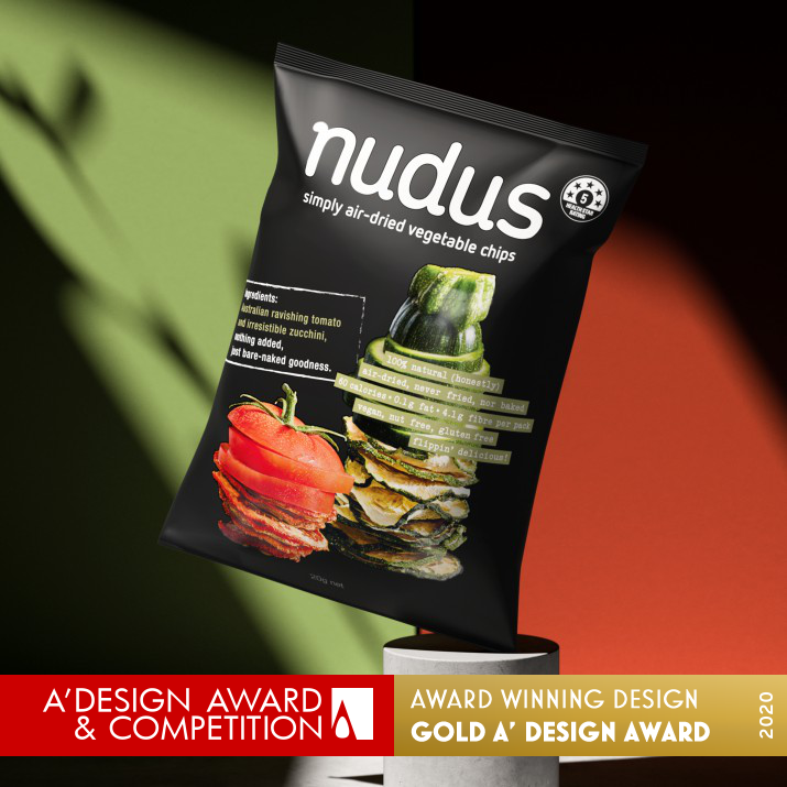
Inspired by the still life paintings, we looked to create a range of product where the fruit and vegetables appeared just as nature had intended. The stark black background allows the photography to really jump off pack.
UNIQUE PROPERTIES / PROJECT DESCRIPTION:
Strategy, brand mark and packaging livery for a new air-dried fruit and vegetable snack.
The packaging imagery depicts the fruit and vegetables as gloriously naked as they day they were picked in sunny Australia. The stacked slices, going from fresh to dried, articulates the slow-dried method and the powerful crunch. The product is picked dried and packaged.
OPERATION / FLOW / INTERACTION:
This packaging targets those who are genuinely looking to eat an unadulterated snack. The tone of voice is playful to appeal to the slight tongue in cheek nature of the brand name. Everything about the product packaging supports its clean credentials. We were determined to create packaging that was clean and simple, just like the product.
PROJECT DURATION AND LOCATION:
From concept through to finished art: May 2018-December 2018
Launched in to market March 2019
FITS BEST INTO CATEGORY:
Packaging Design
|
PRODUCTION / REALIZATION TECHNOLOGY:
The packaging is printed on rewind, using CMYK plus two spot colours per pack. The brand mark and image are finished with a spot UV gloss while the remaining material has a matt finish.
SPECIFICATIONS / TECHNICAL PROPERTIES:
Size: 12.5cm wide by17cm high
TAGS:
Packaging Design, Snack Packaging Design, Food Packaging, Healthy Snack Packaging, Food photography, Design Inspiration, Brand Identity, Logo Design, Food Branding
RESEARCH ABSTRACT:
It was important to tell the story as it is, pure and simple, to move away from the hand-drawn look & cute illustrations and instead present the product in a classical way. Our research took us to look at the art of still life and the essence of the fruit/vegetables as objects of beauty. The 'natural' side came in the simple photography, a single beautiful piece of nature just as it appears. It was important to retain the fruit/vegetable shapes, by using slices both fresh and dried. Not only that, the image gently tells the story of picked, sliced and dried in a very simple way, with nothing added.
CHALLENGE:
Production is usually the challenge and this project was no different. Managing the process and the technical constraints was hard but we got a good result.
ADDED DATE:
2019-09-28 02:24:05
TEAM MEMBERS (4) :
Angela Spindler: Creative Director/Designer, Andy Lewis: Photographer, Anna Lee: Copywriter and Anneke Decker: Retoucher/Finished Artist
IMAGE CREDITS:
Photography: Andy Lewis
|
| Visit the following page to learn more: https://wearedepot.com.au |
|
| CLIENT/STUDIO/BRAND DETAILS |
 |
NAME:
Depot Creative
PROFILE:
We’re an award winning, Sydney based, packaging design agency that believes the strongest brands are powered by great design.
At Depot we do much more than create ‘pretty’ packaging. We get brands noticed. We make choice simpler. We shape the way people interact, engage and experience products through innovative form and packaging design. Moreover, we convert casual browsers into coveted buyers, improving your bottom line while raising your brand awareness.
Since we started in 2002, we have been selecting projects that resonate with us as consumers to deliver effective food, beverage, skin care and lifestyle brands.
|
|
|
| COMMENTS |
| Giulia Esposito |
Comment #10400 on December 26, 2022, 9:24 pm |
|
I am absolutely delighted to see such a feat of packaging design excellence! Nudus is a brilliant example of how to incorporate an innovative design approach to bring a product to life. Every aspect of its packaging has been carefully crafted to create a memorable experience for the user. From the bold colors to the unique typography, every detail has been thoughtfully chosen to make the product stand out. The overall design is eye-catching, modern and simply stunning. Well done to Angela Spindler for creating such a visually stunning product!
|
| Thomas Anderson |
Comment #34986 on January 3, 2023, 11:13 am |
|
This award-winning work is simply stunning. The design of the packaging for this air-dried fruit and vegetable snack is both visually and conceptually elegant. The imagery of the fruit and vegetables in all their natural beauty reflects the slow-dried process and the powerful crunch of the product. The stark black background really makes the photography stand out and brings to life the still life paintings that served as inspiration. It is no surprise that this work was recognized with an A' Design Award - it truly is an example of how design can bring value to a product.
|
| Valentina Rossi |
Comment #35504 on January 3, 2023, 11:23 am |
|
This packaging design is an impressive blend of art and technology. The visuals communicate the product's story in an authentic and captivating manner.
|
| Paul Williams |
Comment #52090 on January 3, 2023, 6:17 pm |
|
Nudus is an exemplary work of design, showcasing the beauty of nature in a unique and powerful way. The packaging imagery of fresh and dried fruit and vegetables is presented in a classical style, with a stark black background that allows the photography to really jump off the pack. The brand mark, livery and imagery are a testament to the slow-dried method and the powerful crunch that come with the product. The production process was managed skillfully, resulting in a beautiful work of art that is sure to be admired by many. Congratulations to the Designer for this amazing achievement!
|
| Paul Phillips |
Comment #60328 on January 3, 2023, 10:15 pm |
|
I'm so impressed by the creativity and innovative approach to this packaging design! The idea of depicting the fruit and vegetables as if they were freshly picked is inspiring and unique. The stacked slices of fruit and vegetables to illustrate the slow-dried process and the powerful crunch is a clever idea and a great visual representation. It's no wonder that this work was recognized with an A' Design Award!
|
| Elena Petrenko |
Comment #63952 on January 3, 2023, 11:54 pm |
|
This award-winning work is a stunning example of how powerful simplicity can be in packaging design.
|
| Adam Harris |
Comment #68192 on January 4, 2023, 1:49 am |
|
I am absolutely in awe of this award-winning work! It is simply stunning and a beautiful example of good design. The imagery of the fruit and vegetables in their glorious natural state is truly captivating and the story behind the product is clear and concise. It is impressive how the design team managed to tell the story of the product and its production process with such minimalistic elements. The crisp black background allows the product to take centre stage and the stacked slices provide an accurate portrayal of the slow-dried method. This award-winning work is truly an exemplary example of good design.
|
| Anna Ivanova |
Comment #70275 on January 4, 2023, 2:49 am |
|
I am delighted to show my appreciation for Angela Spindler's award-winning work 'Nudus'. A remarkable achievement and a great example of excellence in packaging design.
|
| Chloe Turner |
Comment #77715 on January 4, 2023, 6:28 am |
|
I am absolutely mesmerized by the snack food packaging design entitled "Nudus" by Angela Spindler. The stark black background allows the natural beauty of the fruit and vegetables to really stand out and the photography appears as if it has been taken directly from nature. It is an incredible achievement to take inspiration from still life paintings and bring it to life in such a unique, creative way. The A' Design Award is well deserved for such an incredible piece of artwork. Congratulations to Angela Spindler for taking home this prestigious award!
|
| Mark Allen |
Comment #79760 on January 4, 2023, 7:36 am |
|
This award-winning packaging design is a testament to the power of simplicity. The bold black background allows the photography to really stand out and the stacked slices, going from fresh to dried, effectively conveys the slow-drying process and the powerful crunch. The product is picked, dried and packaged, and the image beautifully tells the story of the process. The production challenges were managed to produce a good result, and the printing process is a combination of CMYK plus two spot colours per pack, with the brand mark and image finished with a spot UV gloss. Congratulations to the designer for this well-deserved success!
|
| Elisabeth Clark |
Comment #81131 on January 4, 2023, 8:31 am |
|
I am absolutely in awe of Angela Spindler's work 'Nudus' and the creativity and thought that has gone into the design. The concept of using still life paintings to create a range of product that appear just as nature intended is truly inspiring. The stark black background brings out the colours of the product and emphasizes the powerful crunch of the slow-dried fruit and vegetables. I love how the image gently tells the story of the product's production process, from picked to sliced to dried, and how nothing has been added to the product. This is a great example of how design can be used to create something that is both aesthetically pleasing and functional. Well done on winning this award and celebrating the beauty of nature!
|
|
|
Did you like Angela Spindler's Packaging Design?
You will most likely enjoy other award winning packaging design as well.
Click here to view more Award Winning Packaging Design.
Did you like Nudus Snack Food? Help us create a global awareness for good packaging design worldwide. Show your support for Angela Spindler, the creator of great packaging design by gifting them a nomination ticket so that we could promote more of their great packaging design works.
|
|

|
|
|
|


