13 International Cultural Media Identity by Creator Strategic Marketing Co., Ltd |
Home > Winners > #92411 |
 |
|
||||
| DESIGN DETAILS | |||||
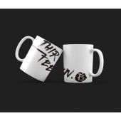
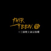
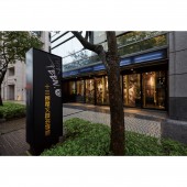
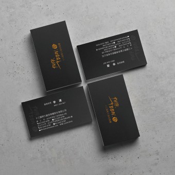
| DESIGN NAME: 13 International Cultural Media PRIMARY FUNCTION: Identity INSPIRATION: At the brand launching meeting, we hope that the name of the brand can have a story and meaning, which will help brining a spiritual symbol into the brand image. We decided to use the number 13 as the name of the company, a number has a meaningful story during their business planning stage. UNIQUE PROPERTIES / PROJECT DESCRIPTION: Thirteen International Creative Industries and Multimedia is a multimedia production company, which includes tv programs, movies, cultural and creative development and entertainment. It is a very diverse and creative company, which has international perspective in the professional field. Therefore, during the process of the visual design, we took the ideal company profile from the founders mind to create a design expresses the youth and creativity that fits the best to the brand. OPERATION / FLOW / INTERACTION: The logo is based on the text THIRTEEN, and the font strokes are hand-painted. It emphasizes the creativity, vitality and the neatness of the brand. With the Arabic numeral 13 along embellishing the design. We use black and gold as two main colors presenting the brand is capable to have the highest level of expertise and international texture under the young and energetic. PROJECT DURATION AND LOCATION: The brands visual identity and space design took nearly 5 months (from 16/08/2016~) to complete, in both Taipei and Taichung, Taiwan. FITS BEST INTO CATEGORY: Graphics, Illustration and Visual Communication Design |
PRODUCTION / REALIZATION TECHNOLOGY: Since it is a multimedia cultural and creative company with a clear operating direction and purpose, we focus more on the image of the brand in founders mind and the number 13. After the discussion and positioning, we set four key points for the brand design: Young, Neat, Tension, and internationalization SPECIFICATIONS / TECHNICAL PROPERTIES: Western style envelope 215mm x 184mm Chinese style envelope 325mm x 247mm Letter paper 210mm x 297mm TAGS: branding, identity, entertainment, multimedia, creative RESEARCH ABSTRACT: In the early stage, we collected relevant information and elements related to the multimedia industry and analyzed the visual designs from other design studios. We discussed with the brand operation team many times on the initial design elements, like the trigger, volume control panel, and playback Interface, etc. As the team consistently felt that it was too ordinary and did not have the unique sense of the brand. In the end, the design element was positioned on the most meaningful element in the founder's heart. CHALLENGE: When we set the design style at the beginning, taking the elements of film and television multimedia is not enough to express the spirit and the story of the brand, especially it is lack of uniqueness. Therefore, we changed the way of thinking and focused our strategy on the founders founding process. The final outcome successfully reached the founders ideal image. ADDED DATE: 2019-09-27 07:30:14 TEAM MEMBERS (2) : Design Deputy Manager: Gray Wu and Senior Designer: Chih Yu Hsieh IMAGE CREDITS: Creator Strategic Marketing Co., Ltd, 2019. |
||||
| Visit the following page to learn more: http://www.creatorstudiotw.com/index.php | |||||
| AWARD DETAILS | |
 |
13 International Cultural Media Identity by Creator Strategic Marketing Co., Ltd is Winner in Graphics, Illustration and Visual Communication Design Category, 2019 - 2020.· Read the interview with designer Creator Strategic Marketing Co., Ltd for design 13 International Cultural Media here.· Press Members: Login or Register to request an exclusive interview with Creator Strategic Marketing Co., Ltd. · Click here to register inorder to view the profile and other works by Creator Strategic Marketing Co., Ltd. |
| SOCIAL |
| + Add to Likes / Favorites | Send to My Email | Comment | Testimonials | View Press-Release | Press Kit |
Did you like Creator Strategic Marketing Co., Ltd's Graphic Design?
You will most likely enjoy other award winning graphic design as well.
Click here to view more Award Winning Graphic Design.


