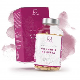
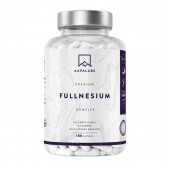
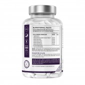
Aava Supplements by Maja Maksimovic |
Home > Winners > #91182 |
| CLIENT/STUDIO/BRAND DETAILS | |
 |
NAME: Aavalabs PROFILE: There is one word in Finnish that has had a special meaning for centuries for those who love natural purity and breathtaking beauty: AAVA. There is no direct translation into English, but this feeling of freedom and freshness can best be experienced by looking at a vast landscape that can only be found in untouched nature. Here at AAVALABS, our Finnish family business, we embody this feeling in all our products and decisions. We are "Nordic by Nature". We take the well-being of those who want to enjoy natural and organic products as seriously as our own. |
| AWARD DETAILS | |
 |
Aava Supplements by Maja Maksimovic is Winner in Packaging Design Category, 2019 - 2020.· Read the interview with designer Maja Maksimovic for design Aava here.· Press Members: Login or Register to request an exclusive interview with Maja Maksimovic. · Click here to register inorder to view the profile and other works by Maja Maksimovic. |
| SOCIAL |
| + Add to Likes / Favorites | Send to My Email | Comment | Testimonials | View Press-Release | Press Kit | Translations |
Did you like Maja Maksimovic's Packaging Design?
You will most likely enjoy other award winning packaging design as well.
Click here to view more Award Winning Packaging Design.


