Changing Perspectives Environmental Typography by Haley Tebo |
Home > Winners > #87839 |
 |
|
||||
| DESIGN DETAILS | |||||
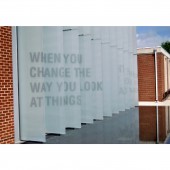
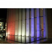
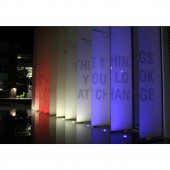
| DESIGN NAME: Changing Perspectives PRIMARY FUNCTION: Environmental Typography INSPIRATION: Inspired by environmental typography installations that use perspective in a way that the words can only be read from one spot, we wanted to bring this somewhere where a lot of people could interact with typography. We were inspired by the potential we saw in the fountain in front of the our university's art building and the vertical glass panels above it. We used the dimensions of these panels to inform the choice of Helvetica Condensed and people walking from both directions to choose the quote. UNIQUE PROPERTIES / PROJECT DESCRIPTION: This interactive installation compels the viewer to move in such a way to view the piece differently. As people walk by, the shapes align to form a message, which can be read walking from either direction. Installed on an art building at a university, the piece can be viewed from inside the gallery or across campus and draw people to it. The lighting also reflects the shapes of the typography in the form of shadows and reflections. OPERATION / FLOW / INTERACTION: This installation is unique because it is put into movement as the viewer walks by, compelling them to pause and align themselves with the piece in order to read it. The space builds anticipation as the viewer must move themselves to read the next half of the message. The typography tells a story that parallels the environment it is in, achieving mutual enhancement of the design and the environment. PROJECT DURATION AND LOCATION: Research for this project started in late April 2019. Installation lasted for two weeks in May 2019. FITS BEST INTO CATEGORY: Graphics, Illustration and Visual Communication Design |
PRODUCTION / REALIZATION TECHNOLOGY: Adobe software was used to create slides that were then projected onto the building. The projector was placed on a ladder at eye-height so it would be convenient for onlookers walking by to read. The shapes were traced with china marker then covered with frosted vinyl and cut out. SPECIFICATIONS / TECHNICAL PROPERTIES: Each letter of the design is approximately 1-2 feet tall, varying with distance from the viewer. TAGS: Environmental typography, interaction design, user experience, typography, graphic design, RESEARCH ABSTRACT: Researching existing projects inspired aspects of this design but also allowed it to be unique. Scouting local areas to find an optimal environment for the typography, we chose to install on campus for convenience and because of having a strong concept for the space, which included a well thought-out quote that could be read from either direction. The area was measured so a digital mockup could be done to scale. The design was very well received as people complimented it as it was being installed. CHALLENGE: After choosing an approved concept, we addressed the installation process. We could digitally cut out the letters, but they might not align correctly, or we could project it so the alignment was perfect, but would have to cut them by hand. After taping up a to-scale proof of the estimated warp we decided to project the letters because they did not align in the proof. The projection then needed to be done at night and required ladders, multiple extension cords, and for the fountain to be drained. ADDED DATE: 2019-06-22 16:45:00 TEAM MEMBERS (1) : Angeli Leong IMAGE CREDITS: Image #1 : Professor Wade Lough, 2019 Image #2 : Professor Wade Lough, 2019 Video Credits : Angeli Leong Quote used is by Wayne Dyer |
||||
| Visit the following page to learn more: http://www.haleytebo.com/ | |||||
| AWARD DETAILS | |
 |
Changing Perspectives Environmental Typography by Haley Tebo is Winner in Graphics, Illustration and Visual Communication Design Category, 2019 - 2020.· Read the interview with designer Haley Tebo for design Changing Perspectives here.· Press Members: Login or Register to request an exclusive interview with Haley Tebo. · Click here to register inorder to view the profile and other works by Haley Tebo. |
| SOCIAL |
| + Add to Likes / Favorites | Send to My Email | Comment | Testimonials | View Press-Release | Press Kit |
Did you like Haley Tebo's Graphic Design?
You will most likely enjoy other award winning graphic design as well.
Click here to view more Award Winning Graphic Design.


