Museum Of Illusions Visual Identity by Dragan Vejnovic |
Home > Winners > #82985 |
 |
|
||||
| DESIGN DETAILS | |||||
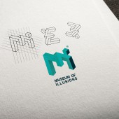
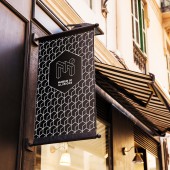
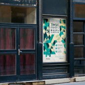
| DESIGN NAME: Museum Of Illusions PRIMARY FUNCTION: Visual Identity INSPIRATION: The main inspiration for the MOI brand visualization idea came from the impossible stairs, the popular penrose steps. A variation of the Penrose triangle is a two-dimensional depiction of a staircase in which the stairs make four 90-degree turns as they ascend or descend yet form a continuous loop so that a person could climb them forever and never get any higher. The color palette and combinations for the brand identity have been inspired by Abstract Illusionism. UNIQUE PROPERTIES / PROJECT DESCRIPTION: Museum of Illusions - Visual identity contrasting the reality and the illusion. Museum of Illusions started as a unique project which soon became one of the fastest growing education and entertainment places, with locations in 13 cities around the globe; and continues to expand! This original concept was launched in Zagreb, Croatia in 2015 and quickly become a recognizable brand and leading attraction with it's unique design worldwide. OPERATION / FLOW / INTERACTION: Museum of Illusions offers an interactive, immersive and fun experience for children, parents, couples, grandmothers and grandfathers. A perfect, unusual and exciting place for all generations. Amusing and awesome tricks will teach you about vision, perception, the human brain and science so it will be easier to perceive why your eyes see things which your brain cannot understand. PROJECT DURATION AND LOCATION: This original concept was launched in Zagreb, Croatia in 2015 and quickly become a recognizable brand and leading attraction in each city where it is launched. FITS BEST INTO CATEGORY: Graphics, Illustration and Visual Communication Design |
PRODUCTION / REALIZATION TECHNOLOGY: The visual language used in the brand identity creation of the MOI is simple yet creates a strong contrast between reality and illusion, and gives it an identity linked to the world of illusions. These contrasts allow the viewers to be aware of both the reality and the illusion for them to appreciate the world around us by looking at different exhibits across the musseum. It was really important to highlight the idea that reality vs illusion concept is constantly changing and progressing, so the identity was designed that reflects this evolving nature by creating contrasts between the reality and the illusion. SPECIFICATIONS / TECHNICAL PROPERTIES: n/a not applicable TAGS: musseum, illusion, brand identity, abstract, grid, reality RESEARCH ABSTRACT: Think-thank made by marketing experts, founders of the museum and graphic designers had come to a conclusion when researching museum visitors habits that it is necessary to avoid a playful and childish note in the visual identity of the museum. It was concluded that the Museum of Illusions must be primarily focused on educational character, and not purely on amusement. Through these goals, a serious logo with a simple illusion in its core was created. Logo that does not reveal too much and is interesting to the older population (and not just children). This approach helped first-ever MOI to become the most visited museum in Croatia. CHALLENGE: MOI is a museum dedicated to showcasing the illusions created by the human brain that capture the spirit of the world of illusions in its real and tangable environment. The hardest part was to create a contrast between reality and illusion The main logo was designed to display letters M and I in 3D space without specifying exact boundaries. The system creates the idea that everybody perceives for themselves where the real boundary is between the beginning and the end of the letters M and I. ADDED DATE: 2019-03-06 14:51:59 TEAM MEMBERS (1) : IMAGE CREDITS: Dragan Vejnovic, 2018. |
||||
| Visit the following page to learn more: http://draganvejnovic.com/ | |||||
| AWARD DETAILS | |
 |
Museum of Illusions Visual Identity by Dragan Vejnovic is Winner in Graphics, Illustration and Visual Communication Design Category, 2018 - 2019.· Read the interview with designer Dragan Vejnovic for design Museum Of Illusions here.· Press Members: Login or Register to request an exclusive interview with Dragan Vejnovic. · Click here to register inorder to view the profile and other works by Dragan Vejnovic. |
| SOCIAL |
| + Add to Likes / Favorites | Send to My Email | Comment | Testimonials | View Press-Release | Press Kit |
Did you like Dragan Vejnovic's Graphic Design?
You will most likely enjoy other award winning graphic design as well.
Click here to view more Award Winning Graphic Design.


