Jungle Society Brand Identity by WeWantMore |
Home > Winners > #81307 |
 |
|
||||
| DESIGN DETAILS | |||||
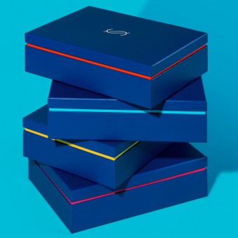
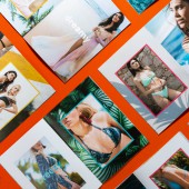
| DESIGN NAME: Jungle Society PRIMARY FUNCTION: Brand Identity INSPIRATION: Based on the all-inclusive vision of Jungle Society’s founder Amanda, a luxury brand was developed that looks beyond the perfect image of bikini models and focusses on real women from all around the world, in all shapes and sizes. Exploring the atmosphere of sunny Rio de Janeiro, with it’s colorful urban vibe and culture, and nature with it’s fruit and flowers as the perfect reflection of jungle and society. UNIQUE PROPERTIES / PROJECT DESCRIPTION: Celebrating femininity in all its forms, a swimwear brand was developed on a foundation of female empowerment: enjoying life to the fullest and embracing every aspect of yourself. Designed for women who are real and authentic, who appreciate quality and luxury, but who aren’t stiff or reserved. A brand with strong color combinations, photography that is energetic and spontaneous, showing women as they are instead of being models. Scenery photography adds an extra touch of summer to the brand. OPERATION / FLOW / INTERACTION: The bold, colorful and vivid style sets Jungle Society apart from other luxury fashion brands. Breaking with luxury codes and using direct self-positive messaging and photography makes the brand own-able and recognizable. This gives Jungle Society its unique positioning within the high-end swimwear market. PROJECT DURATION AND LOCATION: Development started in january 2018 and the brand was launched when the first rays of sun warmed the sky in May 2018. Designed in Belgium for the European and Brazilian market. FITS BEST INTO CATEGORY: Graphics, Illustration and Visual Communication Design |
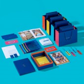
PRODUCTION / REALIZATION TECHNOLOGY: Packaging, Bags & Hangtags: Printed in Pantone, CMYK and gold foil printing. Stationary: Printed in Pantone, CMYK and gold foil printing. Business cards and envelopes: Printed in gold foil on uncoated GF Smith paper Lookbook: Printed in CMYK, Spot UV and gold foil printing SPECIFICATIONS / TECHNICAL PROPERTIES: Celebrating diversity is visually translated into a bold and colorful brand identity. A base of royal blue and gold is combined with 4 bright poppy colors based on tropical flowers and fruits, aiming for that perfect mix of ‘Jungle’ and ‘Society’ All items are mixed randomly creating a set of combinations as diverse as the women they are made for. All packaging and print materials are produced with high quality materials and finishings for a luxurious feel. TAGS: identity, branding, packaging, swim wear, leisure, luxury, Brasil, Belgium, WeWantMore RESEARCH ABSTRACT: Inspirational research was conducted through discussions and interviews with Jungle Society's designer and founder. CHALLENGE: Finding the balance between a luxury image and being an energetic, tropical all-inclusive beachwear brand. Balancing the Jungle and the Society so to speak. ADDED DATE: 2019-02-28 11:38:02 TEAM MEMBERS (6) : Creative Director: Michiel de Vreede, Designer: Lotte Neirynck, Designer: Jochem de Weert, Designer: Johannes Stoll, Copywriter: Sabine Neddermeyer and Lookbook models photography: Liselotte Fleur IMAGE CREDITS: Photography : WeWantMore |
||||
| Visit the following page to learn more: https://wewantmore.studio/work/jungle-so |
|||||
| AWARD DETAILS | |
 |
Jungle Society Brand Identity by Wewantmore is Winner in Graphics, Illustration and Visual Communication Design Category, 2018 - 2019.· Read the interview with designer WeWantMore for design Jungle Society here.· Press Members: Login or Register to request an exclusive interview with WeWantMore. · Click here to register inorder to view the profile and other works by WeWantMore. |
| SOCIAL |
| + Add to Likes / Favorites | Send to My Email | Comment | Testimonials | View Press-Release | Press Kit |
Did you like Wewantmore's Graphic Design?
You will most likely enjoy other award winning graphic design as well.
Click here to view more Award Winning Graphic Design.


