Brand Book Brand Book by Ragù Communication |
Home > Winners > #81287 |
 |
|
||||
| DESIGN DETAILS | |||||
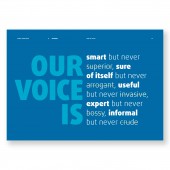
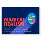
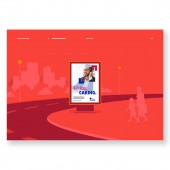
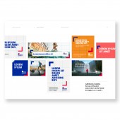
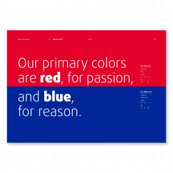
| DESIGN NAME: Brand Book PRIMARY FUNCTION: Brand Book INSPIRATION: Revolutionize the cold world of the brand book by uniting technique with narration, design and storytelling, and realize a useful book and a fascinating manual. UNIQUE PROPERTIES / PROJECT DESCRIPTION: A manual able to foresee every use of the brand in a clear, intuitive manner without any need for long explanations, useful in Brazil as well as China. The realization started out from the restyling of the logo, which then generated all the new graphic elements of the manual. The icons echo the forms of the logo, so that the big corners of the communication format are born from it. Each element of the project is generated taking into account the graphic identity of the Europ Assistance brand. OPERATION / FLOW / INTERACTION: The manual is a technical tool in book form. The digital version is enriched with extra content. PROJECT DURATION AND LOCATION: The project began in Rome in May 2018, was delivered to the client in February 2019 and is constantly updated. FITS BEST INTO CATEGORY: Graphics, Illustration and Visual Communication Design |
PRODUCTION / REALIZATION TECHNOLOGY: The brand book is presented in dual form, digital and printed. The digital form is necessary to ensure maximum dissemination and make it updatable in real time thanks to the specially realized sharing platform. In this way the manual never becomes obsolete, but guides change, anticipating needs and proposing constant improvements to all while at the same time embracing the positioning of the brand: Anytime, Anywhere. SPECIFICATIONS / TECHNICAL PROPERTIES: Digital: Interactive pdf with download links to the presented materials. Print: closed format 29.7x21 cm; open format 59.4x21 cm four colour printing both sides cover of board covered with Fedrigoni Ispira 150 g/m2 with dry printing on corners and title internal pages of Fedrigoni Ispira 120 g/m2 ring binding TAGS: ragu communication, brand book, manual, digital issue, graphic, logo, typography, values. RESEARCH ABSTRACT: As enthusiasts of branding, we have tried to view the complex world of the application manual of a logo, putting ourselves in the end users' place. Every problem had to be resolved with the eyes of a layman, because that is often the case, so every aspect had to be explained without excessive use of technical terms and expressions. Fewer rules and more intuitiveness: that was the only way we could be certain our requisites would be met. CHALLENGE: Create a technical manual able to simultaneously convey the brand’s spirit, philosophy and personality, achieved not only with graphic choices but also with language, words and emotions. A book to use but also to browse through because it is aimed at being not only useful but also the story of who the brand is and what its ethics are. A long group work to achieve the best synthesis, choose the strongest creative solution to convey the values of Europ Assistance, and affirm a more than 50-year history while remaining tuned to the future. ADDED DATE: 2019-02-28 11:16:43 TEAM MEMBERS (11) : (9), Creative chief: Martina Venettoni, Creative director: Art Stefano Coccia, Creative director Copy: Alessandro Brunetti, Senior art director: Pierpaolo Livoni, Senior art director: Andrea Venanzi, Art director: Silvia Piscopiello, Copywriter: Alessandro Brunetti, Copywriter: Aaron Maines, General manager: Giovanna Montani and Account supervisor: Stefania Crapsi IMAGE CREDITS: Ragù Communication, 2018. PATENTS/COPYRIGHTS: Europ Assistance |
||||
| Visit the following page to learn more: http://ragucommunication.com | |||||
| AWARD DETAILS | |
 |
Brand Book Brand Book by Ragù Communication is Winner in Graphics, Illustration and Visual Communication Design Category, 2018 - 2019.· Read the interview with designer Ragù Communication for design Brand Book here.· Press Members: Login or Register to request an exclusive interview with Ragù Communication. · Click here to register inorder to view the profile and other works by Ragù Communication. |
| SOCIAL |
| + Add to Likes / Favorites | Send to My Email | Comment | Testimonials | View Press-Release | Press Kit |
Did you like Ragù Communication's Graphic Design?
You will most likely enjoy other award winning graphic design as well.
Click here to view more Award Winning Graphic Design.


