DESIGN NAME:
Telegraphe Cafe
PRIMARY FUNCTION:
Brand Identity
INSPIRATION:
The simplicity of the cafe and interaction people have in the environment are main stimuli that lead to the creation of typography and brackets in this project.
UNIQUE PROPERTIES / PROJECT DESCRIPTION:
Telegraphe Cafe is a boutique coffee shop located in Chelsea, New York City. The design concept is to create an unique identity which reflects the simplicity character of Telegraphe Cafe by utilizing typography and specific symbols. With a purpose of gaining interest and bringing people closer during the coffee time, dialogues that customer might experience in cafe are recurred on collaterals in a simple and rather poetic way by sharing the same design elements.
OPERATION / FLOW / INTERACTION:
This project is designed with a purpose of giving the coffee shop a clear identification and helping it stand out in a crowded market. The logo and visual elements appear on every design items in a clear order which catch attention and make it memorable at the same time.
PROJECT DURATION AND LOCATION:
The project was finalized in July 2016, New York City.
FITS BEST INTO CATEGORY:
Graphics, Illustration and Visual Communication Design
|
PRODUCTION / REALIZATION TECHNOLOGY:
After on-site research and conceptualizing ideas, typography and symbol were chosen as main design elements. The logo draft was first made by hand sketch and the design process continued in exploring variations and spacing by software. A bunch of time was spent on the relationship among letter, brackets and negative space so that they had a nice balance and gave poetic vibes to the brand. As the brand identity was finalized, logo was applied on stationary and relevant collaterals with cooperated color palette and scaling.
SPECIFICATIONS / TECHNICAL PROPERTIES:
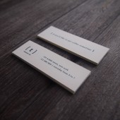
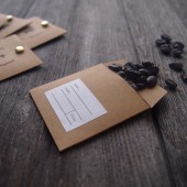
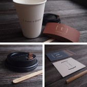
Brand identity with a series of collateral that include: Business Card, Letterhead, Envelope, Coaster/Memo Sheets, Menu, Lunch Bag, Coffee Bean Packaging, Food & Beverage Packaging.
TAGS:
branding, identity, logo, graphic design, typography, packaging, coffee, cafe
RESEARCH ABSTRACT:
This project started with field research and on-site observation. As a customer, I spent a bunch of time sitting in the cafe in different time and days, felt the vibes of the brand itself, and observed how people interacted in the environment. The research result was abstract and personal at first, it turned into verbal words as notes were written down during the observation and then the design idea was conceptualized gradually with cooperated visual solution.
CHALLENGE:
The main challenge of this project was to transform the abstract and personal observation into visual experience and create a solid brand identity full of characters that could strike a chord with its target audience.
ADDED DATE:
2019-02-28 08:10:55
TEAM MEMBERS (1) :
IMAGE CREDITS:
All images by Chung Hui Pao, 2016.
|


