812 Laundry Corporate Identity by Calix Wong |
Home > Winners > #81024 |
 |
|
||||
| DESIGN DETAILS | |||||
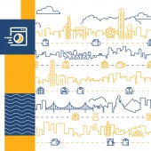
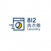
| DESIGN NAME: 812 Laundry PRIMARY FUNCTION: Corporate Identity INSPIRATION: A brand logo is designed in a way combining a washing machine and a delivery car. This idea represents the laundry service with delivery crew of the company. There is a moon inside the washing machine which represent the service of 812 Laundry in night time, from 8 to 12. A "keep moving fast" image is created to 812 Laundry, since the company provides delivery service together with washing clothes. The graphic shows different "moving clothes" icons, just like many cars are moving in the city. UNIQUE PROPERTIES / PROJECT DESCRIPTION: 812 Laundry is a Hong Kong based mobile laundry offering door-to-door delivery of clothes washing service. They serve all areas of Hong Kong with a delivery crew introducing the concept of mobile laundry. The whole identity of 812 Laundry is rebranded, in order to project a modern and young image to their clients. OPERATION / FLOW / INTERACTION: The new identity of the laundry brand gives a new and clean image to the customers. The bold and easy to remember identity makes confident to the customer. The supporting graphic and icons show all the services provided by the brand in a clear way. It helps fast and systematic order placing on their website. PROJECT DURATION AND LOCATION: The project started in January 2018 and finished in March 2018 in Hong Kong. It was launched locally by revamping their delivery crew and packaging. Their website launched in the end of March 2019. FITS BEST INTO CATEGORY: Graphics, Illustration and Visual Communication Design |
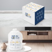
PRODUCTION / REALIZATION TECHNOLOGY: Adobe illustrator was mainly used in the project. SPECIFICATIONS / TECHNICAL PROPERTIES: For physical items, the carton box and bag were designed in a dimension of 50cm cube and 48cm x 65cm respectively. For non-physical designs, an expandable supporting graphic system is created, to ensure the new identity has perfect application in the future in all situation. TAGS: logo, branding, laundry, pattern, hong kong, skyline, packaging, icon, business card, website RESEARCH ABSTRACT: We compared an amount of competitors in Hong Kong and overseas, which helped to enhance the traditional image of the laundry service. Commonly used colors like sky blue, green etc were avoided to make sure the new design is outstanding. CHALLENGE: The hardest part was to wash out the traditional image of laundry. To make it more fun, keep the clean and reliable image at the same time. ADDED DATE: 2019-02-28 04:02:21 TEAM MEMBERS (1) : IMAGE CREDITS: Calix Wong, 2018. |
||||
| Visit the following page to learn more: http://bit.ly/abc812laundry | |||||
| AWARD DETAILS | |
 |
812 Laundry Corporate Identity by Calix Wong is Winner in Graphics, Illustration and Visual Communication Design Category, 2018 - 2019.· Read the interview with designer Calix Wong for design 812 Laundry here.· Press Members: Login or Register to request an exclusive interview with Calix Wong. · Click here to register inorder to view the profile and other works by Calix Wong. |
| SOCIAL |
| + Add to Likes / Favorites | Send to My Email | Comment | Testimonials | View Press-Release | Press Kit |
Did you like Calix Wong's Graphic Design?
You will most likely enjoy other award winning graphic design as well.
Click here to view more Award Winning Graphic Design.


