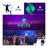
Pride Brand by Oleksii Chernov |
Home > Winners > #79896 |
 |
|
||||
| DESIGN DETAILS | |||||
| DESIGN NAME: Pride PRIMARY FUNCTION: Brand INSPIRATION: We sought inspiration in human psychology. We studied how these or other forms affect a person. How shades of color affect the choice. We looked for inspiration in nature and in sports. We were looking for pure energy. UNIQUE PROPERTIES / PROJECT DESCRIPTION: Creating a brand company with the help of psychology, color psychology and psychogeometry. We used advanced methods of studying the target audience to create a strong, stylish and energetic brand. This includes all printed materials, all of the web material, mobile application, etc. OPERATION / FLOW / INTERACTION: Energetic, bright and stylish visual range attracts customers ' attention, but that does not prevent to examine the product itself. The client must have the feeling that he is involved in a large prestigious Club. Constant desire is in the team. Learn and earn. The client wants to keep corporate style, attracting new participants. PROJECT DURATION AND LOCATION: The project started in March 2017 onwards and still lives. FITS BEST INTO CATEGORY: Graphics, Illustration and Visual Communication Design |
PRODUCTION / REALIZATION TECHNOLOGY: The process of creating can be divided into several key stages. At the first stage we fully explored the business customer and deeply dived into the product. In the second stage, we explored the target audience based on statistics, demography, psychology and metrics. Then we found a metaphor and brand association. then have one of our corporate identity SPECIFICATIONS / TECHNICAL PROPERTIES: File formats: psd: Social-media templates, landings, App layouts; png 24 for images, renders, banners; Eps for icons; Ai for Vectors; TIFF for prints; PDF for presentations. Minimal size of logotype - 10mm. Minimal size around logotype 80%. Minimal size of brandwall - 2x3 meters. Bootstrap layout for landings, 8pt grid for APP. Handmade layouts for main sites. Main PANTONEs: 2735 C, 7479 C; RGB: 2f0f69 09ff8c. Fonts Gotham Pro Bold, Open Sans Regular TAGS: Education, IT, Sport, Digital, major, purple, branding, Energy, Dynamic RESEARCH ABSTRACT: The goal of our experiment was to study the effect of the colors, fonts and forms on human choice. We have studied the materials on the topic of how colors affect our brains. As well as what users associate certain forms and fonts. The experiment was successful. When the product launched we hit the desired audience, and we were able to convey the correct message. CHALLENGE: The most difficult task was to unite Education, Business and Sport for a closed community in one brand. It was necessary to explore three different areas and combine them in the same corporate style. We went through 68 different logo variants, 20 different color combinations, about 200 fonts and dozens of references in order to achieve a result. ADDED DATE: 2019-02-26 20:17:11 TEAM MEMBERS (2) : Art-Director: Oleksii Chernov and Designer: Alisa Zhabinets IMAGE CREDITS: Oleksii Chernov, 2018. |
||||
| Visit the following page to learn more: https://bit.ly/2Ir3DO5 | |||||
| AWARD DETAILS | |
 |
Pride Brand by Oleksii Chernov is Winner in Graphics, Illustration and Visual Communication Design Category, 2018 - 2019.· Read the interview with designer Oleksii Chernov for design Pride here.· Press Members: Login or Register to request an exclusive interview with Oleksii Chernov. · Click here to register inorder to view the profile and other works by Oleksii Chernov. |
| SOCIAL |
| + Add to Likes / Favorites | Send to My Email | Comment | Testimonials | View Press-Release | Press Kit | Translations |
Did you like Oleksii Chernov's Graphic Design?
You will most likely enjoy other award winning graphic design as well.
Click here to view more Award Winning Graphic Design.


