Little Red Studio Identity Visual Identity by Ana Ramirez Gonzalez |
Home > Winners > #79137 |
 |
|
||||
| DESIGN DETAILS | |||||
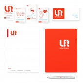
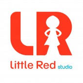
| DESIGN NAME: Little Red Studio Identity PRIMARY FUNCTION: Visual Identity INSPIRATION: The inspiration for this logo arose thanks to the stories for children, it was wanted to adapt to the current times with a different vision and meaning to enhance the Little Red Riding Hood. For that, he thought of joining a character of fiction and adventure, hence his position that makes him have a disposition marked by action. UNIQUE PROPERTIES / PROJECT DESCRIPTION: This design represents and reminds its members of the company values (creativity, innovation, action and empathy). Little Red Riding Hood is the union of creativity and innocence together with innovation and determination giving character to the service. OPERATION / FLOW / INTERACTION: This is a logo design with wide typography, marked with its own character and created geometrically. Together with the red that remind us of Little Red Riding Hood, it confers a great presence and power, which makes it the perfect frame to fit the figure that creates the emptiness of the letter R. PROJECT DURATION AND LOCATION: The project started at the end of december 2015 in Bilbao and finished at April 2016. FITS BEST INTO CATEGORY: Graphics, Illustration and Visual Communication Design |
PRODUCTION / REALIZATION TECHNOLOGY: The first sketch was made with the Slate tablet and then worked on Adobe Illustrator. SPECIFICATIONS / TECHNICAL PROPERTIES: The colors used are; PANTONE Bright Red C C 72,8% M 2,93% Y 15,35% K 0% The fonts are: SchulVokalDotless and Planet Estyle TAGS: event brand, brand, culture, visual identity, music, image design RESEARCH ABSTRACT: The first thing that was done was to study the Perrolt stories, their morals and their social contents. Little Red Riding Hood was chosen because it reflects the social and labor context of the current woman. We investigate the psychological and formal aspect of history. This helped to create an image that changed the passive role of Little Red Riding Hood to an active woman, gave her strength and reflected her worth by approaching the images of comic book heroines such as Wonder Woman, this is reflected in the figure of Little Red Riding Hood logo and the word study reflects creation and analysis. CHALLENGE: The biggest challenge was to create a drawing of Little Red Riding Hood that did not reflect aggression by its pose, but a willingness to act to achieve the objectives set by the client and be empathetic. ADDED DATE: 2019-02-25 17:03:55 TEAM MEMBERS (1) : IMAGE CREDITS: Ana Ramirez Gonzalez- LR studio, 2018 PATENTS/COPYRIGHTS: Copyright ©2018 LR studio, Ana Ramirez Gonzalez. All rights reserved. |
||||
| Visit the following page to learn more: https://bit.ly/2H4sZzP | |||||
| AWARD DETAILS | |
 |
Little Red Studio Identity Visual Identity by Ana Ramirez Gonzalez is Winner in Graphics, Illustration and Visual Communication Design Category, 2018 - 2019.· Read the interview with designer Ana Ramirez Gonzalez for design Little Red Studio Identity here.· Press Members: Login or Register to request an exclusive interview with Ana Ramirez Gonzalez. · Click here to register inorder to view the profile and other works by Ana Ramirez Gonzalez. |
| SOCIAL |
| + Add to Likes / Favorites | Send to My Email | Comment | Testimonials | View Press-Release | Press Kit | Translations |
Did you like Ana Ramirez Gonzalez's Graphic Design?
You will most likely enjoy other award winning graphic design as well.
Click here to view more Award Winning Graphic Design.


