Kinderpalliativ Netzwerk Nordrhein Corporate Identity by CRENEO |
Home > Winners > #79044 |
 |
|
||||
| DESIGN DETAILS | |||||
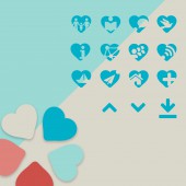
| DESIGN NAME: Kinderpalliativ Netzwerk Nordrhein PRIMARY FUNCTION: Corporate Identity INSPIRATION: Competent palliative care of terminally ill children and youths can only work in a multi-professional setting. For this purpose, Kinderpalliativ Netzwerk Nordrhein was founded under the leadership of Dr. Gisela Janssen. Within the scope of a pro-bono project, we were developing and realizing a new look for Kinderpalliativ Netzwerk Nordrhein. The logo, color world, image world, iconography, and typography now follow a uniform and modern visual language. UNIQUE PROPERTIES / PROJECT DESCRIPTION: After a careful analysis of the segment, a new word-image-brand was created. At the same time, the figurative mark acts as a visual platform for the newly developed iconography concept. The symbolic imagery manages to communicate the sensitive content of this topic in a subtle, focused manner. Every now and then, one of the numerous illustrations depicts a ship, which serves as a stylistic device representing the transition between life and death. The simple, stylized illustrations manage to achieve a high level of visual distinctiveness which were used on the new website. OPERATION / FLOW / INTERACTION: The clear menu structure starts with general information about the network, leads through the regional network, up to the individual active teams. Within this group, the focus is on the institution and its health services. On the other hand, there is a change of perspective in the area of "Parents & Families". Through individual experience and specific literature recommendations of former affected parents, a different view of the situation emerges. The offer is constantly extended - as next around the range "Medical Doctors". PROJECT DURATION AND LOCATION: The project was started in 2017 and lasted for 4 months in Düsseldorf, Germany. FITS BEST INTO CATEGORY: Graphics, Illustration and Visual Communication Design |
PRODUCTION / REALIZATION TECHNOLOGY: The numerous illustrations are hand-drawn by an illustrator. For creating the logo and iconography we used Adobe Illustrator. The website design was built in Adobe Photoshop and afterwards programmed and realized with Wordpress. SPECIFICATIONS / TECHNICAL PROPERTIES: This website should work on any screen to be able to be shown on any screen dimension. TAGS: Logo, Corporate Design, Web Design, UI, Illustration RESEARCH ABSTRACT: A careful analysis of the segment was conducted into making the website more appealing and structured. This research guided our design principles of establishing trust, maintaining transparency and facilitating understanding. CHALLENGE: The main challenge was creating a user-friendly digital platform that could be used as an information and advice portal for the palliative care of terminally ill children. At the same time, the site’s design should provide an emotionally appealing approach to this sensitive topic. ADDED DATE: 2019-02-25 14:23:54 TEAM MEMBERS (2) : Creative Direction / Art Direction: Alexander Willuweit and Illustration: Helke Rah IMAGE CREDITS: CRENEO, 2019. |
||||
| Visit the following page to learn more: https://bit.ly/2NsegQw | |||||
| AWARD DETAILS | |
 |
Kinderpalliativ Netzwerk Nordrhein Corporate Identity by Creneo is Winner in Graphics, Illustration and Visual Communication Design Category, 2018 - 2019.· Read the interview with designer CRENEO for design Kinderpalliativ Netzwerk Nordrhein here.· Press Members: Login or Register to request an exclusive interview with CRENEO. · Click here to register inorder to view the profile and other works by CRENEO. |
| SOCIAL |
| + Add to Likes / Favorites | Send to My Email | Comment | Testimonials | View Press-Release | Press Kit |
Did you like Creneo's Graphic Design?
You will most likely enjoy other award winning graphic design as well.
Click here to view more Award Winning Graphic Design.


