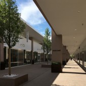
Torino Outlet Village Retail Store by Claudio Silvestrin |
Home > Winners > #78975 |
 |
|
||||
| DESIGN DETAILS | |||||
| DESIGN NAME: Torino Outlet Village PRIMARY FUNCTION: Retail Store INSPIRATION: In my design for the Torino Outlet Village in Italy, I have remained faithful to my vocation as an architect of aesthetics by choosing to express beauty, elegance, harmony, visual order, calm, serenity, timelessness, and Nature. The ostensible simplicity of this project is in actual fact the result of visual clarity, freedom of movement, open perspectives, visual order. UNIQUE PROPERTIES / PROJECT DESCRIPTION: Torino Outlet (Fashion) Village is a 32,000 sqm street-level, open-air development. The assertive horizontality of the outlet makes it visually modern, as well as classic and elegant in configuration and proportions. The building is clad in ancient and natural materials: natural stone and lime plaster. The shopping promenade is 290 m long with ceilings reaching up to 6 m in height. It is flanked by an arcade that extends into infinity and is adorned by a regular trail of trees. OPERATION / FLOW / INTERACTION: This project does not lay claim to power, majesty, or divinity. It is not aggressive, imposing or self-important, but rather it is an understated architecture, elegant and refined in its details, with parking areas for example that are partially concealed by the new green hill. This is intentional, because the ultimate protagonist is the visitor, not the building. The visitor will perceive an architectural and spatial quality in the Torino Outlet Village that is unprecedented in fashion mall design, a quality aimed at contemporary psychological comfort as a way of stimulating and encouraging the purchase. In a simple and solid architecture, without frills or ornaments, with a clarity of form, perspective and direction that creates a sense of calm, the visitor is encouraged into making a purchase and spending more time. Above all, there is an incentive to return because, in ‘un luogo di qualità’ (place of quality) you experience a sense of ease and comfort, you feel valued. PROJECT DURATION AND LOCATION: Settimo Torinese, Turin, Italy. Planning begins: 2009. Building site opens: August 2015. Project completion: March 2017. FITS BEST INTO CATEGORY: Architecture, Building and Structure Design |
PRODUCTION / REALIZATION TECHNOLOGY: Materials Obelisk: metal structure panelled with 1.5-3 cm thick metal sheets, pearl varnish finish. Floorings: Santafiora stone (15 million-year-old sandstone), finish: piano sega limaia. Facades and partition walls: lime plaster, earth colour. Parapet walls, internal walls, stairs, skirting boards, lavatories panelling: Santafiora stone (15 million-year-old sandstone), finish: piano sega limaia. Stonework technologies Precast concrete. Exterior insulation and finish system. Energy systems Heat network units (teleheating units) to curb energy consumption and lower environmental impact compared to traditional boiler heating systems. Waste heat recycling from nearby electrical plant. Solar panels to cover 50% of hot water supply for food and drink areas. Air and moisture conditioning through ‘water ring’ plus heat pump system: the centralised system generates controlled-temperatu SPECIFICATIONS / TECHNICAL PROPERTIES: Overall surface area: 3,000 sqm. GLA: 19,500 sqm. Obelisk height: 85 m. Building lenght: 290 m. Building width: 110 m. Shop gallery lenght: 275 m. Platform canopies: 3 m. Commercial units: 90. Parking: 2,600 places. TAGS: simplicity, fashion, retail, minimalist, elegant, natural RESEARCH ABSTRACT: Torino Outlet (Fashion) Village is a 32,000 sqm development, intentionally laid out on one street-level open-air floor. The shopping gallery is 290 m long. The mark-line stretches out horizontally, making the outlet visually modern, but also classic and elegant in configuration and proportions. The influence of Mies van der Rohe is apparent. The building is clad with natural stone and lime plaster, both ancient and natural materials. The promenade, surrounded by an arcade that extends into infinity and evokes the stunning Mosque-Cathedral of Cordoba, is adorned by a regular trail of trees, an invitation to be out in the open. The ostensible simplicity of this project is in actual fact the result of visual clarity, freedom of movement, open perspectives, visual order. I began by imagining a long horizontal line, drawn in pencil, running parallel to the ground; a sign that extends for almost 300 m and represents the intention of a modern architectural structure that is at the same time classical and elegant in its configuration and proportions. The long facade overlooks the highway and is concealed by new bushes and trees. From behind the trees a 85 m high freestanding spire rises as a metaphorical bridge between the sky and the earth and as an iconic landmark connecting the surrounding territory. The symbolic spire seems to pierce the sky, drawing its cosmic energy down on the earth. It has a delicate structure and its remarkable design, although anchoring the tower solidly to the ground, makes it soar into the sky with exceptional lightness. The spire is a gate to the Fashion Village and, simultaneously, stands as a gate and icon of the city. The obelisk rises with remarkable lightness thanks to its bright white skin, which I really wanted. It functions as the gate-entrance into the fashion mall and, at the same time, as the gate-icon of the territory. A modern medieval spire, it is just as assertive by day as it is by night; a purely symbolic element, soaring high up into the sky, but at the same time inviting (the opposite of a tower) and signalling the horizon, just as church bell towers did in the past. The Silvestrin Obelisk is not a traditional structure however. It has an unexpected geometry, like a prism, which I created to show the play of light and unimagined shadows. It is not solid and impenetrable, but rather open, like a door that is always ajar. It is tempting, and you want to cross it as you would a medieval drawbridge, to enter into the castle and to feel protected. CHALLENGE: The outlet is located between Settimo Torinese and the Milan-Turin highway. The real challenge was being able to design an architectural object that would mark a clear and effective connection between the city and the new urban development in the area. Instead of tall skyscrapers or common glass-and-concrete towers which often mark operational or commercial districts but disfigure the urban landscape, I designed a purely symbolic element, ostensibly devoid of any material purpose. ADDED DATE: 2019-02-25 12:15:03 TEAM MEMBERS (2) : Principal Architect: Claudio Silvestrin. and Project Architect: Mariachiara Suriani. IMAGE CREDITS: Claudio Silvestrin Architects |
||||
| Visit the following page to learn more: https://www.torinooutletvillage.com/en | |||||
| AWARD DETAILS | |
 |
Torino Outlet Village Retail Store by Claudio Silvestrin is Winner in Architecture, Building and Structure Design Category, 2018 - 2019.· Read the interview with designer Claudio Silvestrin for design Torino Outlet Village here.· Press Members: Login or Register to request an exclusive interview with Claudio Silvestrin. · Click here to register inorder to view the profile and other works by Claudio Silvestrin. |
| SOCIAL |
| + Add to Likes / Favorites | Send to My Email | Comment | Testimonials | View Press-Release | Press Kit |
Did you like Claudio Silvestrin's Architecture Design?
You will most likely enjoy other award winning architecture design as well.
Click here to view more Award Winning Architecture Design.


