Rivers Coatings Corporate Identity by Hesse Shanghai, Klaus Hesse, Shen Tu and Jiang Yi |
Home > Winners > #78511 |
 |
|
||||
| DESIGN DETAILS | |||||
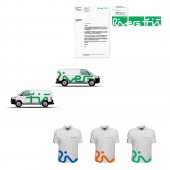
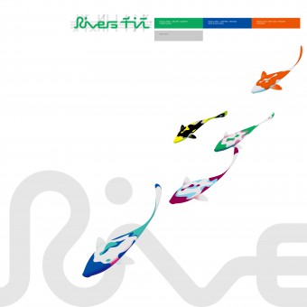
| DESIGN NAME: Rivers Coatings PRIMARY FUNCTION: Corporate Identity INSPIRATION: »Rivers/Qianjiang« develops and manufactures environmentally friendly powder coatings, water-based coatings and oil coatings for the highest demands. »Rivers/Qianjiang« is one of the leading Chinese producers for eco-friendly high- tech coatings for the industry.»Rivers/ Qianjiang« feels equally committed to his clients and the environment. UNIQUE PROPERTIES / PROJECT DESCRIPTION: The brand design joins Latin and Chinese characters to one word mark. It marks all product lines and creates one strong brand. And it has done by a single line as a reference to the beauty of a river. »Rivers/Qianjiang« is full of powerful meanings. A river is life, a river connects and a river flows like the coatings. »Rivers/Qianjiang« is a remarkable and trustful name that expresses the mission and tasks of the company: »Rivers/Qianjiang« makes things more beautiful, safe and more sustainable OPERATION / FLOW / INTERACTION: - PROJECT DURATION AND LOCATION: The project started in 2016 and finished in 2018 in Guangdong, and was exhibited in red dot museum and iF exhibition as iF gold winner of 2018. FITS BEST INTO CATEGORY: Graphics, Illustration and Visual Communication Design |
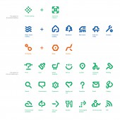
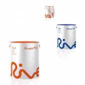
PRODUCTION / REALIZATION TECHNOLOGY: - SPECIFICATIONS / TECHNICAL PROPERTIES: All packagings have a very clean design and and are free from all unnecessary ballast. The background color is light grey or silver depending on the material of the cans and boxes. Three different colours help to distinguish between power coatings, water-based coatings and oil coatings. The brand name always follows the shape of the packaging. All relevant information about the coatings are on the top of the packagings. This design is very unique for the Chinese market and expresses the high quality of the coatings. The icons indicate the different specific applications of the coatings and the colours mark the type of coating. This is important for the consumer to recognise the right product at first sight. The design of the icon system comes from the design of the brand name. Beside that the icons are used for signage system and to strengthen cultural identity. TAGS: - RESEARCH ABSTRACT: - CHALLENGE: "A clear design that unites fine form with a commercial approach that works on the market. Simple, clear, with soft typography and a mixture of Eastern and Western influences. Attention-grabbing and recognizable." ADDED DATE: 2019-02-24 11:56:36 TEAM MEMBERS (5) : Creative Director:Klaus Hesse, Art Direction:Shen Tu,Jiang Yi,Yuriy Matveev,Nikolas Brueckmann, Strategy:DeTao Group, and IMAGE CREDITS: Hesse Shanghai, Klaus Hesse, Shen Tu and Jiang Yi, 2018. |
||||
| Visit the following page to learn more: http://hesseshanghai.com/zh/visual-ident |
|||||
| AWARD DETAILS | |
 |
Rivers Coatings Corporate Identity by Hesse Shanghai, Klaus Hesse, Shen Tu and Jiang Yi is Winner in Graphics, Illustration and Visual Communication Design Category, 2018 - 2019.· Press Members: Login or Register to request an exclusive interview with Hesse Shanghai, Klaus Hesse, Shen Tu and Jiang Yi. · Click here to register inorder to view the profile and other works by Hesse Shanghai, Klaus Hesse, Shen Tu and Jiang Yi. |
| SOCIAL |
| + Add to Likes / Favorites | Send to My Email | Comment | Testimonials | View Press-Release | Press Kit |

