Maldonado City Corporate Identity by Agustin Larrosa |
Home > Winners > #78345 |
 |
|
||||
| DESIGN DETAILS | |||||
| DESIGN NAME: Maldonado City PRIMARY FUNCTION: Corporate Identity INSPIRATION: The city immersed us in the sea and allowed us to take from its essence, the spirit of strength, exchange and union. Through the fusion between the path drawn by the blast of water thrown by the whales, when swimming against the water stream and the initial of Maldonado, we managed to generate an emblematic image that identifies the city. UNIQUE PROPERTIES / PROJECT DESCRIPTION: This design is focused on the city spirit. Thick and rounded lines achieve a friendly and corporeal image, resulting in a playful yet professional work. Maldonado’s population needs to see the logo as the symbol that represents their town, and be related to it. OPERATION / FLOW / INTERACTION: The logo can be used in the color blue, but in order to not compromise it legibility in other backgrounds, we prefer white. This applies on big and small scales. We prefer to use only the icon in smaller reductions such as 10mm. PROJECT DURATION AND LOCATION: This project started on August of 2017 and ended in December, in Montevideo, Uruguay. It was created for a academic project, and now there is big chance this work could be used for institutional purposes. FITS BEST INTO CATEGORY: Graphics, Illustration and Visual Communication Design |
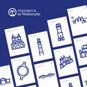
PRODUCTION / REALIZATION TECHNOLOGY: The sea waves, the whale’s struggles and the citizens union and connection with the town, are the principal factors in the image of the logo. The waves shown in the M letter are replicated on the visual opening of the brand, which is then part of patterns, posters and banners. SPECIFICATIONS / TECHNICAL PROPERTIES: Cards: 95mm(length) * 50mm(width) Letterhead: 297mm(length) * 210mm(width) Web design: 1920 * 1080px and responsive mobile Posters: 420mm(length) * 297mm(width) TAGS: Corporate identity, Logo, Branding, Brand, VI, City, Uruguay RESEARCH ABSTRACT: In order to get all the elements that exactly represents the town of Maldonado, I did a lot of research about all the logos that had been used in the past until now. Then I realized that their image didn’t quite communicate what the town really is. I searched for a strategy that could blend concepts and the town spirit in only one image. Through all this process I also realized that there was indeed one case in which all of this was achieved; in the first period of Maldonado’s history. The town shield have been representing the town all this time. Therefore, my interest in returning some history into present. CHALLENGE: I started by analyzing the town shield and reading about its history. Then I begun sketching whales, circles, some different versions of the letter M, water streams, etc. After that, I scanned the sketches, so that by vectorized them , I could give them shape and color. This way I was also able to see the logo in different surfaces and understanding different ways to use it. ADDED DATE: 2019-02-23 16:04:23 TEAM MEMBERS (1) : Agustin Larrosa IMAGE CREDITS: Brandin Mockups and InVision Screen web PATENTS/COPYRIGHTS: Copyrights belong to Agustin Larrosa, 2019. |
||||
| Visit the following page to learn more: http://pimba.com.uy/ | |||||
| AWARD DETAILS | |
 |
Maldonado City Corporate Identity by Agustin Larrosa is Winner in Graphics, Illustration and Visual Communication Design Category, 2018 - 2019.· Read the interview with designer Agustin Larrosa for design Maldonado City here.· Press Members: Login or Register to request an exclusive interview with Agustin Larrosa. · Click here to register inorder to view the profile and other works by Agustin Larrosa. |
| SOCIAL |
| + Add to Likes / Favorites | Send to My Email | Comment | Testimonials | View Press-Release | Press Kit |
Did you like Agustin Larrosa's Graphic Design?
You will most likely enjoy other award winning graphic design as well.
Click here to view more Award Winning Graphic Design.


