AT Creations Visual Identity Visual Identity by AT Creations |
Home > Winners > #77754 |
 |
|
||||
| DESIGN DETAILS | |||||
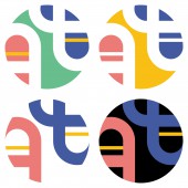
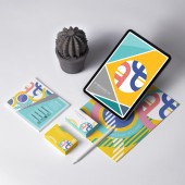
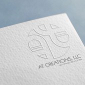
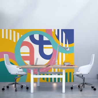
| DESIGN NAME: AT Creations Visual Identity PRIMARY FUNCTION: Visual Identity INSPIRATION: The inspiration for this logo-mark was that the alphabets A and T, initials of designers of the company create their own road by interacting with various people from other thoughts and cultures and getting a deeper understanding of intercultural communication and ideas through the company. UNIQUE PROPERTIES / PROJECT DESCRIPTION: This logo was made for a company that creates outstanding visual artwork pieces for clients across the commercial, community, fashion, cultural and music industries. Unique property of this design is to express that the alphabets A and T, initials of designers of the company, make the world colorful by interacting and creating their own road. OPERATION / FLOW / INTERACTION: This design is clipped a part of the road they made, so it can be any alphabets from the road they made. This brand was created to make outstanding artwork pieces for clients across the commercial, community, fashion, cultural and music industries. It is its characteristic of them what create their own road by interacting with various people from other culture and getting a deeper understanding of intercultural communication and ideas through the company. PROJECT DURATION AND LOCATION: The project started August 2018 and finished January 2019 in San Francisco, California, USA. I am continuing to work on the branding as well. FITS BEST INTO CATEGORY: Graphics, Illustration and Visual Communication Design |
PRODUCTION / REALIZATION TECHNOLOGY: Adobe Illustrator, Adobe Photoshop SPECIFICATIONS / TECHNICAL PROPERTIES: The project does not have a specific size or measure because it can be any sizes. TAGS: logo, design, alphabet, design RESEARCH ABSTRACT: I performed thorough research on the logo design, brand colors, and characteristics of their competition. This logo design expresses that to create their own road by interacting with various people from other culture and getting a deeper understanding of intercultural communication and ideas through the company. CHALLENGE: By bringing the company's concept, "Life is Simple. Life is Colorful.", and making roads colorful, I was able to create a powerful branding for AT Creations and evolve the design into a modern logo design. This brand was created to make outstanding artwork pieces for clients across the commercial, community, fashion, cultural and music industries. It is its characteristic of them what create their own road by interacting with various people from other culture and getting a deeper understanding of intercultural communication and ideas through the company. ADDED DATE: 2019-02-20 23:21:51 TEAM MEMBERS (1) : Designers: Tomoya Yamashita and Asuka Saito IMAGE CREDITS: AT Creations, 2018. |
||||
| Visit the following page to learn more: https://atcreationsllc.com | |||||
| AWARD DETAILS | |
 |
At Creations Visual Identity Visual Identity by At Creations is Winner in Graphics, Illustration and Visual Communication Design Category, 2018 - 2019.· Read the interview with designer AT Creations for design AT Creations Visual Identity here.· Press Members: Login or Register to request an exclusive interview with AT Creations. · Click here to register inorder to view the profile and other works by AT Creations. |
| SOCIAL |
| + Add to Likes / Favorites | Send to My Email | Comment | Testimonials | View Press-Release | Press Kit |
Did you like At Creations' Graphic Design?
You will most likely enjoy other award winning graphic design as well.
Click here to view more Award Winning Graphic Design.


