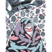
My Chronic Pain Diary Journal by Ciara Chapman |
Home > Winners > #77546 |
 |
|
||||
| DESIGN DETAILS | |||||
| DESIGN NAME: My Chronic Pain Diary PRIMARY FUNCTION: Journal INSPIRATION: This project started out as a form of art therapy for me but sharing it with the public has pushed me forward and given me the confidence to want more. I want this diary to be equally strong between it's emotional and illustrative integrity. I'm proud of what I have achieved with this project. It has helped people in pain as well as their loved ones. Pain sufferers identify with the moment captured and their loved ones gain some insight into what they are going though. UNIQUE PROPERTIES / PROJECT DESCRIPTION: Ciara Chapman started My Chronic Pain Diary in January 2016 as a form of Art Therapy, to help her cope with the mental and physical toll which Chronic Pain had taken on her life. Ciara’s illustrated diary has over 100 illustrations, each capturing a moment in time through her journey with Chronic Pain. Ciara uses delicate lines and a bright colour palette to balance out the weighty themes of her work, namely the struggle of having an invisible illness’ Written by artist Clare Hartigan OPERATION / FLOW / INTERACTION: The impact of each diary entry depends on who is viewing the piece. Some people get very emotional, others laugh, it's all a matter of how the viewer is feeling in themselves that interprets the flow or interaction. PROJECT DURATION AND LOCATION: This project started in January 2016 and has been ongoing since then, there's no end in sight because the diary itself mirrors my own life. FITS BEST INTO CATEGORY: Graphics, Illustration and Visual Communication Design |
PRODUCTION / REALIZATION TECHNOLOGY: Each diary entry is initially drawn traditionally and is scanned into my computer to use on photoshop. I clean the entry up in Photoshop and add colours. I add different layers to add depth or texture if I feel the image is lacking or as a means of introducing more symbolic information into the piece. There is a delicate balance between the design side of a journal entry and the emotional side. SPECIFICATIONS / TECHNICAL PROPERTIES: Each image is usually created as an A3 image, CMYK with 300dpi. If I print the image I use giclee print on textured matte paper with torn edges. TAGS: illustration, character art, character development, design, bright colours, patterns, pattern art, outline art, colourful, RESEARCH ABSTRACT: As this is a personal project the research is mostly internal. I come up with the concept of the piece as it happens or when I'm on my very worst health days, when my body improves I get to work. I sketch out the image on a day where my leg is troubling me as it means I can lie a certain way. On days where my back is causing problems, I use the computer because it forces me to sit still. I draw a lot of inspiration from other artists, illustrators, dancers, designers on Instagram. CHALLENGE: The hardest part of this process for me is capturing an emotion in 2D form. The most successful images I have work because they have been stripped back to the simplest amount of information for the viewer. This is especially important if there is text in the piece. I like to keep text to a minimum in the hopes that the title and illustration together, give enough information to the viewer. Sometimes I hit the nail on the head, other times I know I haven't done the emotion justice and I start over again. ADDED DATE: 2019-02-19 15:48:39 TEAM MEMBERS (1) : IMAGE CREDITS: Image No 1-5 Creator/Illustrator Ciara Chapman PATENTS/COPYRIGHTS: Copyrights belong to Ciara Chapman, 2016 |
||||
| Visit the following page to learn more: https://mychronicpaindiary.com | |||||
| AWARD DETAILS | |
 |
My Chronic Pain Diary Journal by Ciara Chapman is Winner in Graphics, Illustration and Visual Communication Design Category, 2018 - 2019.· Read the interview with designer Ciara Chapman for design My Chronic Pain Diary here.· Press Members: Login or Register to request an exclusive interview with Ciara Chapman. · Click here to register inorder to view the profile and other works by Ciara Chapman. |
| SOCIAL |
| + Add to Likes / Favorites | Send to My Email | Comment | Testimonials | View Press-Release | Press Kit | Translations |
| COMMENTS | ||||||||||||||||||||||||||||||||
|
||||||||||||||||||||||||||||||||
Did you like Ciara Chapman's Graphic Design?
You will most likely enjoy other award winning graphic design as well.
Click here to view more Award Winning Graphic Design.


