Narrative of Stacking Residence by MUHO Design Studio |
Home > Winners > #77228 |
 |
|
||||
| DESIGN DETAILS | |||||
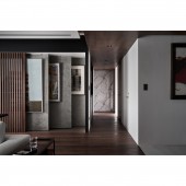
| DESIGN NAME: Narrative of Stacking PRIMARY FUNCTION: Residence INSPIRATION: As the client has lived in this house for more than 15 years, he expected the renovation could bring about visual and living experiences that were ever seen before. Due to a large number of contemporary art paintings collected by the client, how to create a proper storage space and display area for these art paintings became one of the major design courses for this project. Moreover, given the site surrounded by the natural wonder with spectacular lake views, the overall interior texture is presented in low-color-tone and original materials, responding to the pure and tranquil nature of the residential space. UNIQUE PROPERTIES / PROJECT DESCRIPTION: The unique feature of this project is the exhibition wall that features 12 sliding panels divided into six layers from front to back. These panels are hung with the precious collection of art paintings by the client, which allows the previously disorganized art paintings to be displayed in a specific and organized order. Complemented by concrete-finished panels and timber screen, these sliding panels give a more flexible and diverse representation of the art paintings display, and naturally, more sense of fun in everyday living for the client. OPERATION / FLOW / INTERACTION: Having re-configure the layout so that the living room is orientated towards the outdoor lake view, while the previously obstructed view and room were then liberated to an open, spacious and much better illuminated public area; at the same time, it expanded the space of the three bedrooms that allows the previous storage room from one of the bedrooms to become an independent storage space, as well as making the overall living and circulation more flowing. PROJECT DURATION AND LOCATION: The project finished in September, 2018 in New Taipei City, Taiwan. FITS BEST INTO CATEGORY: Interior Space and Exhibition Design |
PRODUCTION / REALIZATION TECHNOLOGY: Considering the enriched color and the strokes of the paintings, the main materials applied for the interior space are focused on purity and simple materiality, including natural masonry materials, genuine timber veneer, iron work, concrete-finished paint and timber floor. SPECIFICATIONS / TECHNICAL PROPERTIES: The entire area of this project is 165 square meters. The issues caused by the antiquated state of the residence were also part of the design missions so that ineffective pipe lines were totally replaced, as the issue of main beam lowering ceiling was solved by partial coverage of iron work materials. TAGS: Minimalism, Stacking, Painting on Exhibit, Residence, Interior Design, Renovation RESEARCH ABSTRACT: Through the re-layout of the interior, the more open and flowing circulation filled with ample natural light was created, while opening up a gallery-like space. The overall color-scheme was of neutral black, white, grey and earth colors, complemented with original materials in sculpting a simple, low-profile and warm scenery with natural ambiance, and at the same time, highlighting the richness of the collected art paintings. CHALLENGE: The client is almost 70 years of age with his fixed living routine, however, he expected for a brand new look for this housing renovation. The design team has also observed that interior space needs to be improved in different aspects such as natural lighting, vista, storage, and circulation. How to reconcile design concept, practicality and the long-term habits of the client had become a major challenge for this project. ADDED DATE: 2019-02-18 08:07:10 TEAM MEMBERS (1) : Design Director : Yu-Fong Chang IMAGE CREDITS: Hey Cheese |
||||
| Visit the following page to learn more: https://www.facebook.com/muhodesignstudi |
|||||
| AWARD DETAILS | |
 |
Narrative of Stacking Residence by Muho Design Studio is Winner in Interior Space and Exhibition Design Category, 2018 - 2019.· Read the interview with designer MUHO Design Studio for design Narrative of Stacking here.· Press Members: Login or Register to request an exclusive interview with MUHO Design Studio. · Click here to register inorder to view the profile and other works by MUHO Design Studio. |
| SOCIAL |
| + Add to Likes / Favorites | Send to My Email | Comment | Testimonials | View Press-Release | Press Kit | Translations |
Did you like Muho Design Studio's Interior Design?
You will most likely enjoy other award winning interior design as well.
Click here to view more Award Winning Interior Design.


