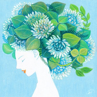
Misty Little Forest Series of Illustraions by Do Kyung Lee |
Home > Winners > #77108 |
 |
|
||||
| DESIGN DETAILS | |||||
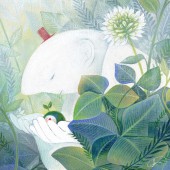
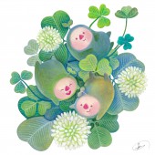
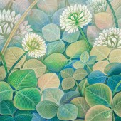
| DESIGN NAME: Misty Little Forest PRIMARY FUNCTION: Series of Illustraions INSPIRATION: The inspiration for the artwork comes from the interest in the small and vulnerable things that are not easy to see. I often think that little weeds and flowers by the that I see while walking on the outside contains an invisible and mysterious world of their own. Imagining and expressing those worlds is quite an interesting thing to do. UNIQUE PROPERTIES / PROJECT DESCRIPTION: The blue-ish and damp texture that is somewhat similar to the earth is intended to create a unique atmosphere. Overlapping the cream and white colored pencil on the green and blue color creates a calm mood that brings up the image of the fog. The leaves and stems in the background were expressed using watercolor to reinforce the soft texture. OPERATION / FLOW / INTERACTION: The unique atmosphere of the works will lead viewers to feel both comfort and mystery at the same time. PROJECT DURATION AND LOCATION: The project started in November 2018 in Korea, and was exhibited in Seoul Illustration Fair (SIF) 2018 with other works. FITS BEST INTO CATEGORY: Graphics, Illustration and Visual Communication Design |
PRODUCTION / REALIZATION TECHNOLOGY: colored pencil and Watercolor on paper SPECIFICATIONS / TECHNICAL PROPERTIES: colored pencil on paper,200 mm x 200 mm TAGS: illustration, forest, green, fantasy, art RESEARCH ABSTRACT: The first thing I did to express the mysterious world was the observation. I found places like the shady stump in the park or a place crowded with clovers, and I took the picture and sketched those places. As well as the colored pencil, I used graphics tools like Photoshop to visualize the mysterious atmosphere from the observation quickly and intuitively. Resultingly, these processes helped me to understand the concepts of the painting. CHALLENGE: The biggest challenge was to prevent audiences from feeling dull and bored. I managed to create diverse and soft colors by mixing many different colored pencils in green and blue tones on many pieces of paper. I wanted to avoid the color that is too bright and has excessively high chroma, so I colored the blank background for multiple times with the very thin yellow color to see how the color fits in the big picture. ADDED DATE: 2019-02-17 15:30:28 TEAM MEMBERS (1) : IMAGE CREDITS: Image #1: Artist Dokyung Lee, 2018 Image #2: Artist Dokyung Lee, 2018 Image #3: Artist Dokyung Lee, 2018 Image #4: Artist Dokyung Lee, 2018 Image #5: Artist Dokyung Lee, 2018 PATENTS/COPYRIGHTS: © Dokyung Lee, 2018. |
||||
| Visit the following page to learn more: http://bit.ly/2FEDDuQ | |||||
| AWARD DETAILS | |
 |
Misty Little Forest Series of Illustraions by Do Kyung Lee is Winner in Fine Arts and Art Installation Design Category, 2018 - 2019.· Read the interview with designer Do Kyung Lee for design Misty Little Forest here.· Press Members: Login or Register to request an exclusive interview with Do Kyung Lee. · Click here to register inorder to view the profile and other works by Do Kyung Lee. |
| SOCIAL |
| + Add to Likes / Favorites | Send to My Email | Comment | Testimonials | View Press-Release | Press Kit |
Did you like Do Kyung Lee's Fine Art Design?
You will most likely enjoy other award winning fine art design as well.
Click here to view more Award Winning Fine Art Design.


