Architype New York Poster/Print by Qian Sun |
Home > Winners > #76831 |
 |
|
||||
| DESIGN DETAILS | |||||
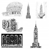
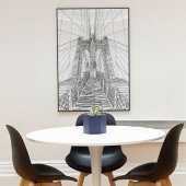
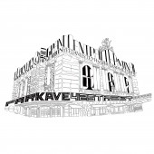
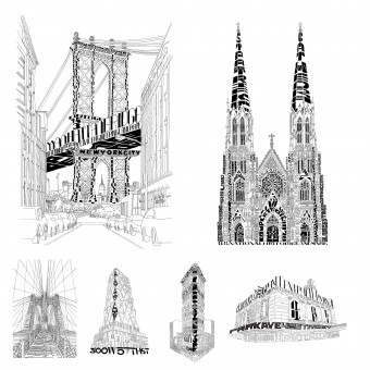
| DESIGN NAME: Architype New York PRIMARY FUNCTION: Poster/Print INSPIRATION: As we walk around New York, we encounter elegant historical landmarks alongside unconventional contemporary structures. From buildings as old as the city itself to ones still being constructed, the architecture of NY is full of surprises and stories. It is out of these stories and a passion for lettering that Architype NY was born. UNIQUE PROPERTIES / PROJECT DESCRIPTION: Architype New York is an on-going series of black and white architectural typographic illustrations of the buildings in NY. Every building is a union of its form and history. With research into both, Architype NY is an exploration of the possibilities to represent architectural form in type as well as to challenge the limitation of lettering as imagery. It invites you to read these structures, to see their stories. In doing so, you may catch glimpses of NY's distinct civilization. OPERATION / FLOW / INTERACTION: Architype helps the viewer gain a greater appreciation for the architecture of New York, highlighting the importance that the historical context to these buildings. Each building illustration is comprised of the historical setting, architects, and story of the building, fusing it with the form and identity of the structure. PROJECT DURATION AND LOCATION: Started in 2016 by Qian Sun in New York City, Architype NY is an on-going project. FITS BEST INTO CATEGORY: Graphics, Illustration and Visual Communication Design |
PRODUCTION / REALIZATION TECHNOLOGY: Each piece is initially created with pen and ink on paper. Later they are scanned and digitally mastered for production. SPECIFICATIONS / TECHNICAL PROPERTIES: The original drawing is 30.5x46cm with reproduction up to 61cmx91.5cm TAGS: Typographic Architecture, Hand lettering Type, typography, architectural illustration, lettering RESEARCH ABSTRACT: Each piece of Architype NY starts with research into the building's location, architects, design details, its official and unofficial histories. The typography designs used in the illustration are also inspired by the era in which that the building was constructed. CHALLENGE: Constructing imageries that utilizes hand lettering type while representing the architecture forms of the buildings and structures. ADDED DATE: 2019-02-16 01:37:55 TEAM MEMBERS (1) : Qian Sun IMAGE CREDITS: Images #1 #2 #3 #4 #5: Maester Design PATENTS/COPYRIGHTS: All Copyrights belong to Maester Design, 2016 |
||||
| Visit the following page to learn more: https://curioussun.com | |||||
| AWARD DETAILS | |
 |
Architype New York Poster/Print by Qian Sun is Winner in Graphics, Illustration and Visual Communication Design Category, 2018 - 2019.· Read the interview with designer Qian Sun for design Architype New York here.· Press Members: Login or Register to request an exclusive interview with Qian Sun. · Click here to register inorder to view the profile and other works by Qian Sun. |
| SOCIAL |
| + Add to Likes / Favorites | Send to My Email | Comment | Testimonials | View Press-Release | Press Kit |
Did you like Qian Sun's Graphic Design?
You will most likely enjoy other award winning graphic design as well.
Click here to view more Award Winning Graphic Design.


