DESIGN NAME:
Nomura 2019 Calendar
PRIMARY FUNCTION:
Desktop Calendar
INSPIRATION:
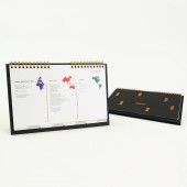
Feedbacks were received from previous users that one of the main usages of this item is for project management especially keeping track on due days or deadlines, which are likely spread over months. A three-month planner layout enables users to check on the dates at a glance. It led to the direction of creating a three-month planner instead a monthly calendar layout.
UNIQUE PROPERTIES / PROJECT DESCRIPTION:
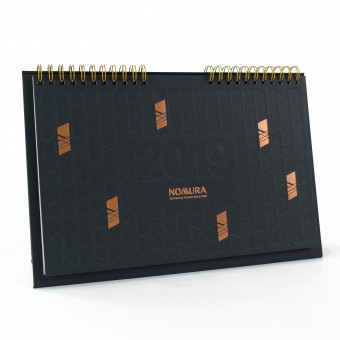
The concept of this corporate calendar is to utilize various printing techniques throughout the item in order to achieve a modern yet luxury style. The cover features the main visual element of the firm; it is repetitively placed to form a pattern as it is a good way to reinforce the brand impression visually. Content pages contain a three-month planner layout which only essential information is printed while secondary visual elements are presented by embossing. The stand is extended by 7mm larger on each side to create a frame guiding user’s visual within the minimal content page layout.
OPERATION / FLOW / INTERACTION:
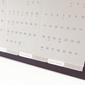
This is a desktop calendar contains information including dates of 2019, national holidays of countries where the firm’s offices located, and the address of the firm’s global offices. In order to differentiate the informations, two different kinds of paper are used for the content pages. Grey Oxford Peace is used for the pages of dates while semi-transparent Gilclear Oxford is used for the pages of national holidays. They are arranged in the order of national holidays page followed by the calendar page of the corresponding months. The specific order of pages helps the user to flip to the page one’s want especially with the use of tabs.
PROJECT DURATION AND LOCATION:
The project started in August 2018 in Hong Kong, and was finished in November in Hong Kong. It was launched in Asia-Pacific regions in January 2019.
FITS BEST INTO CATEGORY:
Graphics, Illustration and Visual Communication Design
|
PRODUCTION / REALIZATION TECHNOLOGY:
Three different kinds of paper are used for the design, two layers of 270gsm Oxford Black are mounted together as the cover, 270gsm Oxford Peace and 150gsm Gilclear are used for the content pages. This is a combination of black, grey and semi-transparent paper, they are intended to create the modern style. And then a touch of bronze is added throughout the design in order to bring out the high-end quality, it includes the bronze binding ring, the bronze hot stamping on the cover and the Patone colour in the content pages.
SPECIFICATIONS / TECHNICAL PROPERTIES:
Dimensions: 255mm (W) x 175mm (L) x 20mm (H)
Paper:
270gsm Oxford Black (cover)
270gsm Oxford Peace (calendar pages)
150gsm Gilclear Oxford (national holiday pages)
TAGS:
Calendar, Three-month Planner, Layout, Stationery, Branding
RESEARCH ABSTRACT:
During the design process, I looked for references on how to create a luxury/high-end design with a cost effective way. And I found out high-end designs usually are with minimal layout. This lead to the development of the concept applying both printing and embossing on the same layout in order to create a minimal yet luxury style.
CHALLENGE:
There are two main challenges. First, this is an information-heavy material, different layouts were created in order to contain as much information as possible on one page in a user friendly arrangement. In the end, it was decided to separate different groups of information and printed on different kinds of paper for differentiation. Second, shipping cost was one of the main concerns during the design process. In order to keep the shipping process cost effective, the dimensions of this calendar is 255mm (W) x 175mm (L) x 20mm (H) which can be fitted in an A4 manila envelope, and it weights 260g.
ADDED DATE:
2019-02-14 16:44:23
TEAM MEMBERS (1) :
IMAGE CREDITS:
Caxton Chung, 2018.
|


